

House of Cards
Fall 2019, 6 weeks
A 20-card activity deck designed to encourage conversation with design texts, and empower users with the perspectives of female designers.
Working with an established jumbo card size and with given text, I created a scalable visual and typographic system geared towards facilitating free-play and improvization.
Working with an established jumbo card size and with given text, I created a scalable visual and typographic system geared towards facilitating free-play and improvization.
Tools:
Illustrator
InDesign
After Effects
(lots of) sticky notes
Illustrator
InDesign
After Effects
(lots of) sticky notes
Skills:
Print/Interaction design
Typographic systems
Design for play
Print/Interaction design
Typographic systems
Design for play
Team:
Individual
Individual


Project Space –
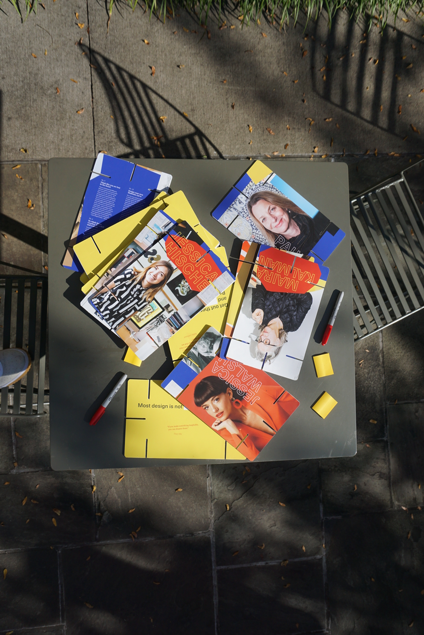
Charles and Ray Eames designed the original House of Cards in 1952. With a simple set of 20 7”x11” slotted and printed pieces of cardboard, they created an activity for exploring the relationships of different printed subjects in a physical space. Confined to this original format, I was tasked with creating a typographic and visual system that included the entire text from Bruce Mau’s 24HRS2 Massive Change Toolkit of Insights, Methods, and Creative Strategies.
I admire Bruce Mau, but I believe his toolkit should be treated as a conversation on the principles of design methodology.
And personally, I believe we should be prioritizing female voices in this conversation.
I chose to pair Mau’s original text with the words and work of the female designers I admire, and designed my system to encourage the players to personally respond and participate in this conversation.
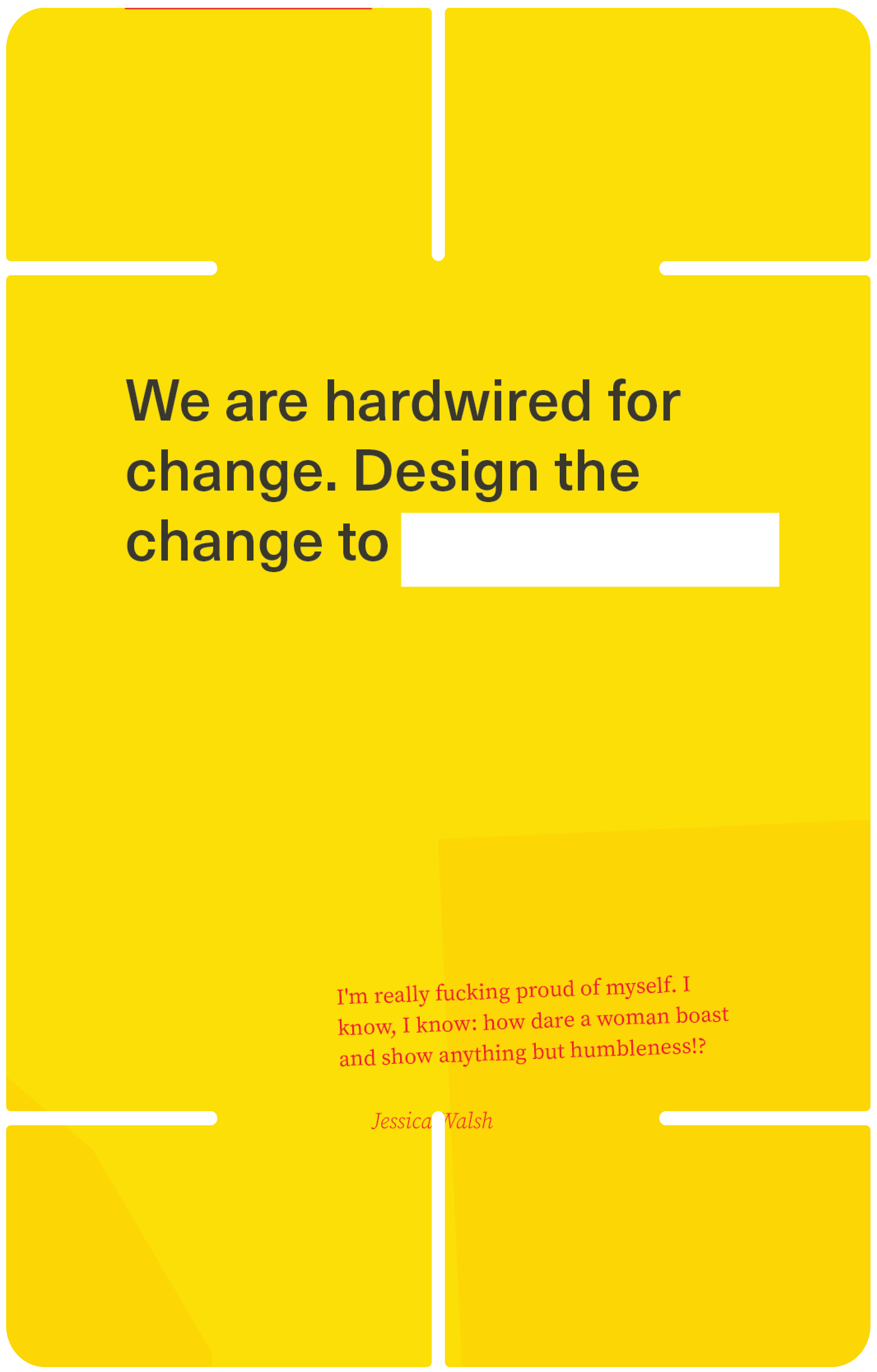
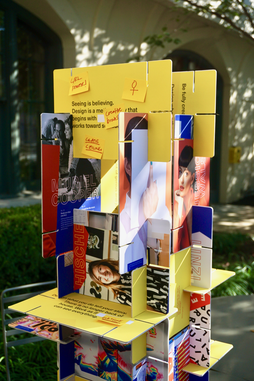
I wanted to acknowledge the spirit of the original Eames deck, so my concept goal was to create a game that’s interactive, physical, and facilitated engagement with Mau’s text. I also wanted to prioritize the specific user interaction of responding to his ideas with their own. This is where the sticky notes come into play.
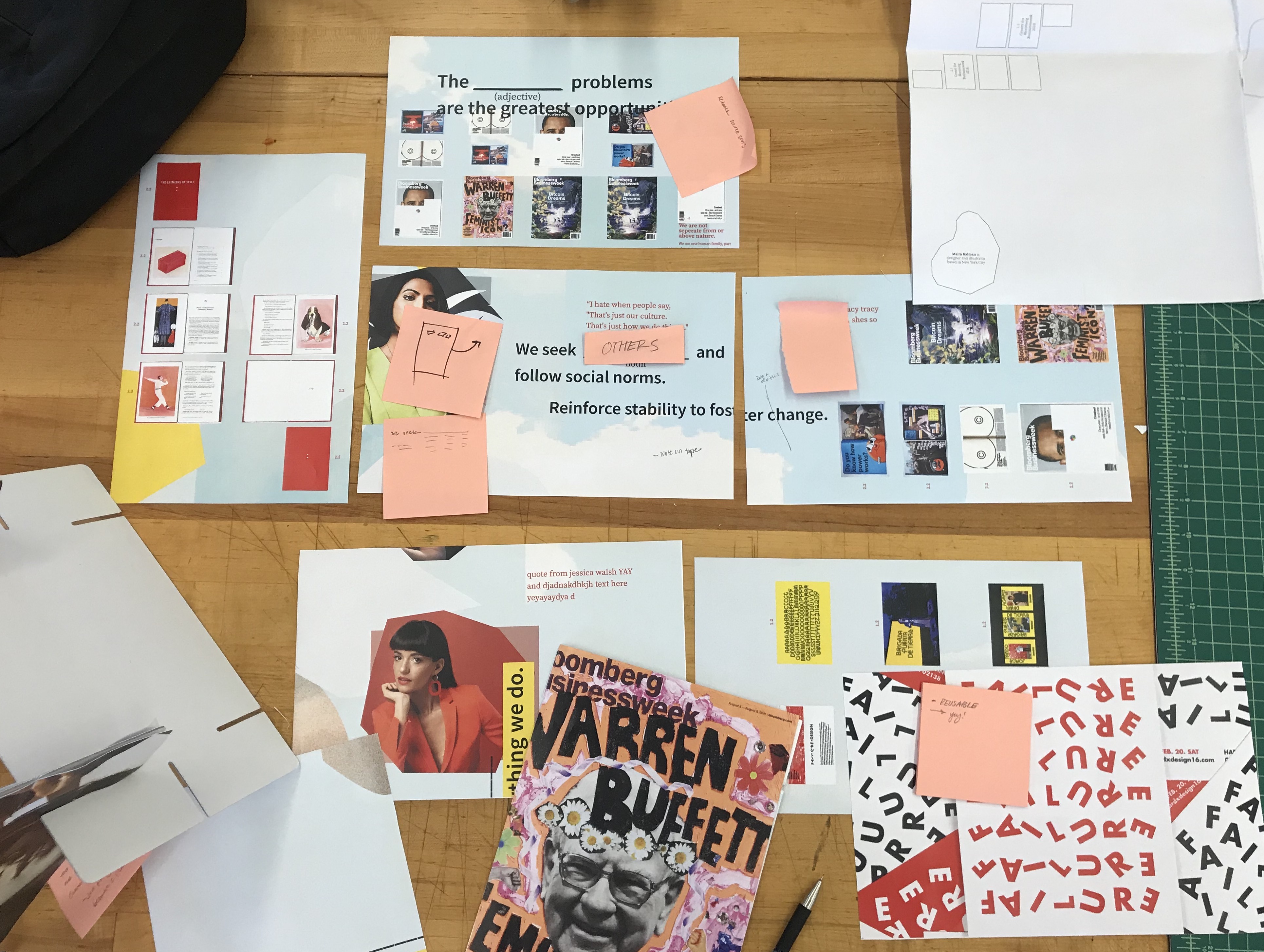
The scope of this project was massively exciting–dangerously so. I knew I needed to be able to structure my workflow in order to meet my own expectations. From the beginning, I set concrete technical goals for myself:
The scope of this project was massively exciting–dangerously so. I knew I needed to be able to structure my workflow in order to meet my own expectations. From the beginning, I set concrete technical goals for myself:
- Create a robust typographic and visual system that accommodates large amounts of copy with multiple hierarchies of information and alternating speakers.
- Employ a strong grid system that enables an editorial and empowering approach to the text, but allows for conversation and user interaction with physical pieces.
- Make an artifact that makes sense for free play (multiple orientations, randomization of order and placement)


01–
Physical interaction with type
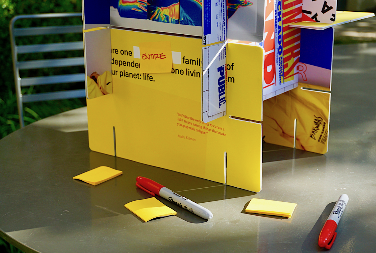
The 24HRS2 Massive Change Toolkit of Insights, Methods, and Creative Strategies is a long, dense body of text. It’s definitely an inspired piece of text, but I took some issue with the tone of how it is written: rather than a suggestion or exploration on design principles, it sounded more like a mandate to me.
To me, conversation is an integral part of the design process. How can I encourage users to treat the given text as a conversation, rather than a mandate?
I realized I needed to prioritize this interaction in my design choices, and this started with typographic decisions. This was a unique format for me to design: in many ways, these cards are all little puzzle pieces designed to work seamlessly in a solid system. But they also have to stand alone and with substance as an individual artifact. If I want the users of this game to feel empowered to speak up to Bruce Mau, they need typographic cues.
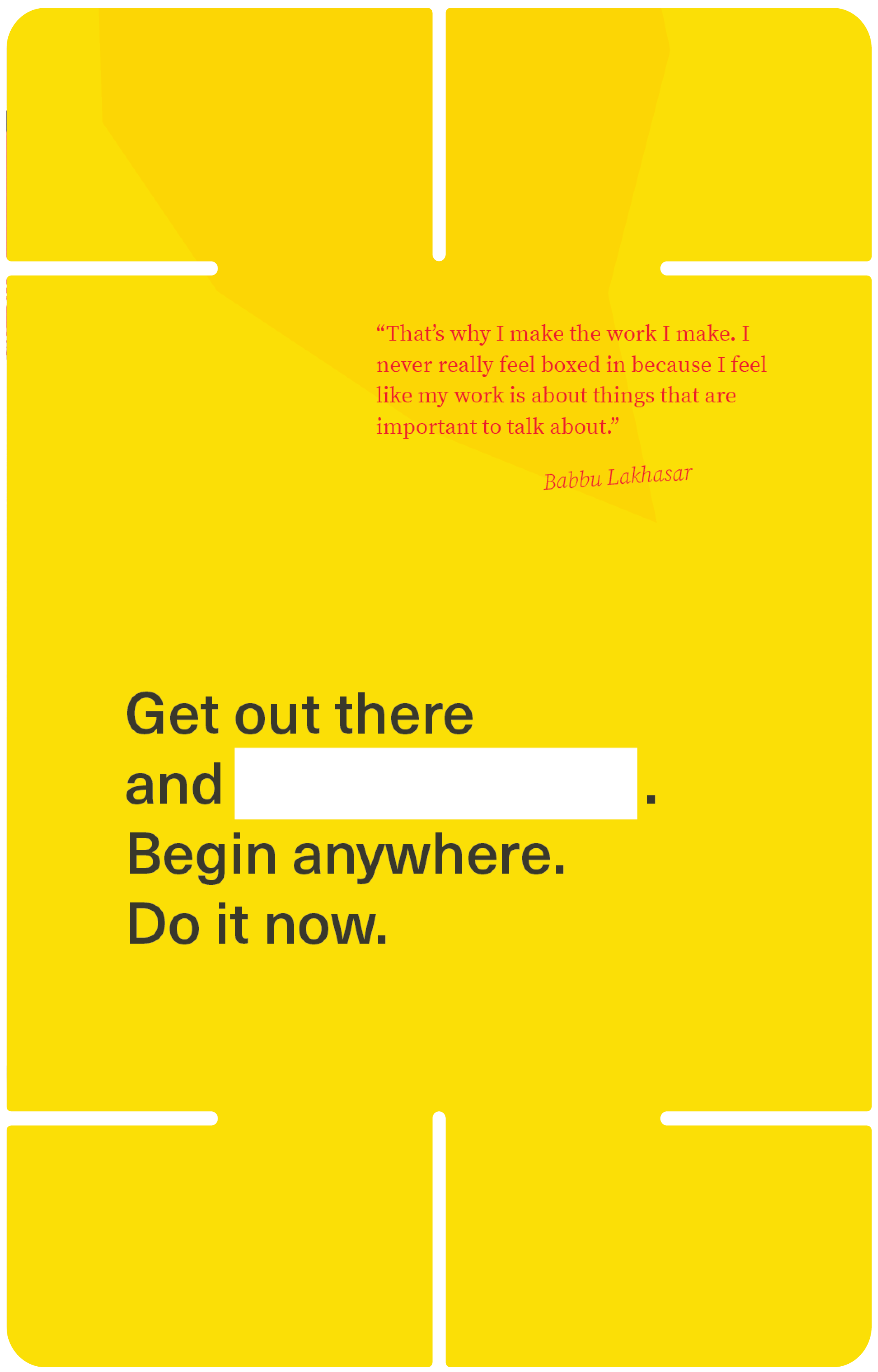
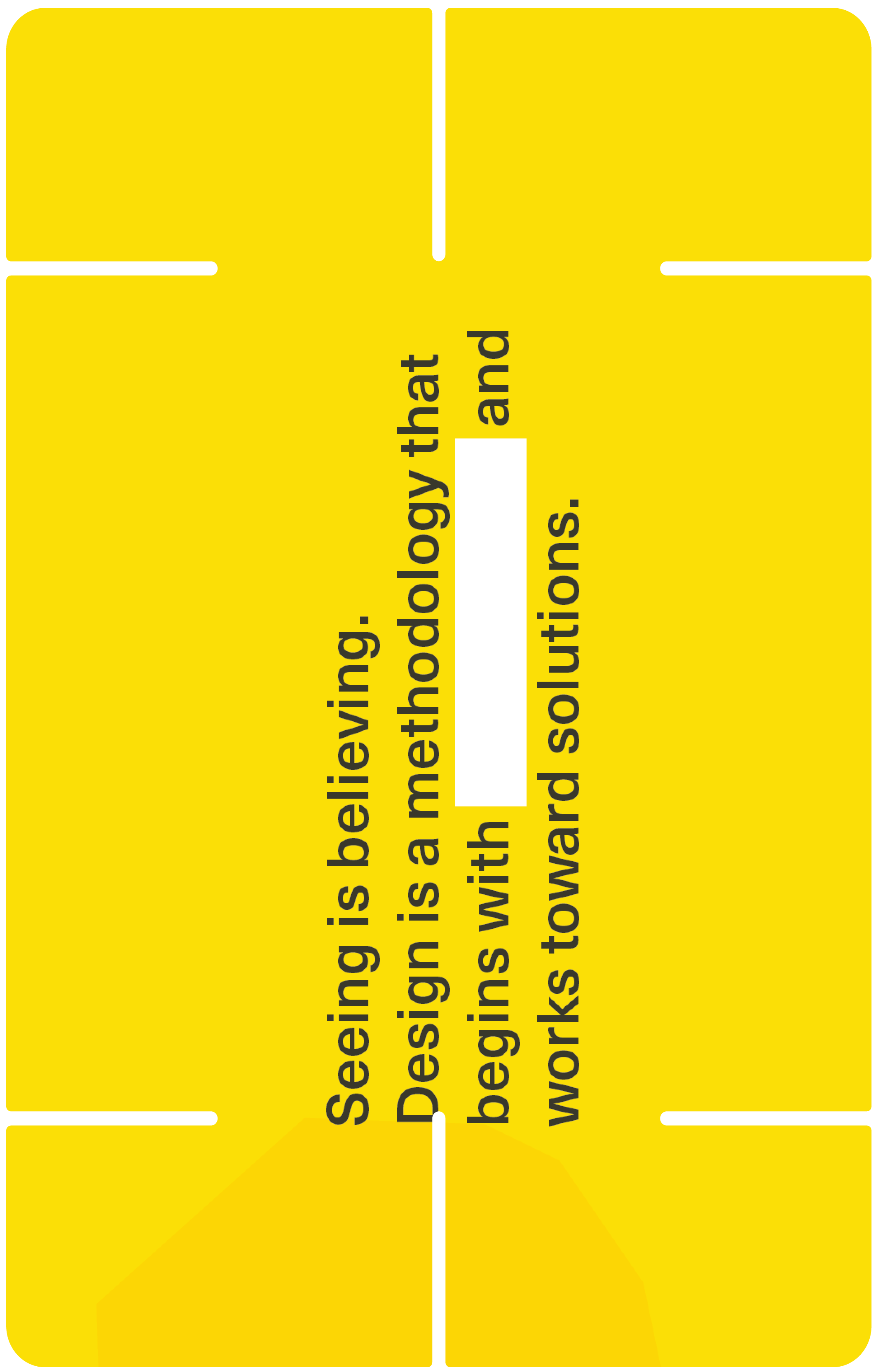
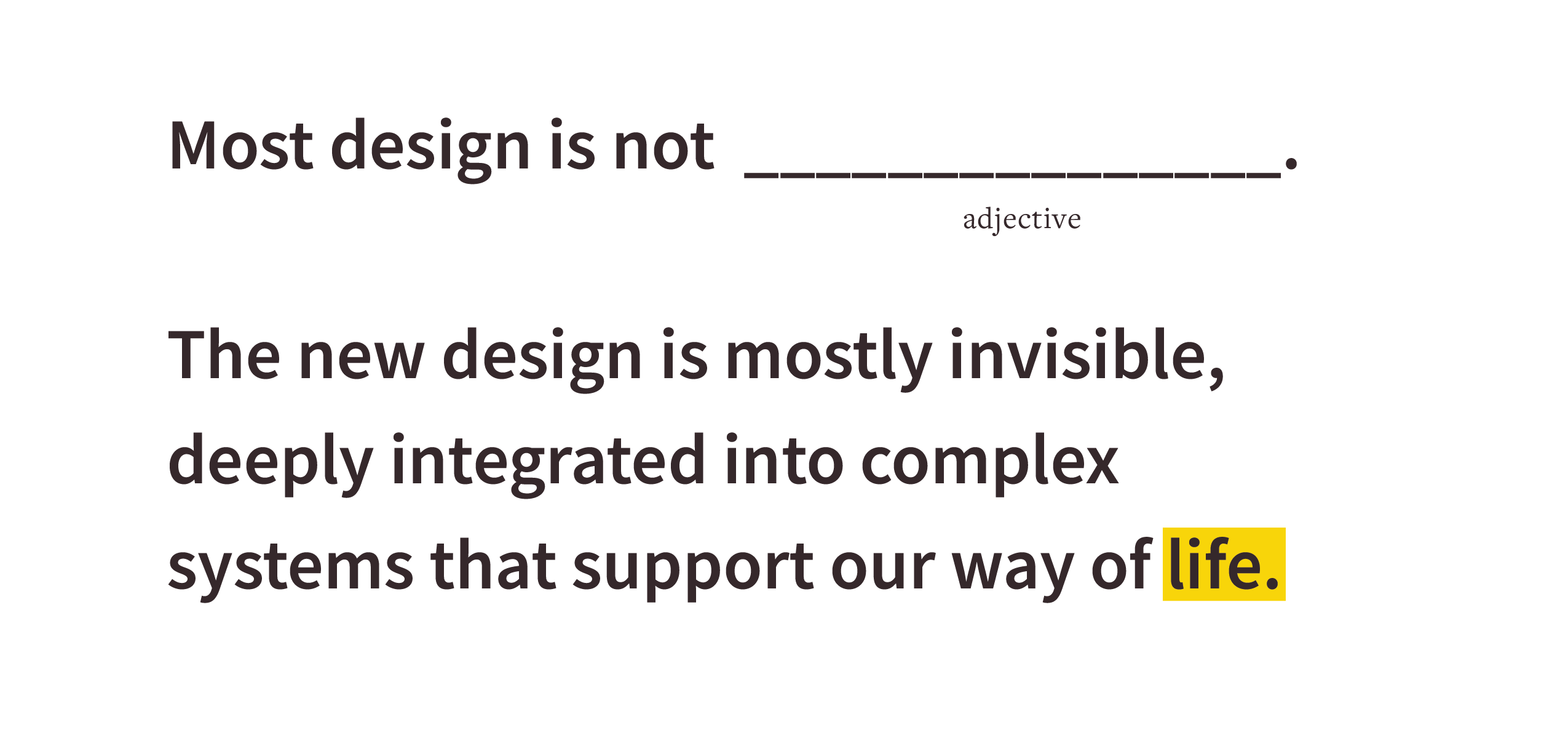
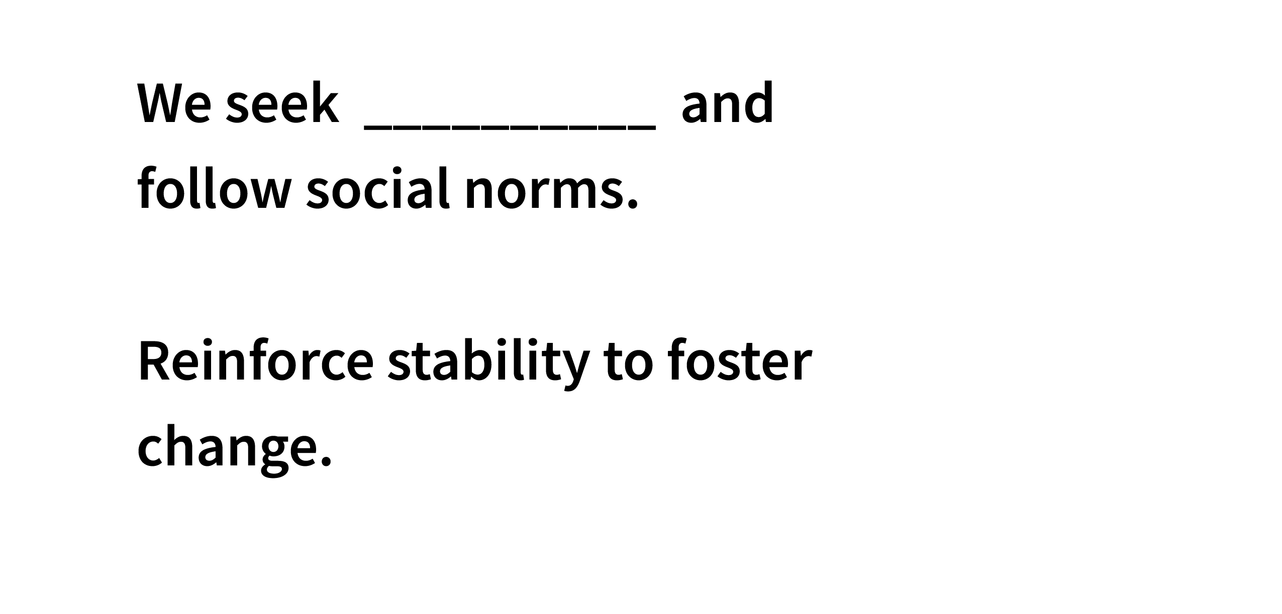
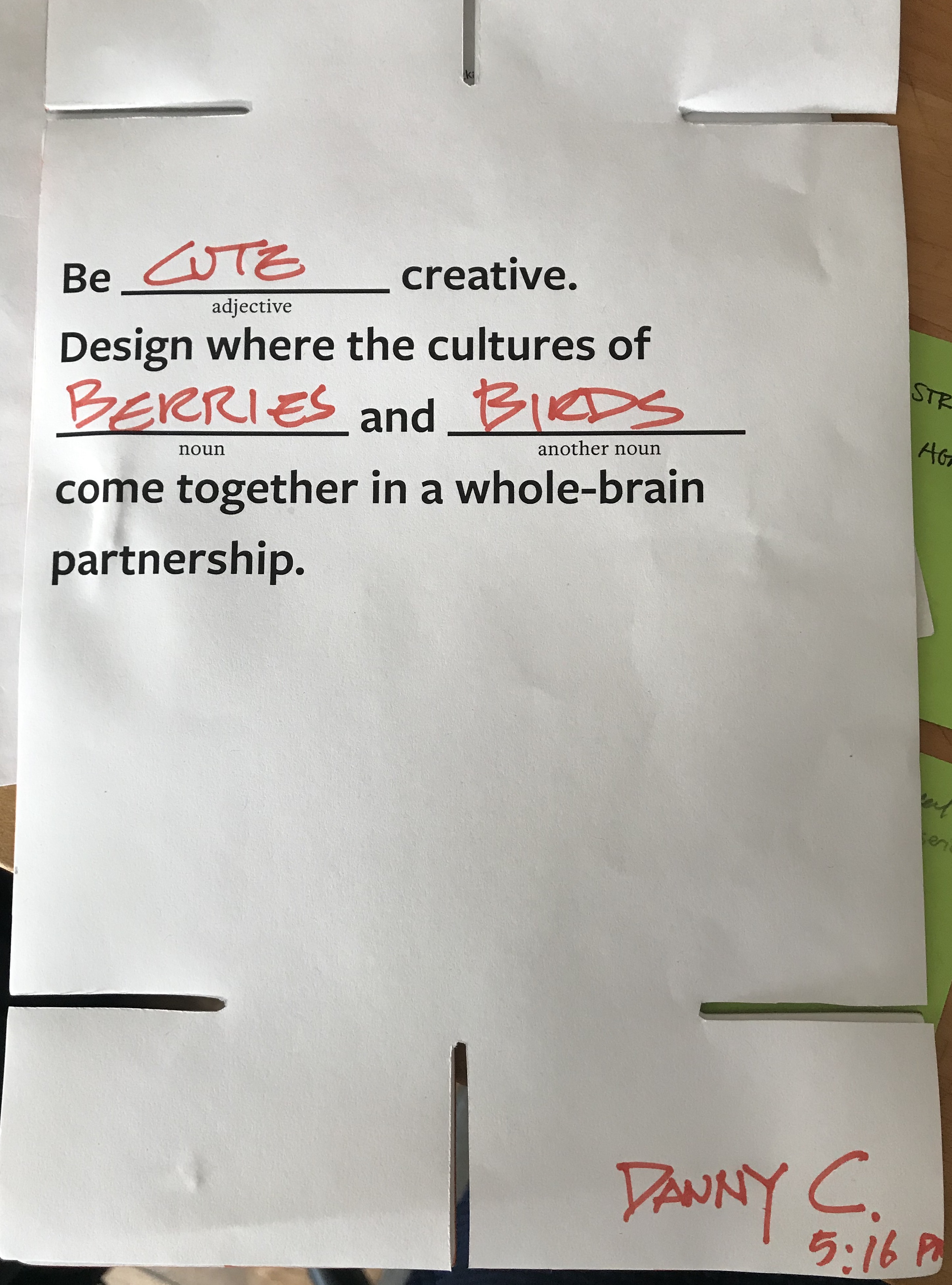
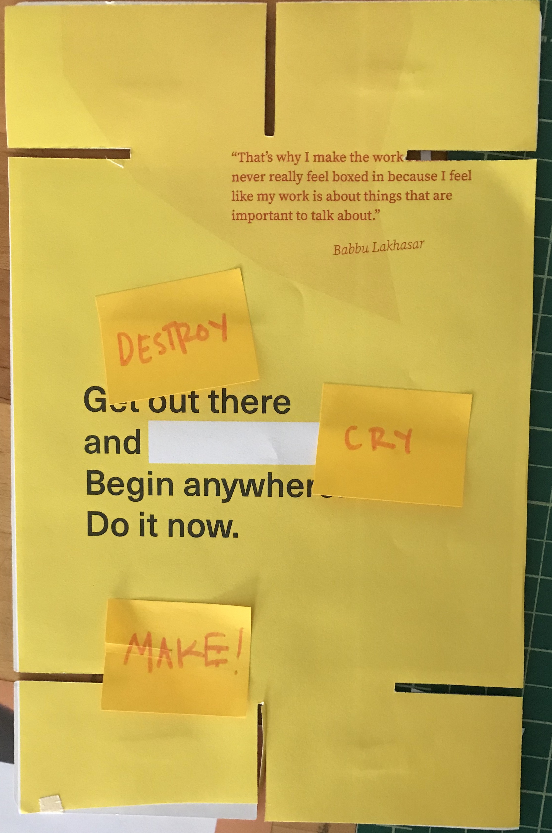
I studied the format of traditional MadLibs. Here, I found a ubiquitous example of simple, analog interaction that encouraged group participation and personal interpretation of given text. So I took this idea and ran with it.
(Below) I selected 16 different mandates from the toolkit, and began to explore the points in Mau’s language where users could interact.
To me, conversation is an integral part of the design process. How can I encourage users to treat the given text as a conversation, rather than a mandate?
I realized I needed to prioritize this interaction in my design choices, and this started with typographic decisions. This was a unique format for me to design: in many ways, these cards are all little puzzle pieces designed to work seamlessly in a solid system. But they also have to stand alone and with substance as an individual artifact. If I want the users of this game to feel empowered to speak up to Bruce Mau, they need typographic cues.
I studied the format of traditional MadLibs. Here, I found a ubiquitous example of simple, analog interaction that encouraged group participation and personal interpretation of given text. So I took this idea and ran with it.
(Below) I selected 16 different mandates from the toolkit, and began to explore the points in Mau’s language where users could interact.

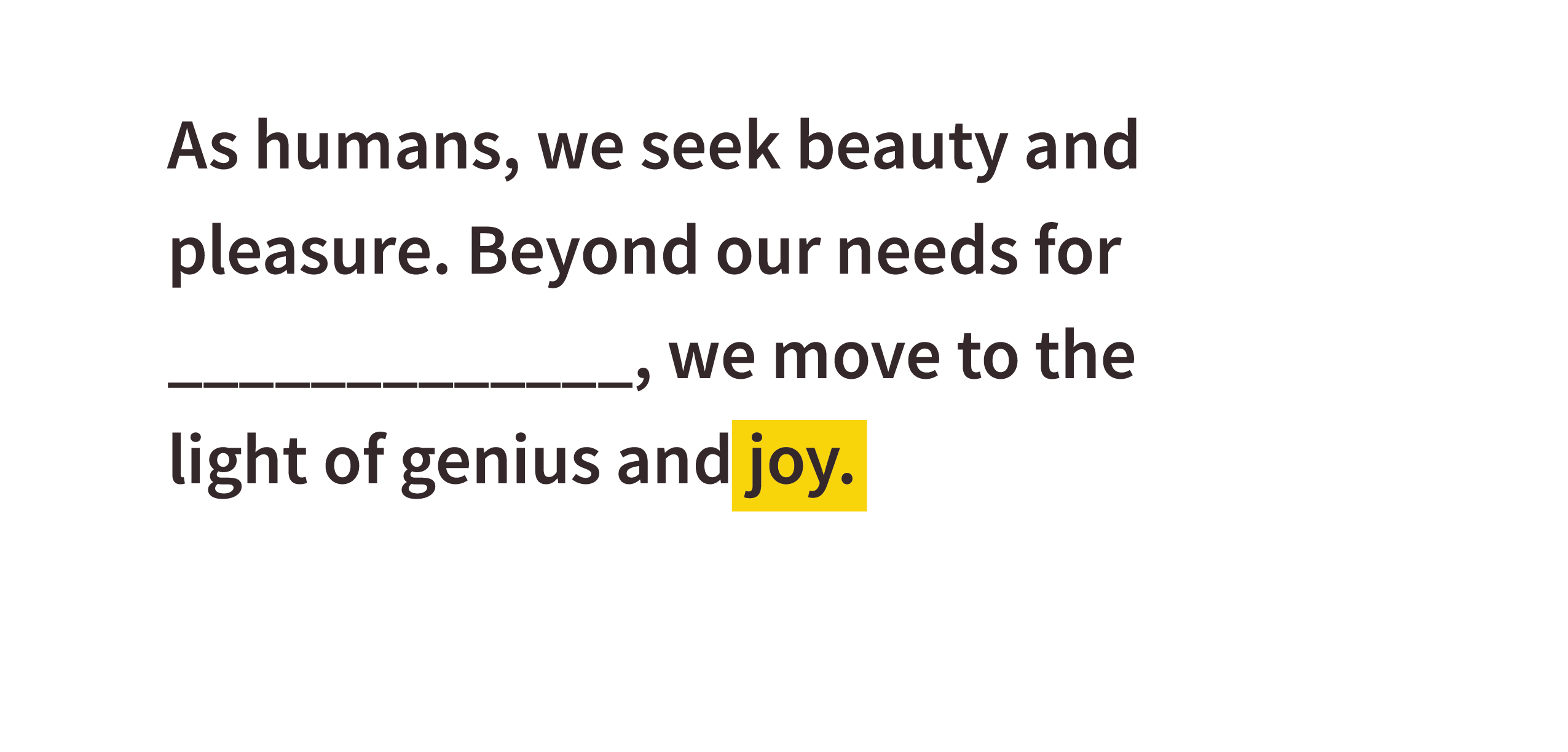
And from here, tested some examples with volunteers. I thought it was interesting that some participants would want to write their name on the cards to tag their work, while others preferred anonymity.
I measured success by assessing:
- The uniqueness of the fill-in responses
- The mood/energy/curiosity level of the participant
I found that the fill-in responses that elicited personal responses were most effective.
I also was looking closely at participants’ intuition for interaction. I am creating a physical, printed product designed to be talked-back-to, which means the typography needs to feel conversational and accommodate participation. I realized it came down to fine-tuning the spacing and color decisions to best facilitate written, active conversation.
Rather than asking the participant to respond, I discovered the most effective interaction was to intentionally leave room for their own words.
The final “headline” card sides were curated to ask personal, blue-sky questions about design, slightly subverting Bruce Mau’s words with whatever the participant decides.
02–
Highlighting female voices
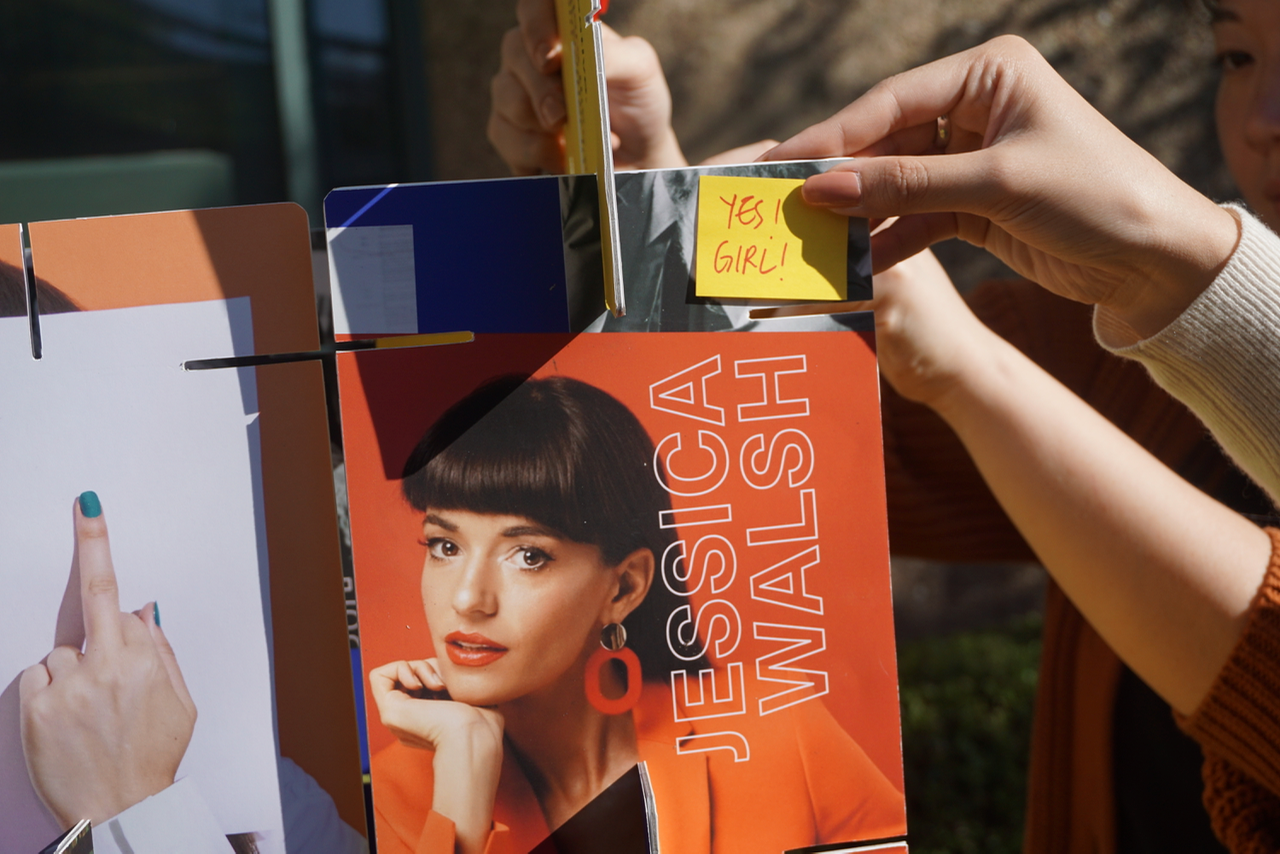
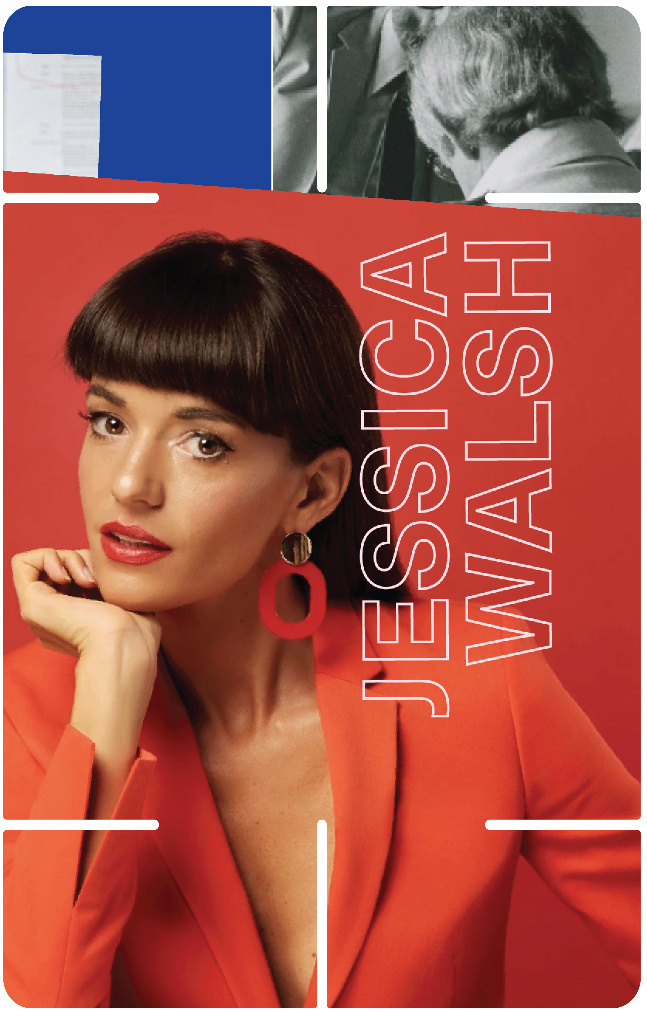
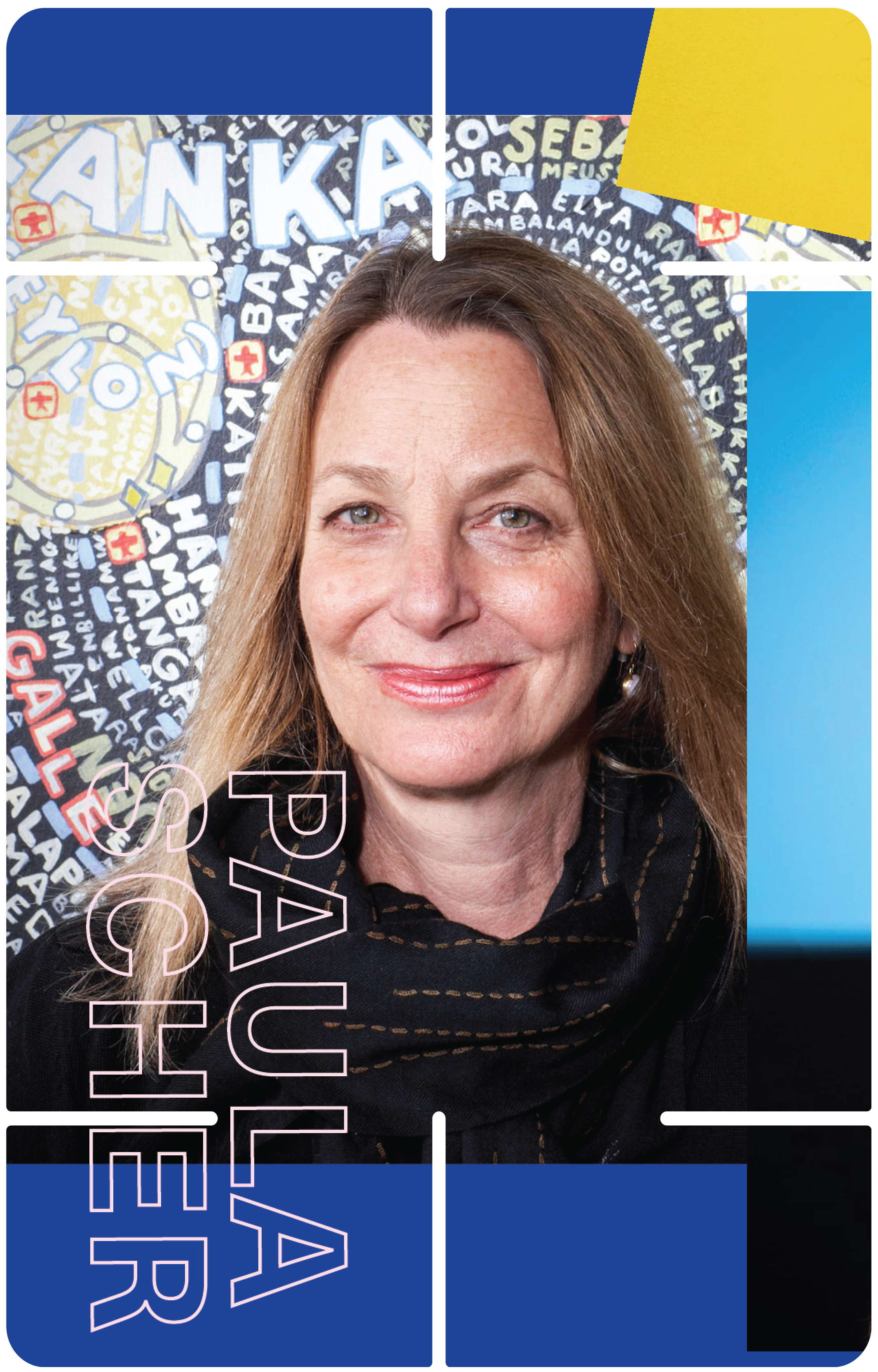
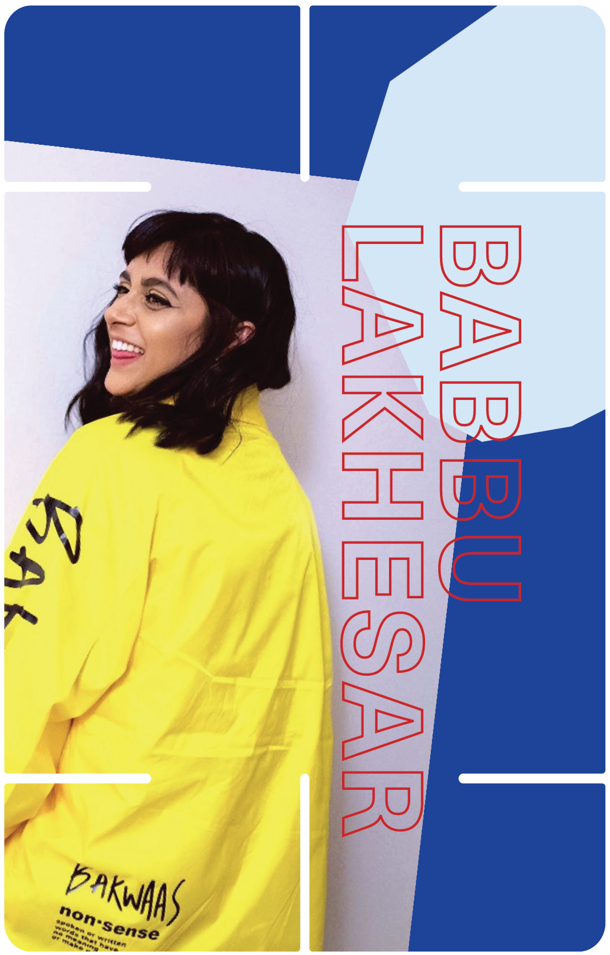
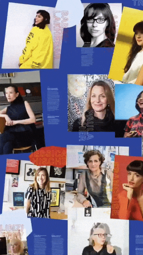
Because I made this project into an exploration in voice and the privilege of being heard, I saw this as place to amplify the ideas of all of the female designers who’ve led me to even pursue design in the first place.
I rounded up every book, article, post, and portfolio site I had saved, and found an overwhelming theme of powerful female designers speaking up for their seat at the table.
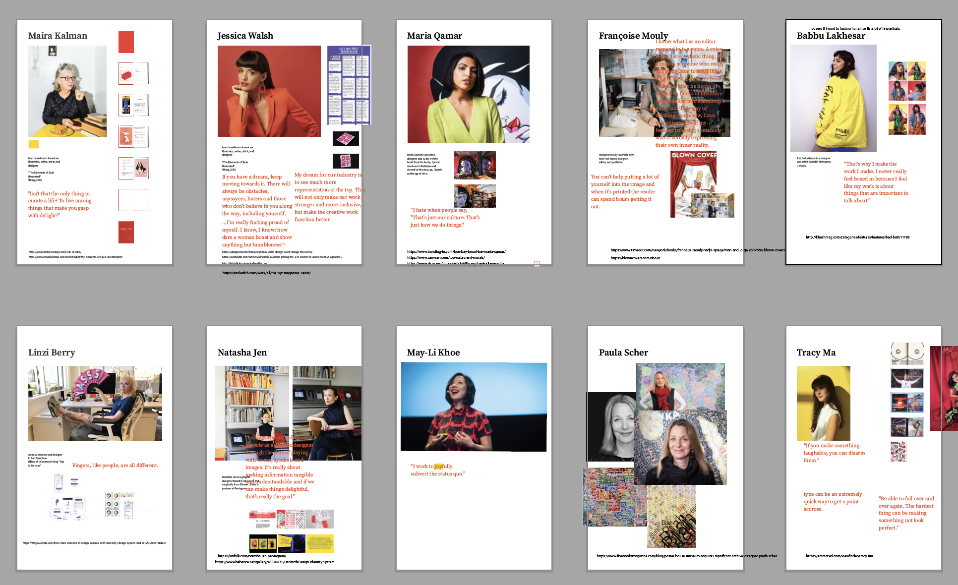
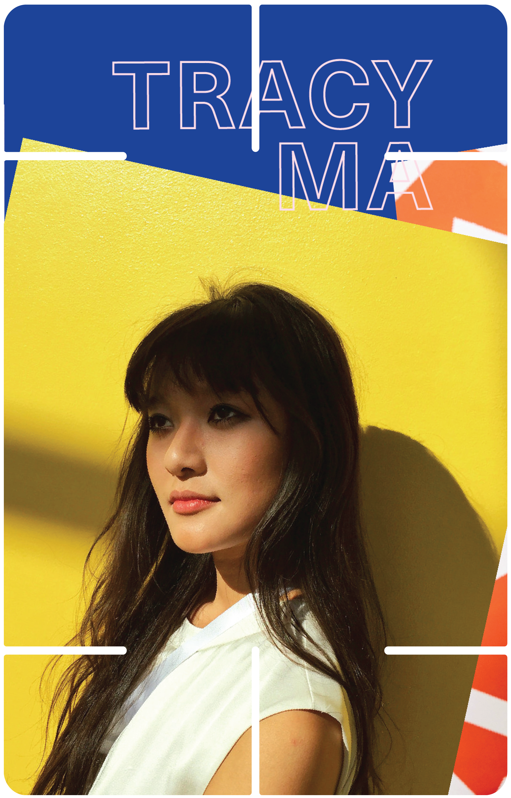
How could I not include this content? I collected and organized the potraits, work and words of a range of designers. I made sure to include a range of disciplines: studio directors to print editors to muralists to computational designers all offer unique words of wisdom that speak back to Mau.
Process 03–
Facilitating Intermixing and designing a campaign
Facilitating Intermixing and designing a campaign
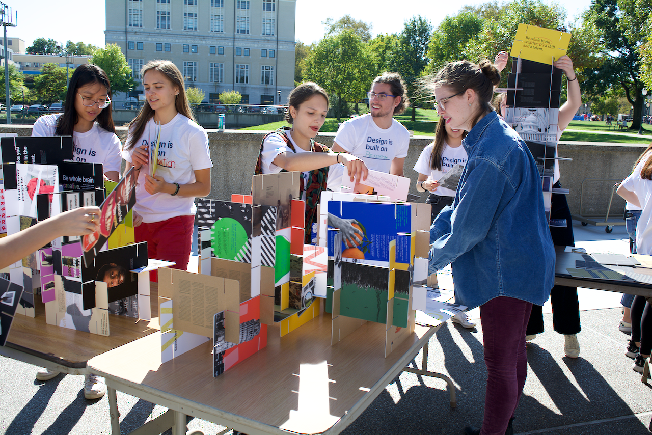
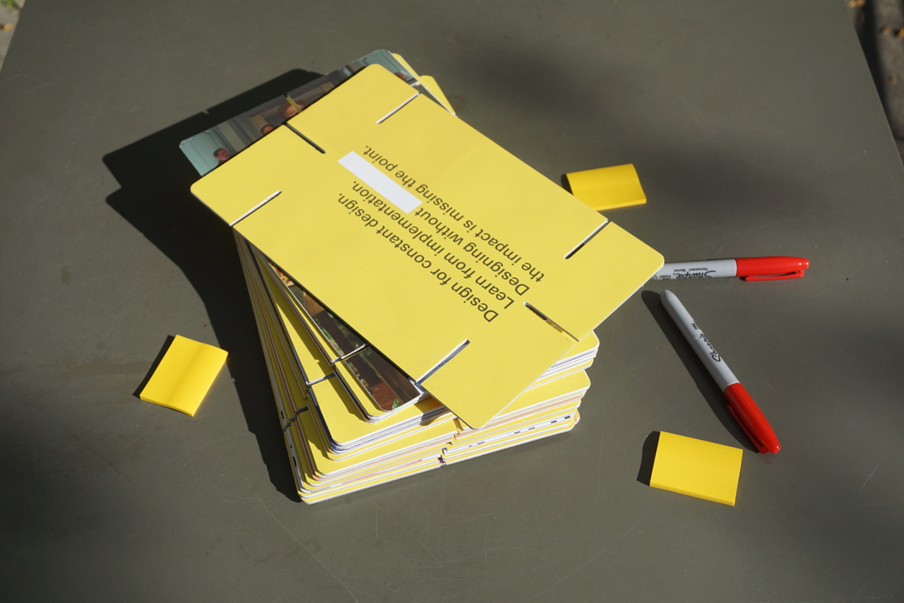
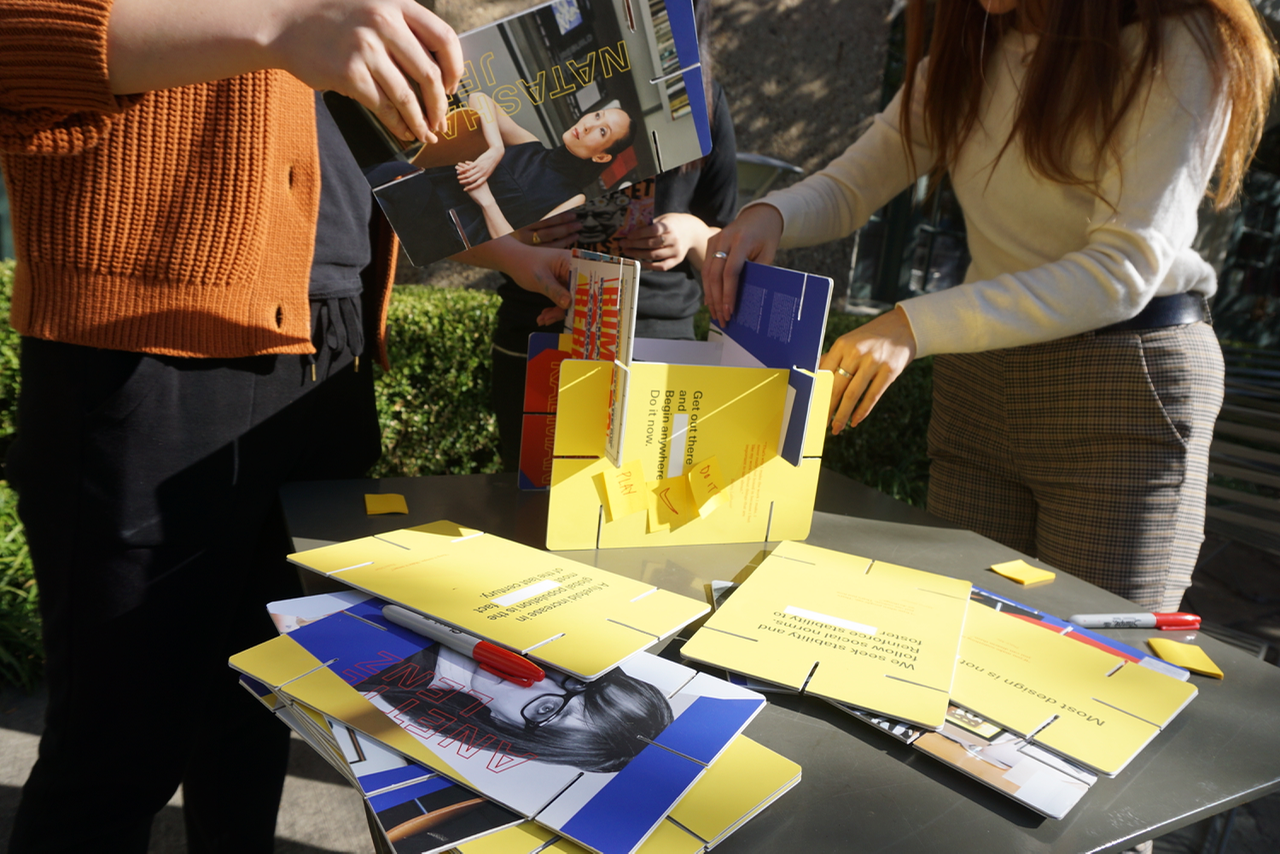
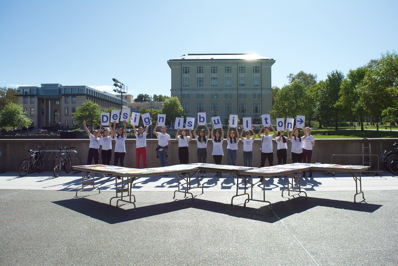
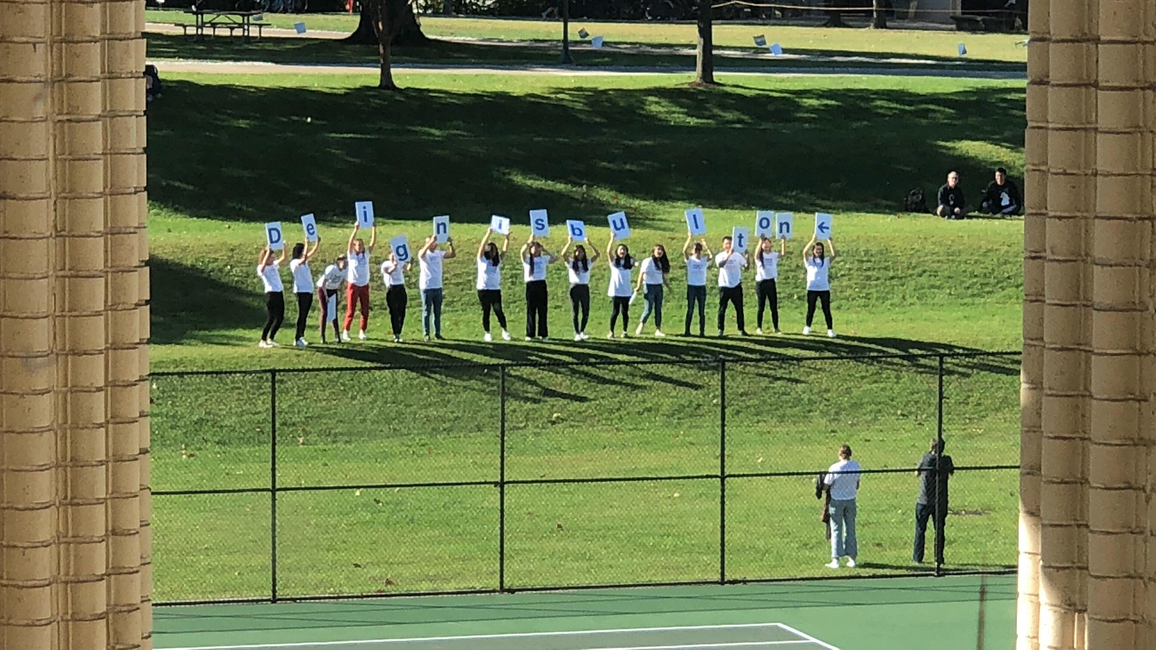
As part of our final presentation, I was on a team of students who organized the “flash mob” building event to showcase the final products. We created a show theme “Design is built on ___” to accomodate the varying themes we designed around. Not only was this an opportunity for me to force my classmates to become human signage, but I was able to watch my cards used in a more natural and unpredictable setting.
Although participants hadn’t used this exact object before, many were able to easily infer the process of interaction.
It’s sharpies, sticky notes, and slotted cues for building. It’s fun!
Although participants hadn’t used this exact object before, many were able to easily infer the process of interaction.
It’s sharpies, sticky notes, and slotted cues for building. It’s fun!
Concluding thoughts –
This project was an excellent exercise in creating a system that can accommodate a large amount of text. I felt strongly from the beginning that I wanted the participants to really be participants in this activity, rather than just simply reading the cards or seeing them as stackable objects and nothing else. This was a unique artifact to design for, and I enjoyed being able to create visual system that was aware of it’s surroundings and the physical space it was going to occupy.
Also, any project where I get to feature my ultimate personal role models, and literally play with their words in type is a rewarding and empowering one.
Also, any project where I get to feature my ultimate personal role models, and literally play with their words in type is a rewarding and empowering one.