iOS Components for NYT
NYT Case StudyLead Product Designer
This content is under NDA.
Reach out to me to learn more about this work.
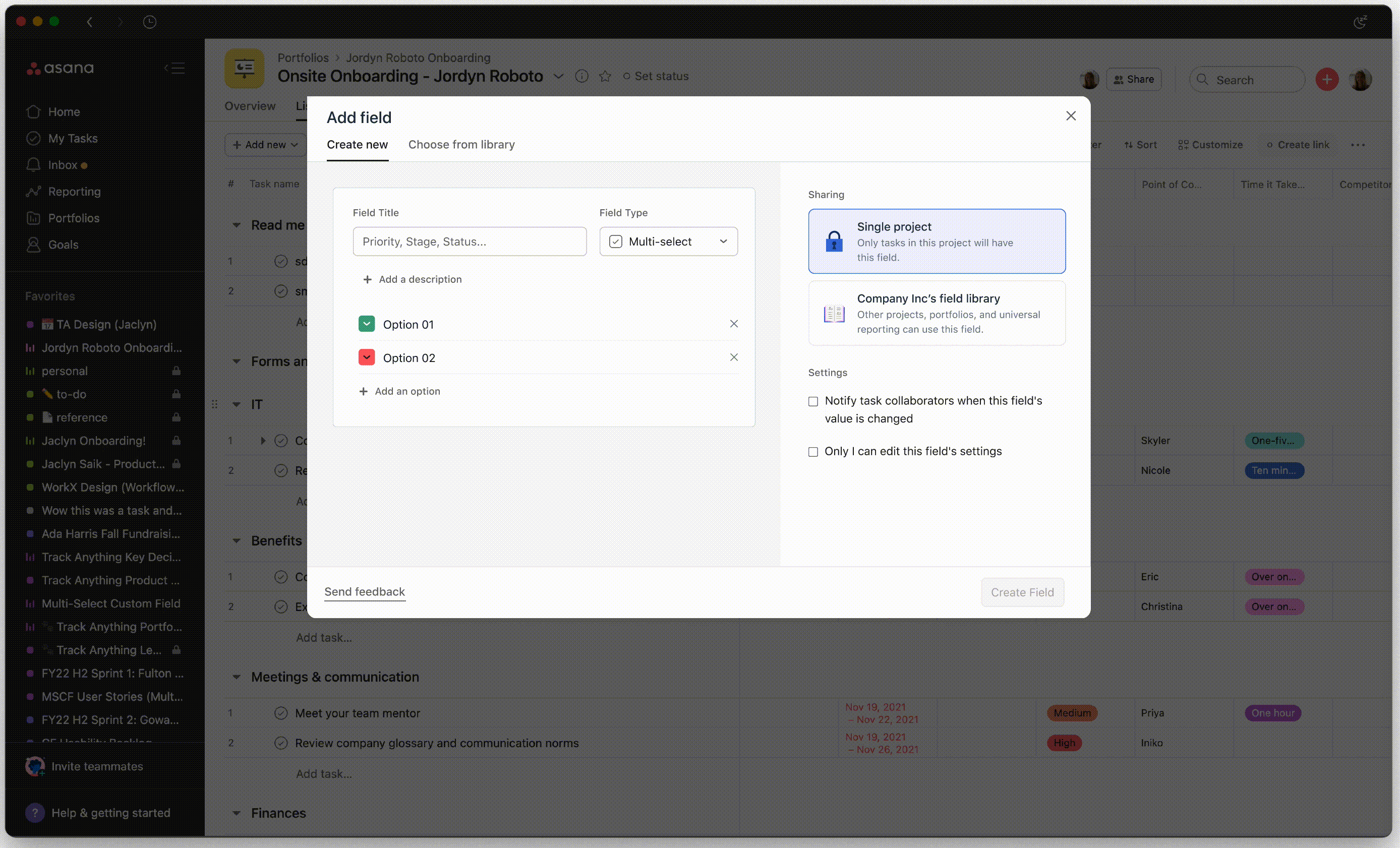
New custom fields
Asana Case Study
Lead Product Designer
How might we add a function to a complicated system without compromising clarity?
Custom fields are a bread-and-butter feature in Asana - simply put, they’re columns that let you tag tasks within a task management product. But as Asana’s feature set grew, no recent updates were made to custom field formatting, and the platform was rife with hacked-together workarounds, broken workflows and confused teams.
I led the design of the end-to-end process for a collection of new custom field types. I initiated early discovery and defined the problem space, generated buy-in, carried out the visual design, and paired with engineering to build and own each field.
We’ve since launched this collection of fields to 3 million users.
Role:
Lead and independent designer
Lead and independent designer
Skills:
End-to-end product design, UX research, Interaction design, Visual Design
End-to-end product design, UX research, Interaction design, Visual Design
Partners:
Cross-functional team including 1 product manager, 1 researcher, 5 engineers, consult with data science.
Cross-functional team including 1 product manager, 1 researcher, 5 engineers, consult with data science.
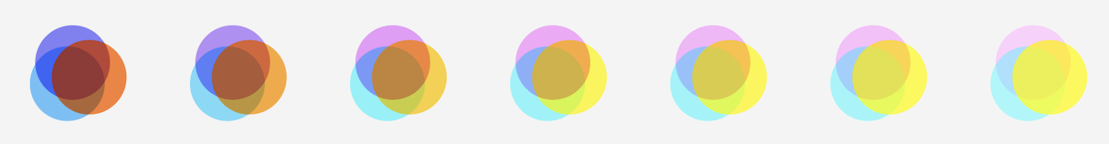
These are the three field types I focus on in this case study.
The problem space —
Asana is a task management platform. I like to describe it as a cross between email, Excel, and analog sticky notes, but with real-time collaboration and animated unicorn celebrations. A lot of our users are cross- functional teams that depend on this tool as a source of truth, so the design problems are often leveled, complicated and highly interconnected.
![]()
Custom fields, specifically, are intended for adding certain data to a task. When I joined the team, Asana only supported three types: a plaintext field, a number field, and a single-selection (dropdown). Users needed more.
Custom fields, specifically, are intended for adding certain data to a task. When I joined the team, Asana only supported three types: a plaintext field, a number field, and a single-selection (dropdown). Users needed more.
User problem:
- Custom fields are a touchpoint for teams to align, but workarounds compromise this clarity and make the product feel brittle. Asana didn’t fully map to a user’s mental model of a workflow.
System problem:
System problem:
- Asana is a tool to establish “who’s doing what by when.” How do we introduce new fields without cannabalizing these core principles?
Vision —
Research —
What do teams want from a custom field? What do they need?
Through interviews and moderated usability testing, we discovered that most teams are actually happy with how Asana handles work people should act on: setting due dates, adding assignees and automating how they complete tasks. But custom fields aren’t for taking actions.
It was non-actionable pieces of data that were clouding the workflow and confusing teammates.
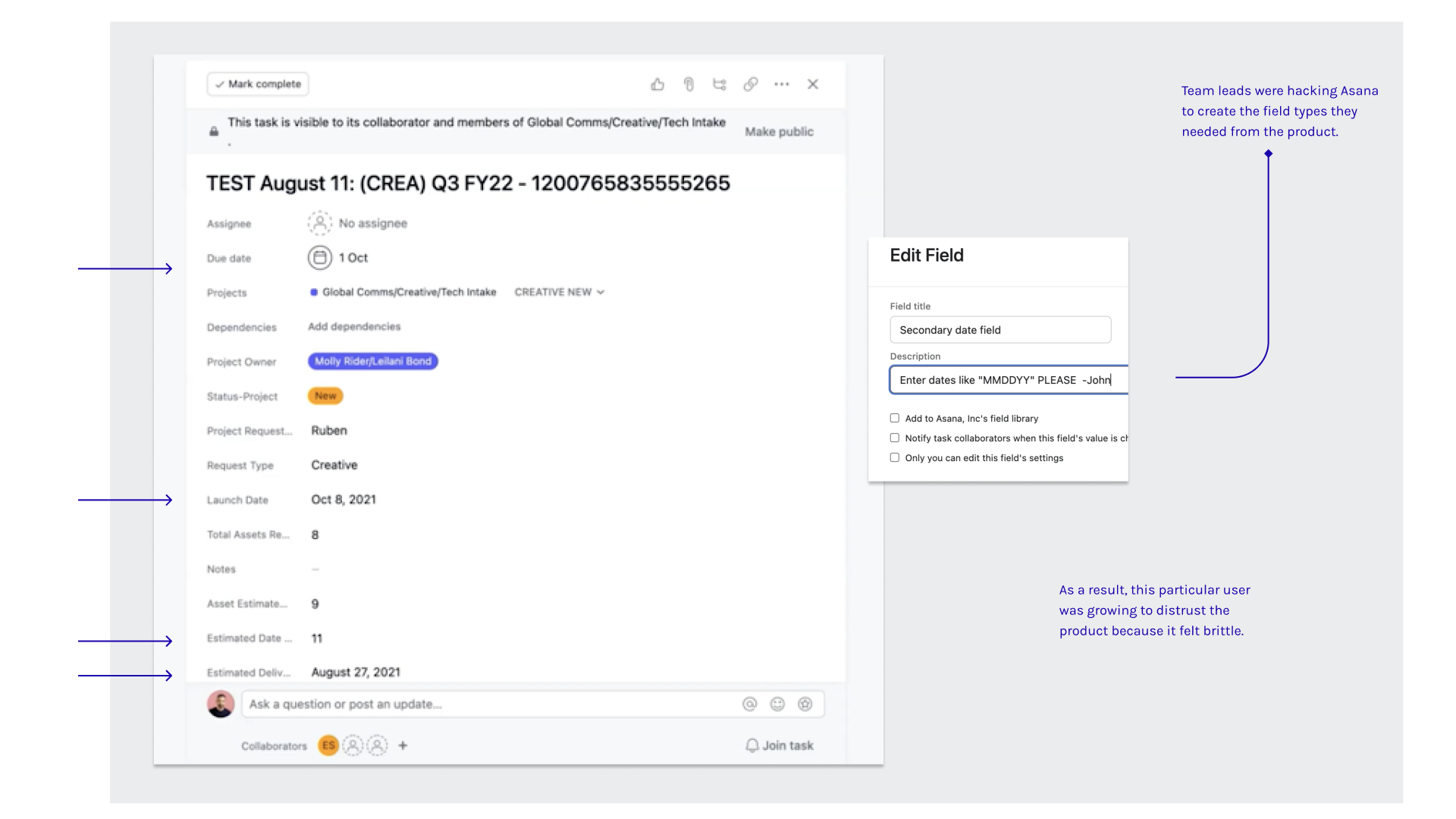
Real examples of “hacked” tasks in Asana
Product “hacking” was a key indicator of where custom fields were falling short:
“I used a number field to record projected release dates, but Asana added them all together automatically and it says 54 million at the bottom of my project. Did I break something?”
Product “hacking” was a key indicator of where custom fields were falling short:
- Labeling number fields with the discreet instructions for how to format them.
- Created a complicated system of rules that auto-configured due dates to the time of completion.
- Using other field types, like single-select, to designate people, then privately messaging them outside of Asana
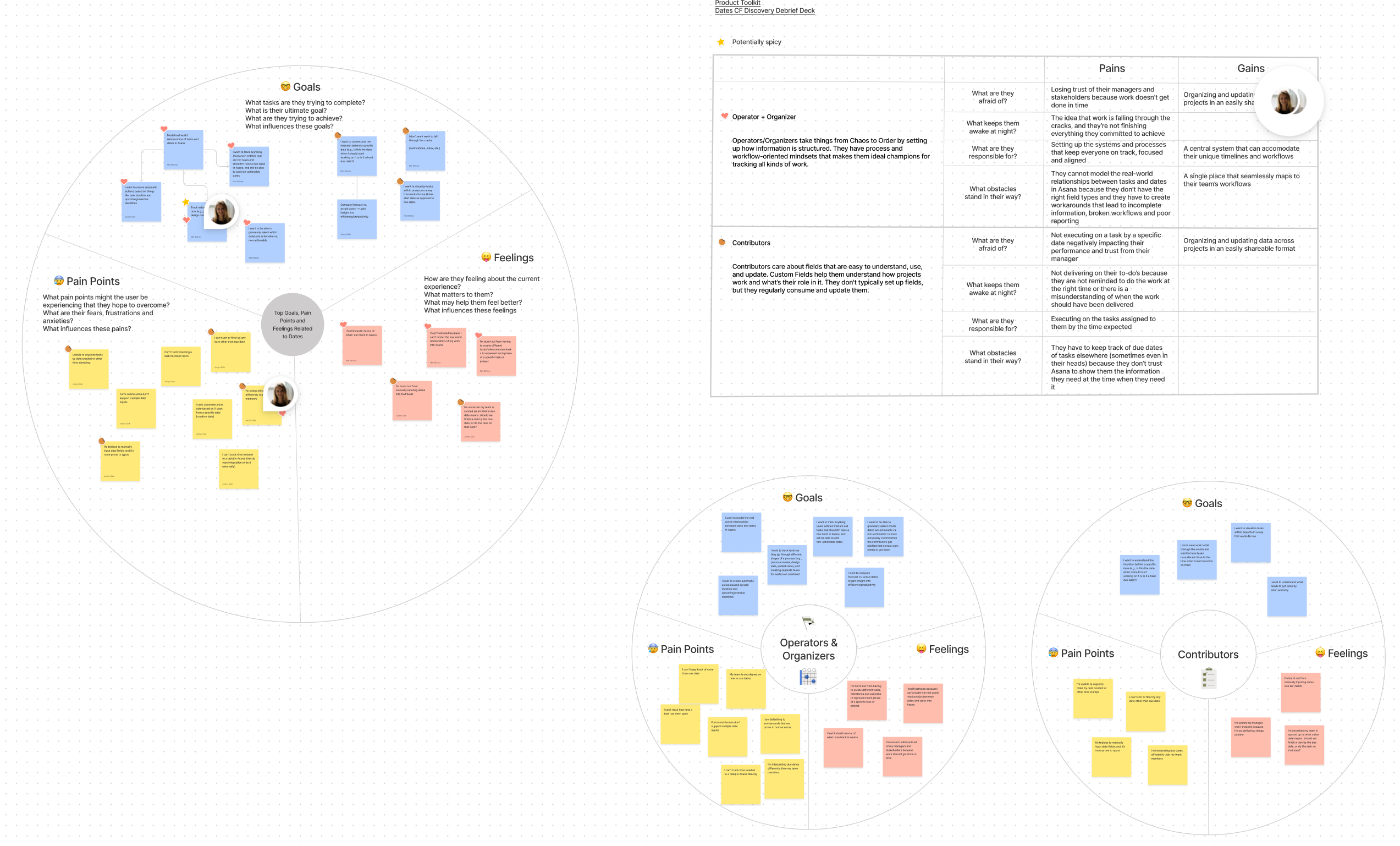
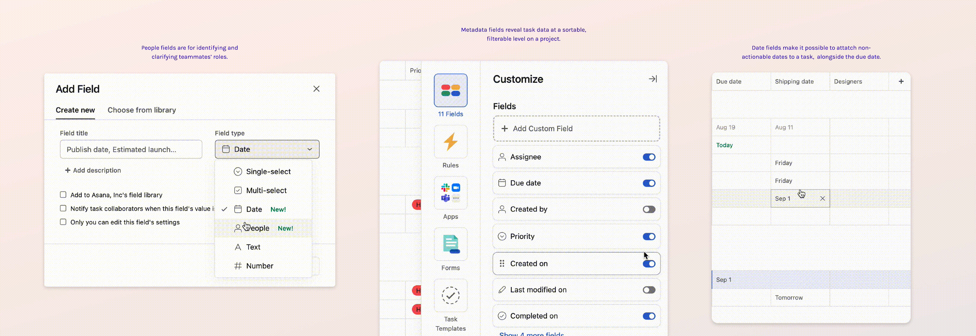
For Date and Person fields specifically, I led a mapping exercise based on insights from user testing
What we built —
Armed with usability research and a round of testing, we developed our solution with a focus on creating fields for reference. Leading the design, I placed a special focus on contributing the concept of non-action to the design system.
We prioritizied:
We prioritizied:
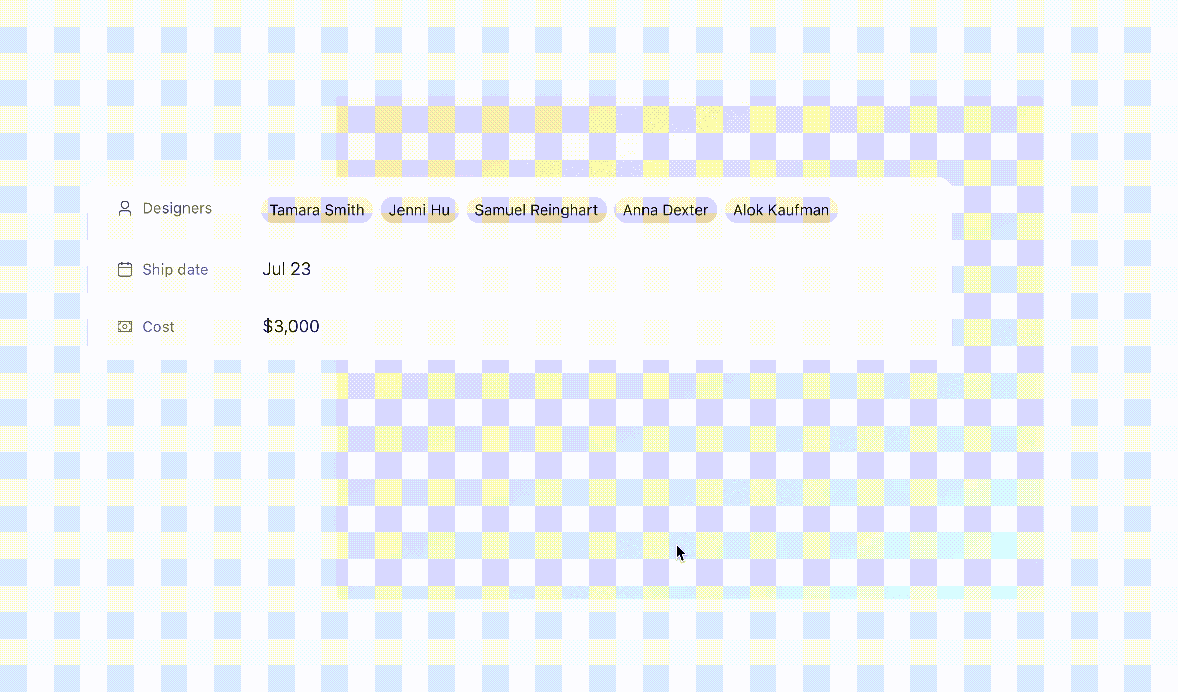
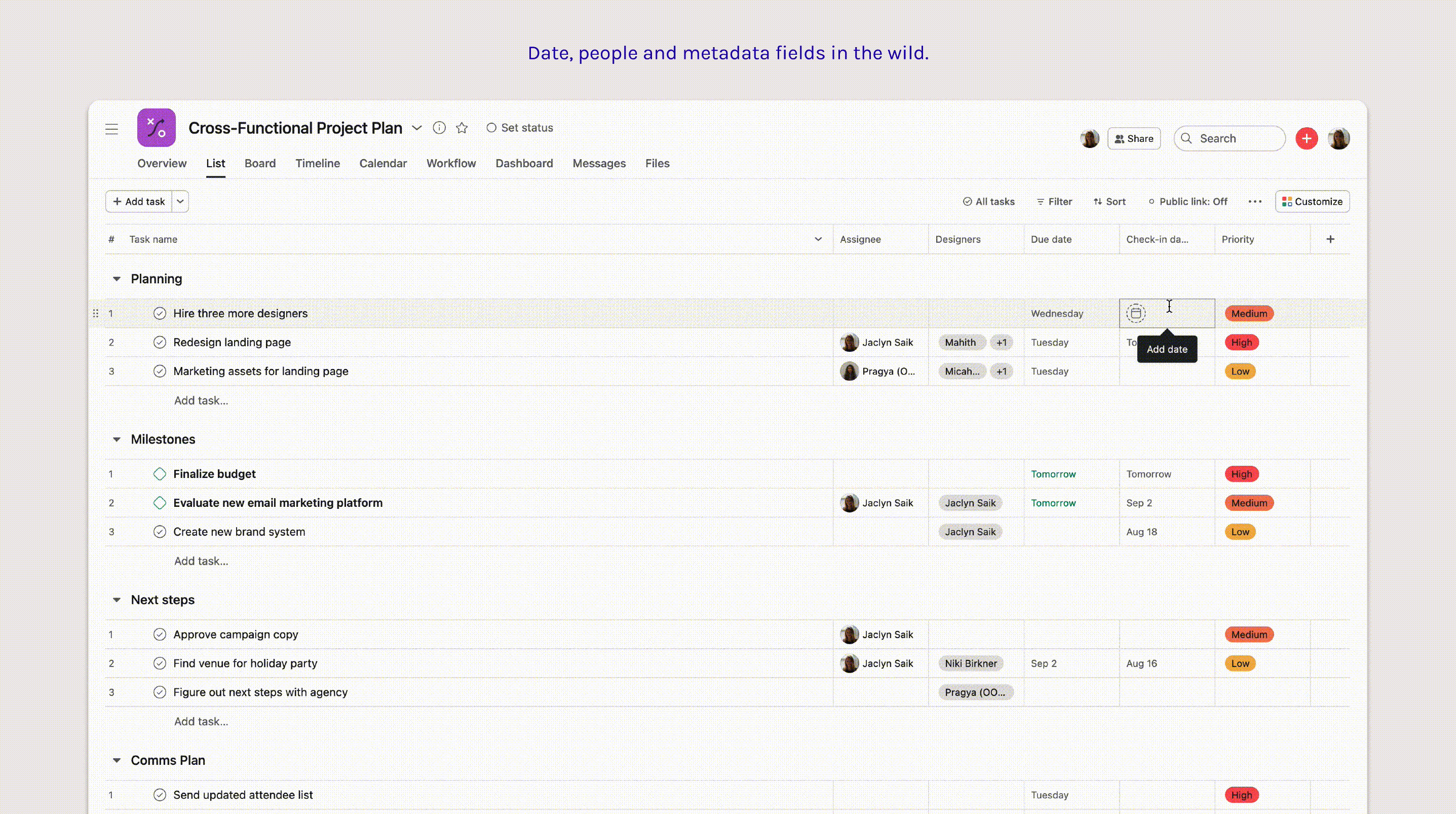
(01) Date
(02) People
(03) Metadata
Additionally, I pushed to allocate a few sprints for usability improvements in the (04) field creation modal and the (05) task pane view.
Implementation —
Because these field types represented a new way to capture information in Asana, I had the unique opportunity to take componentization into my own hands. A lot of our existing design system patterns were built around action and reward, but now people needed a way to add a date or connect a person to their work without explicitly applying responsibility.
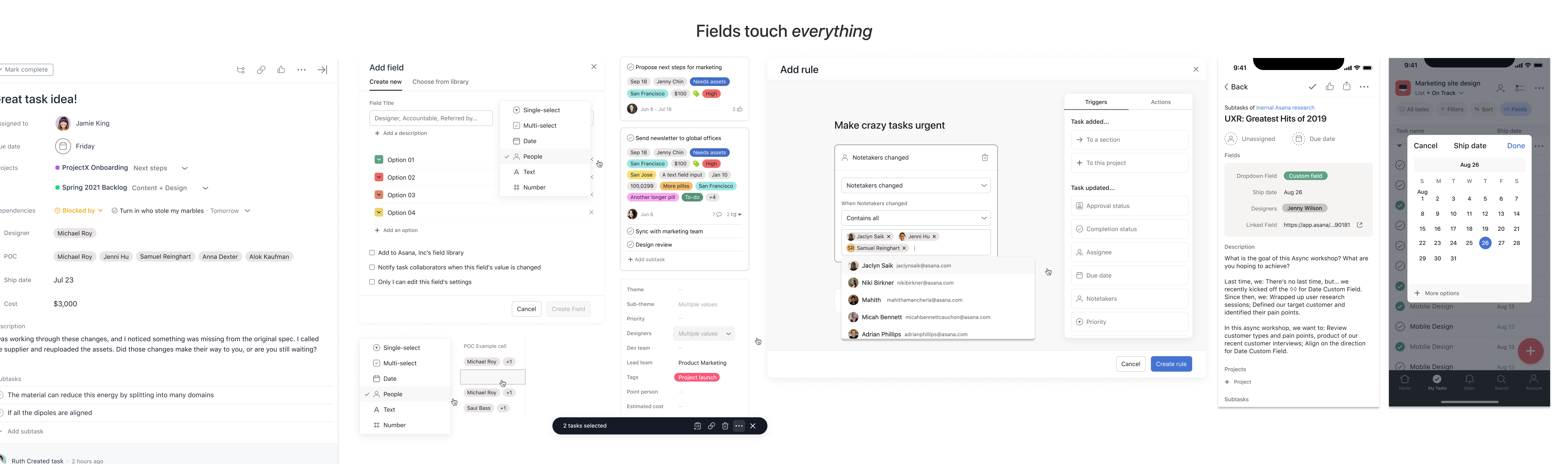
These are some of the components of the final solution. There was a lot of surface area to cover.
I wanted to ensure the components we supported would be replicable, resilient and integrated consistently, so I initiated a design sprint with our internal design systems team.
During the sprint, we established that designing for nuance, accessibility, and discovery are just as critical to designing for achievement or completion, even in task management software.
There is an underbelly of critical, non-urgent information that fleshes out how humans collaborate with each other, and the components we landed on defined this new tone in Asana for future features.
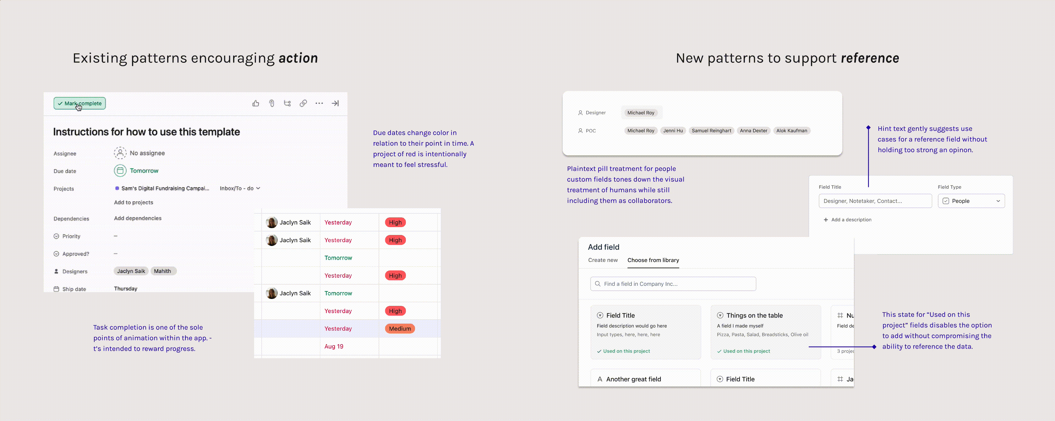
These are some examples of how we created a tone of reference and record in a highly “actionable” product environment.
01. Date custom fields
Referencing dates without urgency
“I want to record the dates that a shipment is expected to arrive, but the overall task to process the shipment isn’t until a week later.”
A “due date” seems like an easily-understood characteristic on the surface, but we found teams weren’t aligned on how to capture other dates, such as shipments, publish dates, receival, or even birthdays.
Working with design systems, I developed a treatment aimed at striking a balance between interactive and non-actionable.
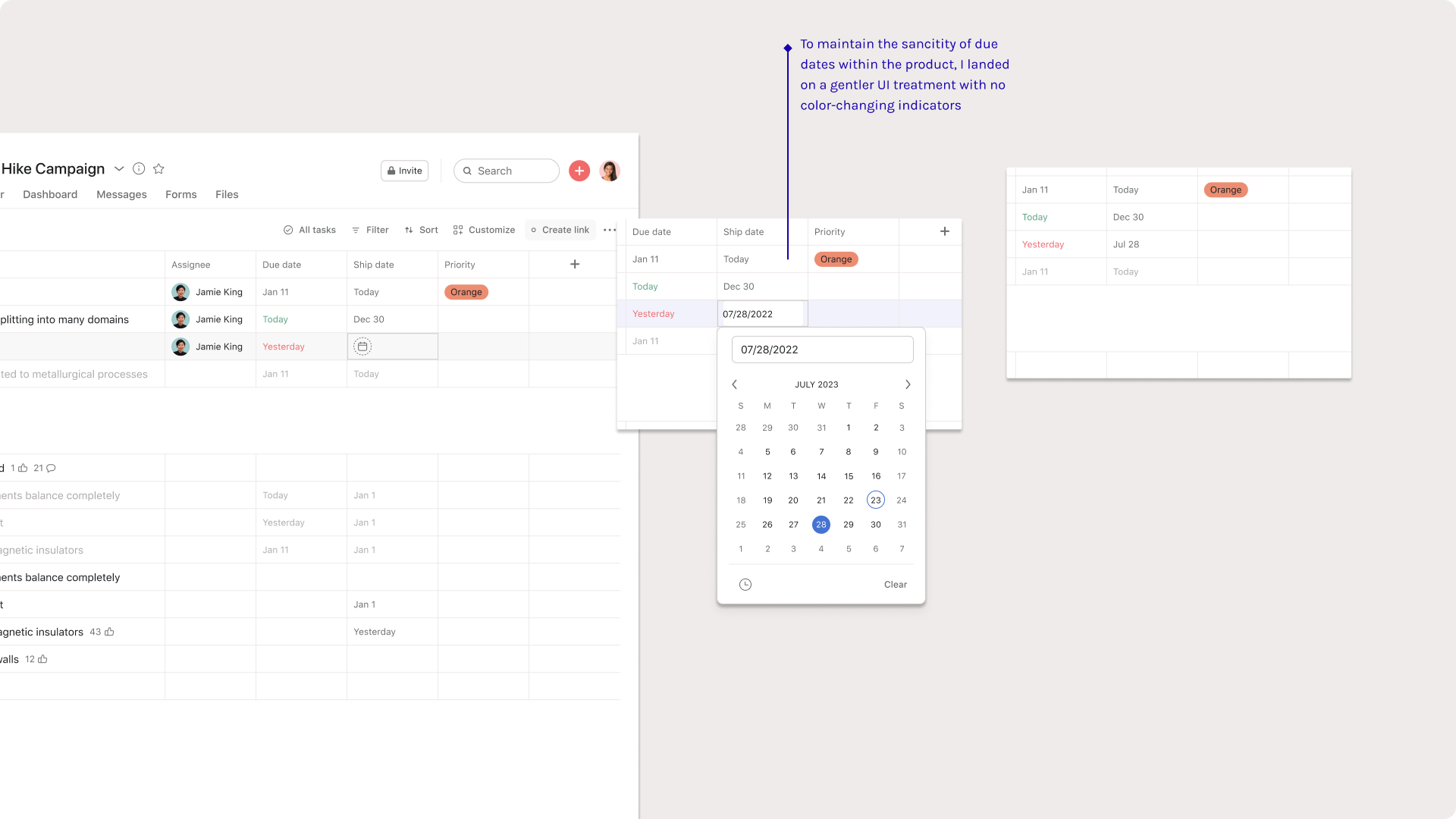 Date custom fields are intentionally static
02. People custom fields
Including humans without assigning them
“This campaign request is Jamie’s responsibility, but I also want to identify which designer is helping out.”
We found that the core principle of “one task assigned to one person at one time” still held true in the wild. But in testing, we also learned that oversimplifying this connection of humans to work was leaving key contributors out of the loop. Users wanted to record their teammates’ relationship to the work alongside the main assignee.
People custom fields in particular posed an interesting design challenge: How might we represent humans in a new way in product?
We tested three options in moderated sessions:
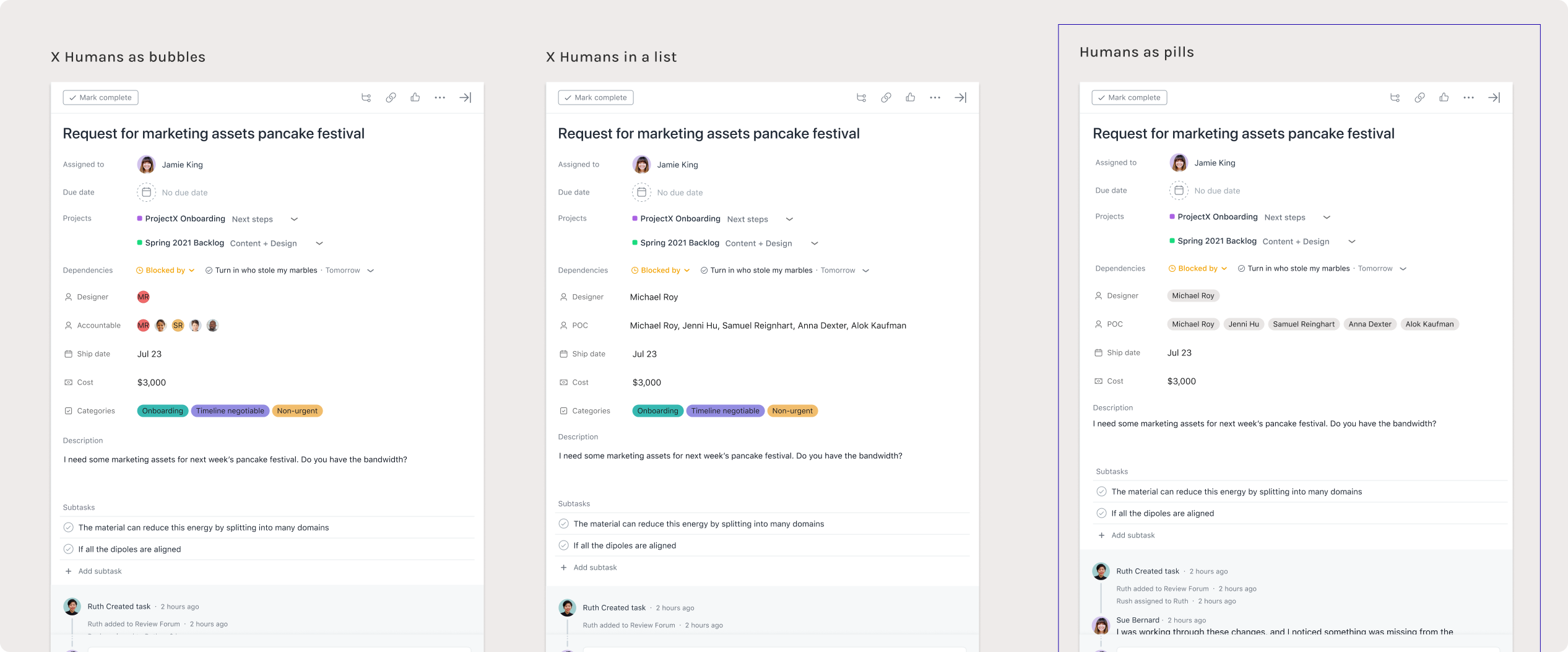
Three tested options for the UI treatment for people. We also tested other surface areas where this feature would appear.
Plaintext pills were the most versatile component to build, and the least competative with the assignee field. I developed a new component by combining these pills with a selection “tokenizer” we originally use in our design system for bulk actions.
In this way, the solution progressively discloses more information about who has been added to the task without overwhelming the task pane interface.
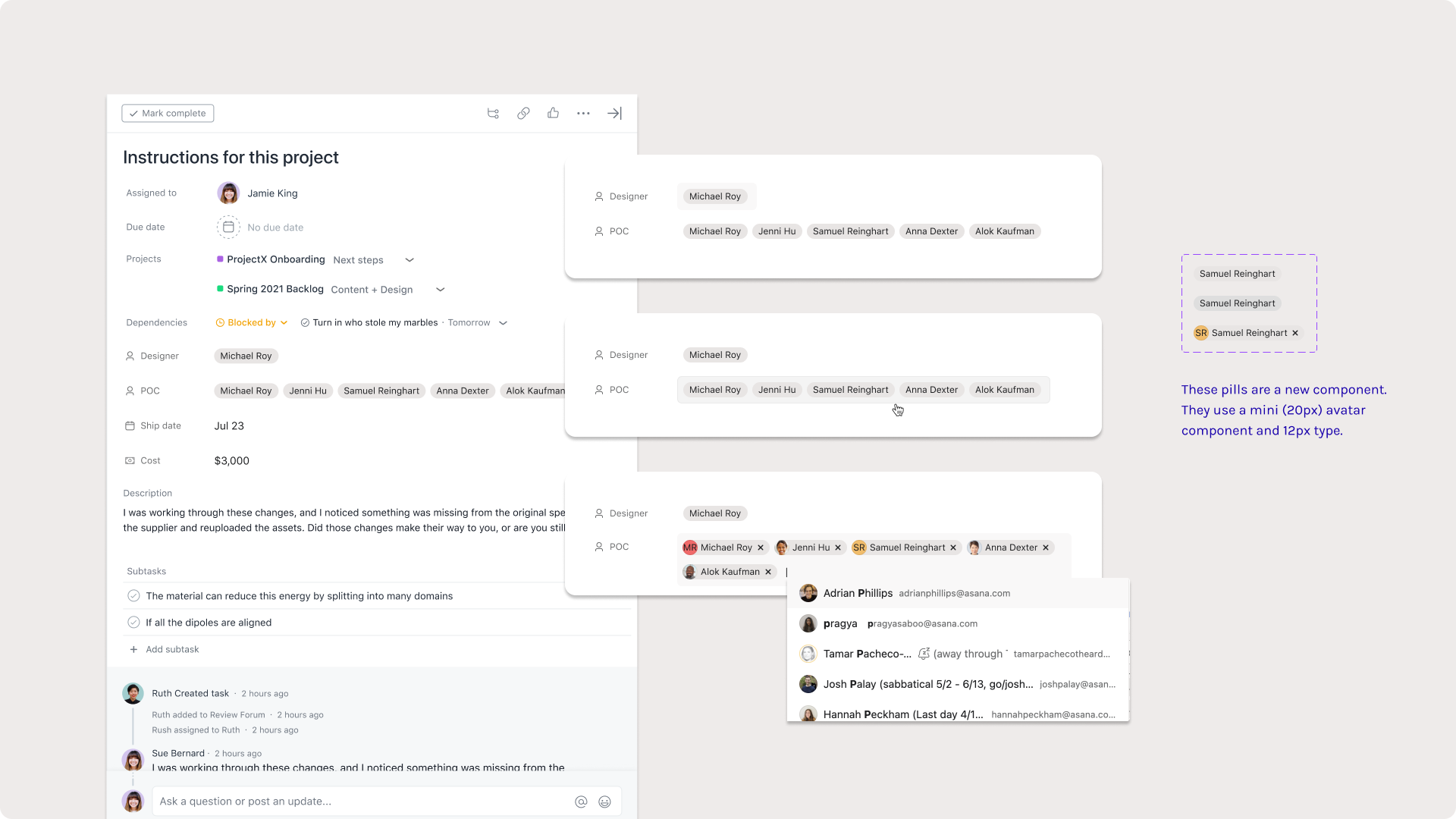
The tokenizer component reveals full names and image cards, but users have to click into the element to reveal that.
03. Metadata fields
Revealing inherent information about work objects
Metadata fields are all about surfacing data that Asana already knows and serving it to users in a way that’s uniquely useful to them. Research felt like watching users describe a fossil hunt they wished they were on.
“I want to sort by who created this task and then when it was last modified. Our team moves fast, and I’m wondering if this is a task that fell through the cracks.”
We uncovered characteristics like “time completed”, “last modified”, and “assigned by” as prominent asks. I worked closely with engineers to weigh design cost against eng cost, and that’s how we selected the first four pieces of metadata to build.
This was also an opportunity to power up a lot of the other popular features. Sorting and filtering projects by task characteristics is a fundamental function (hailing to Asana’s spreadsheet origins), so revealing this data illuminated a lot of existing processes.
 Metadata, our first read-only field type.
04. The custom field modal
Rethinking the system’s entry point
Additionally, our data science team noticed an interesting drop-off in the current creation flow. Although the “add custom field” button was easy to discover, many people were quitting the modal without following through on actually creating a field. Paired with our insights from usability research, it was clear the creation flow needed a redesign.
With no engineering budget left for any change to the information architecture or overarching UX, I used this as an opportunity to push the UI. I focused on prioritizing space, adding supportive product copy and making room in the modal for future custom fields.
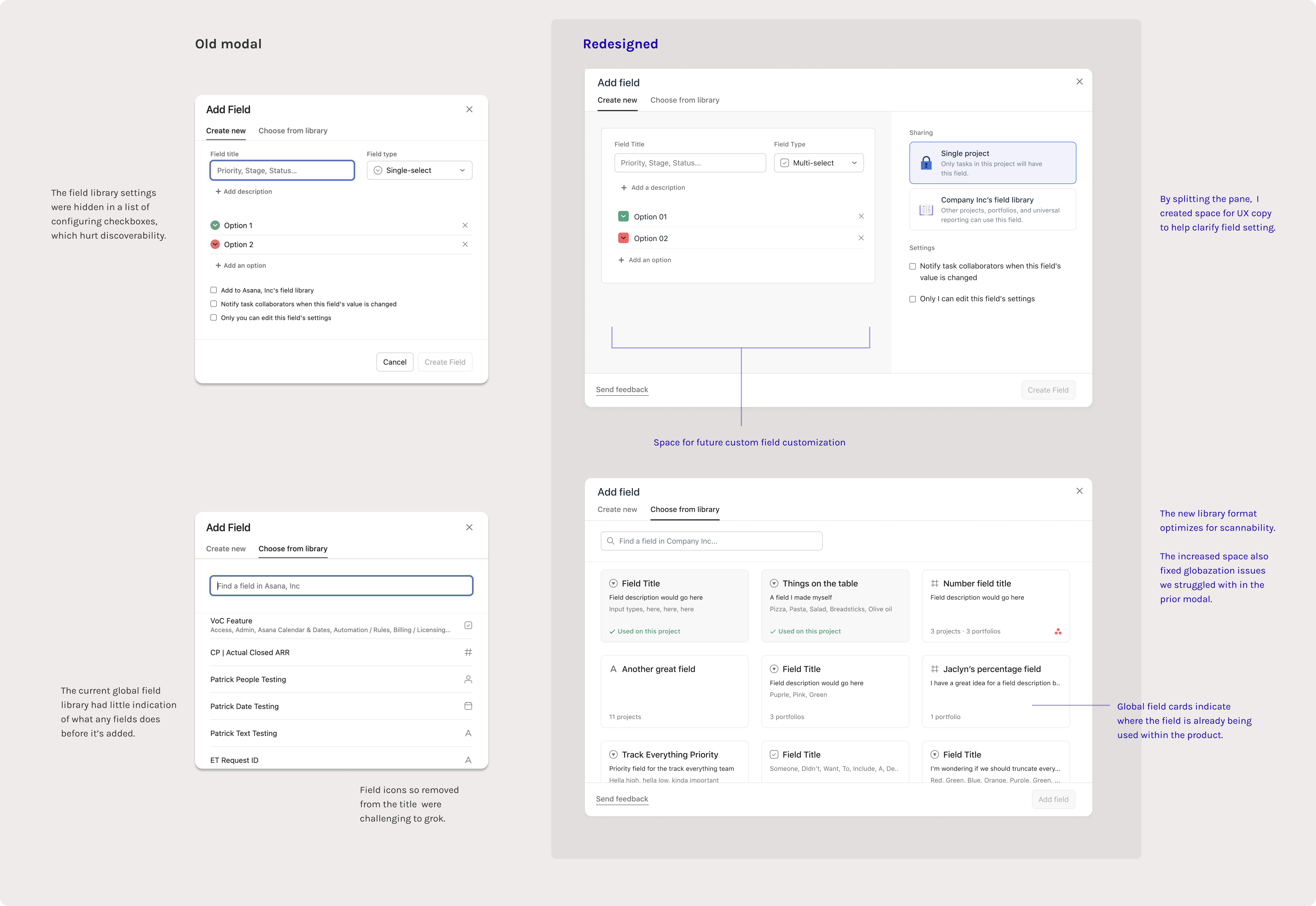
 The modal redesign was also a fun UI challenge
05. The task pane
Distinguishing field types in a crowded space
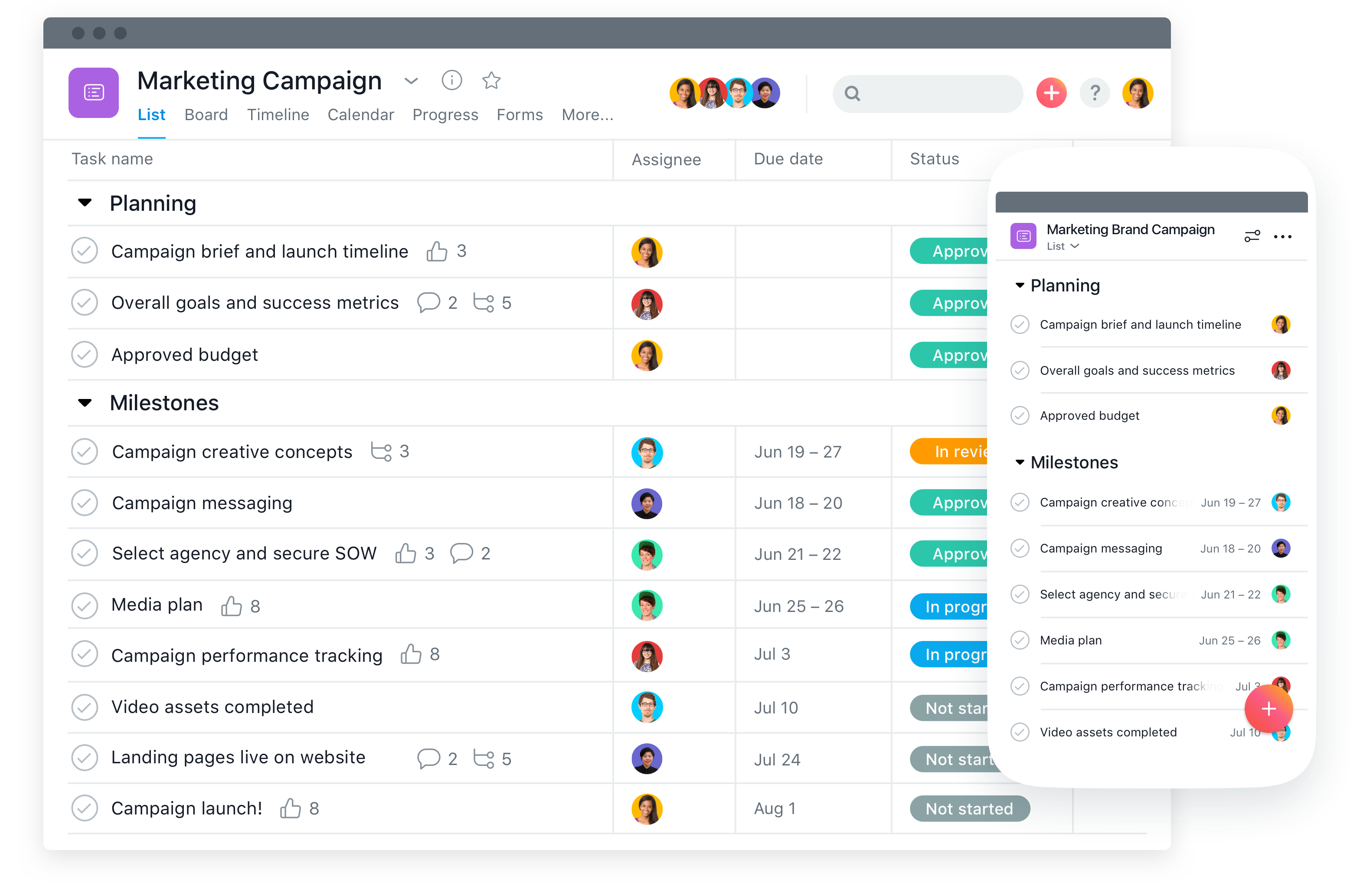
The task pane is a detail view where people can really dig into “who’s doing what by when.” As mentioned, one of the biggest risks with building new field types was introducing something so similar to Assignee or Due date that it clouds this clarity.
We couldn’t just shove new fields types in without a second thought: the task pane needed a revision. This took a lot of visual exploration and a self-led design jam with relevant teams.
I mapped the final contenders on a scale of eng cost:

Curious about the wild places we could push the task pane? I’m happy to show more of what I’ve been thinking about.
... but I had to pare down my solution to gain buy-in from other teams (and not scare the engineers too much).
I was able to convince stakeholders on a light visual polish and a set a mini icons I designed specifically for our new collection of fields, used as a visual indicator in an otherwise uncategorized pane:
These mini icons may look tiny, but it felt like a remarkable achievement for my team to ship a change on such a high surface area
 These fields fully launched in summer 2022
Results—
Post-launch, each of these field types maintained guardrail metrics — data points we specifically set up to make sure new fields weren’t cannabalizing due dates or assignees, which was validating.
We originally launched these fields quietly (no marketing) — and it was at that point we knew they’d be popular. Within a week of launching, a signifigant number of teams had discovered and added these fields into their workflows without any indicators.
We originally launched these fields quietly (no marketing) — and it was at that point we knew they’d be popular. Within a week of launching, a signifigant number of teams had discovered and added these fields into their workflows without any indicators.
It was empowering to know we built a tool that was intuitive enough to adopt without announcement.
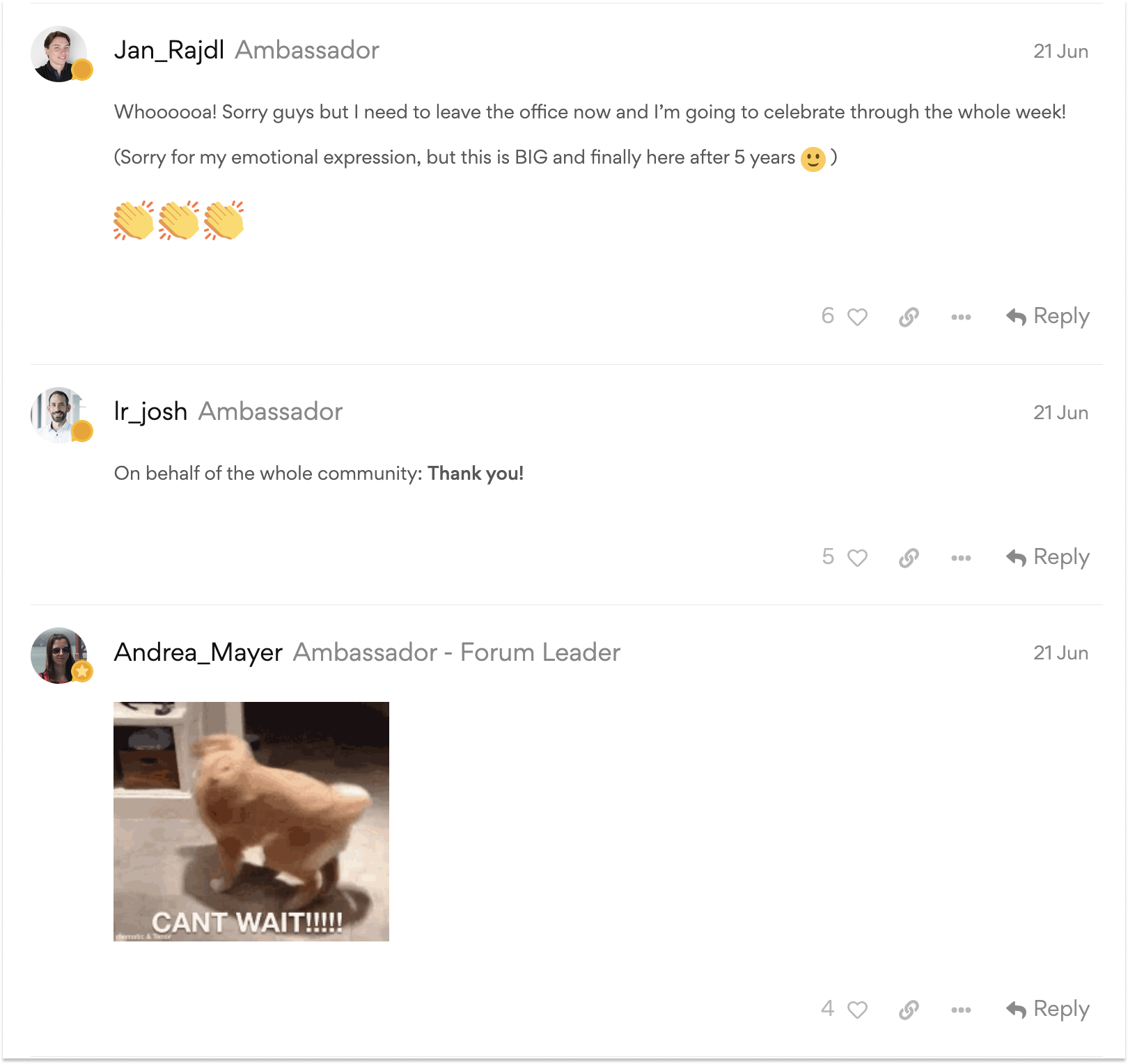
Some of the love we recieved for Date Custom fields.
I also learned that design systems work is all about people and advocacy. This series of projects was a delicate challenge of balancing how we communicate new patterns with honoring an existing system, and getting buy-in meant leading with this mission in every proposal I made.
In the near future, we do need to come to terms with crowding. As we build out the custom field suite in Asana, we’re adding complexity to a system designed for clarity. Although users are using these fields in ways that made their work simpler, there’s also just more options to choose from.
Working closely with design systems, my current work is centered on rethinking how our UI can declutter the touchpoints where users falter with decision fatigue.
Curious to learn more about my design process around these fields? Want a peak at which one’s coming next? Feel free to reach out ↗
AIGA Design Census
5 weeks
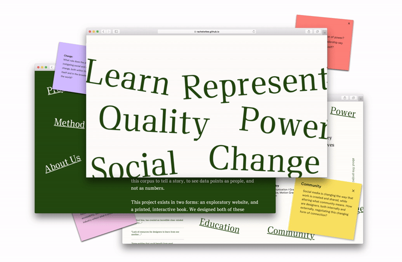
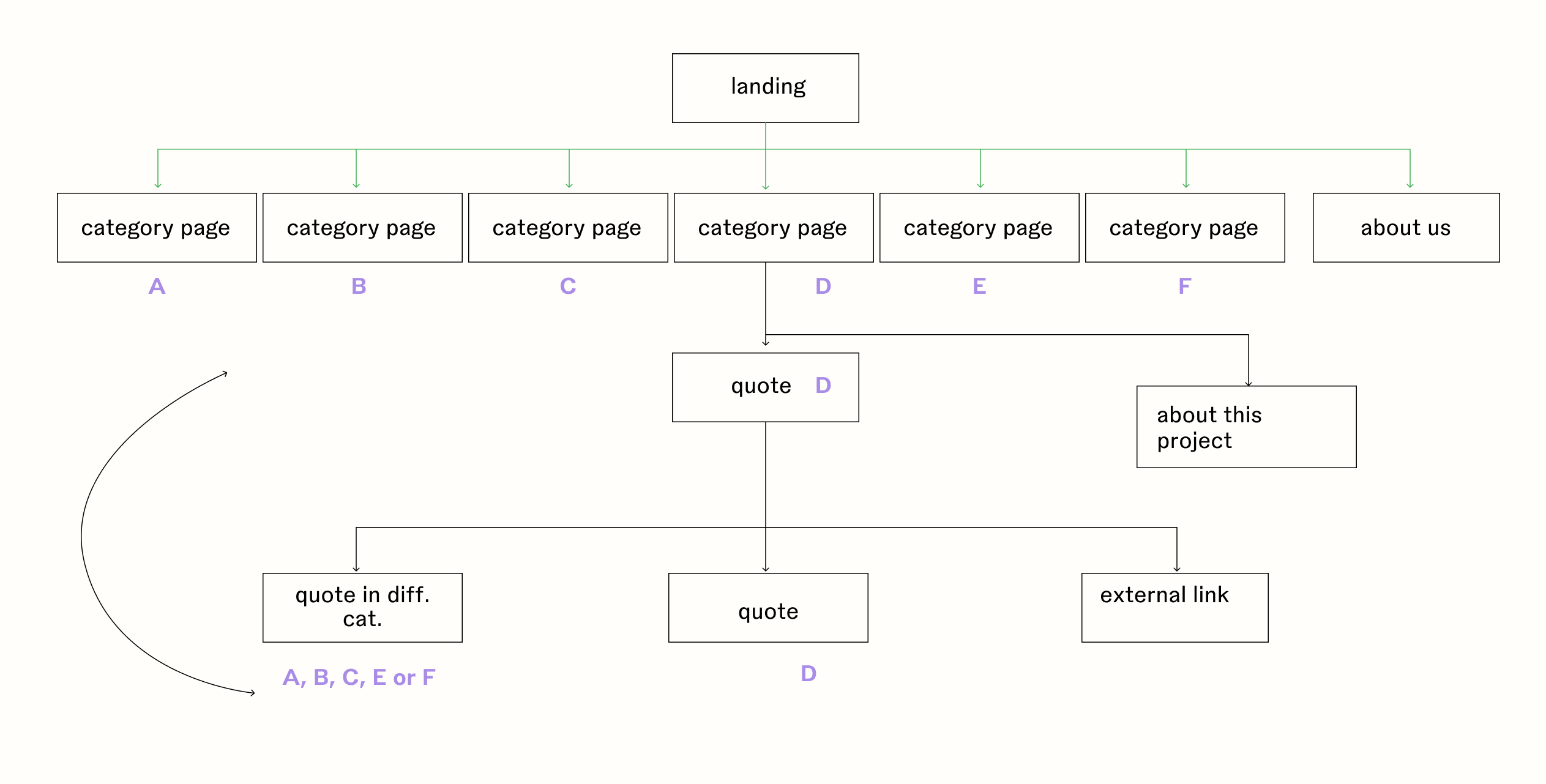
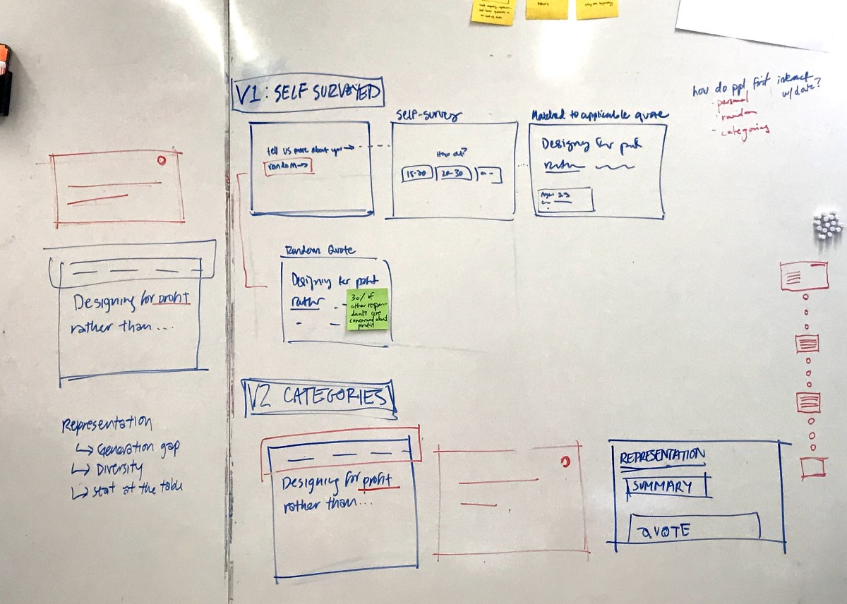
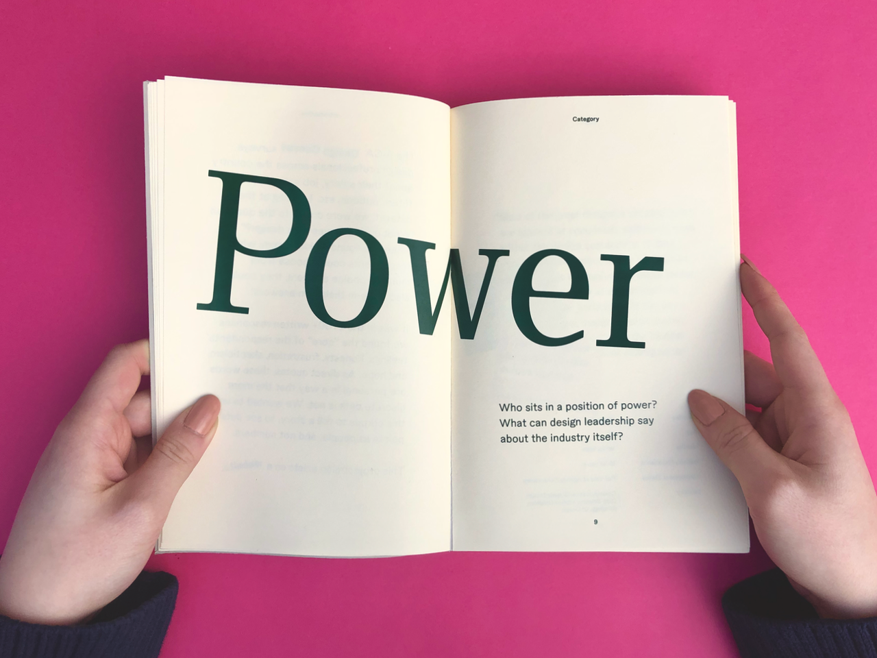
An explorative data visualization in two parts: a live, archival site︎, and an accompanying interactive book.
Using data from the AIGA 2019 Design Census, we built a type-forward experience that emphasizes qualitative analysis and highlights the humanity in the data set.
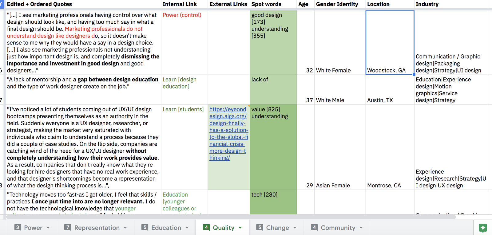
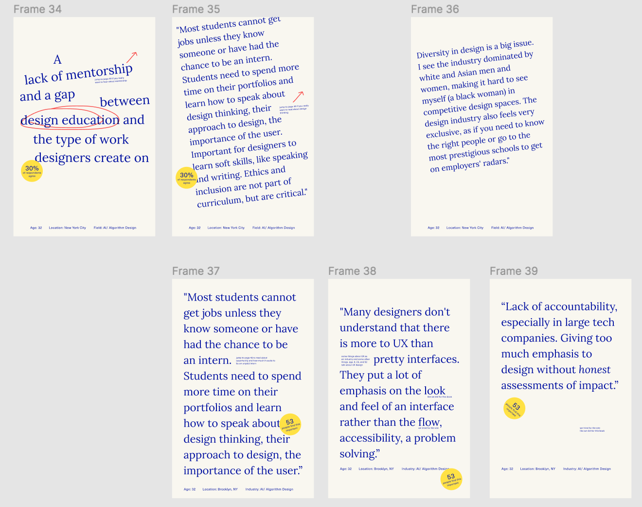
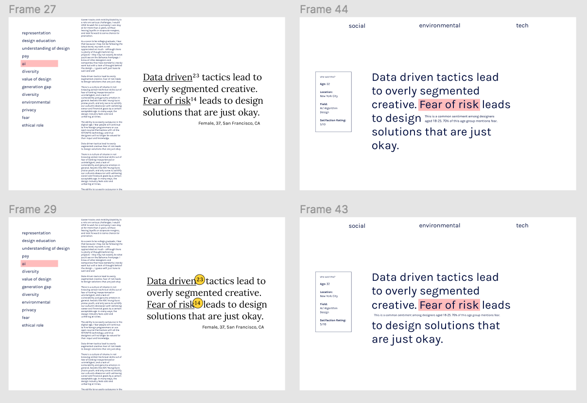
This site is a prototype of a bigger collection, because we couldn’t integrate all 2700+ quotes. We selected ~25 quotes per category to analyze further, and picked phrases that described the main point or theme of each response. If quotes intersected with other categories, we made sure to highlight those phrases as well. (And we made a super-sexy color-coded spreadsheet ↗ ) To find spot words (eg. 18 mentions of “age-ism”), we ran word frequency with the entire corpus.
Tools:
Figma
Adobe Illustrator, InDesign
Python (NLTK)
HTML/CSS
Traditional bookbinding methods
Figma
Adobe Illustrator, InDesign
Python (NLTK)
HTML/CSS
Traditional bookbinding methods
Skills:
Interaction design
Humanist data representation
Qualitative data visualization
Interaction design
Humanist data representation
Qualitative data visualization
Problem Space–
How do you create an experience that communicates the human element of data?
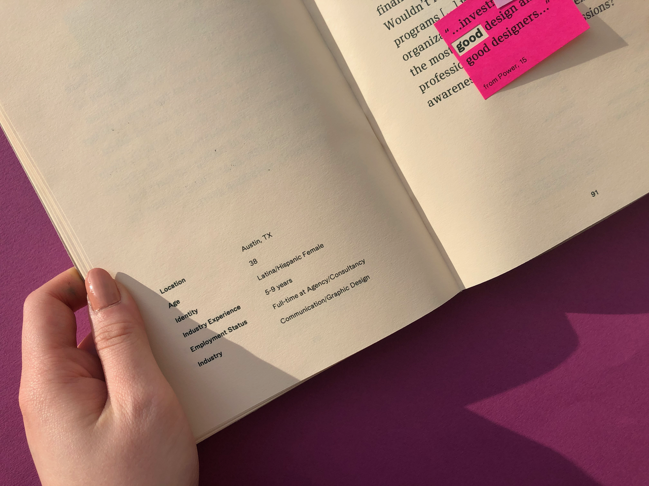
The AIGA Design Census surveys design professionals across the country about their salary, job satisfaction, future outlook, and more. They provide a csv file for download, and it’s massive.
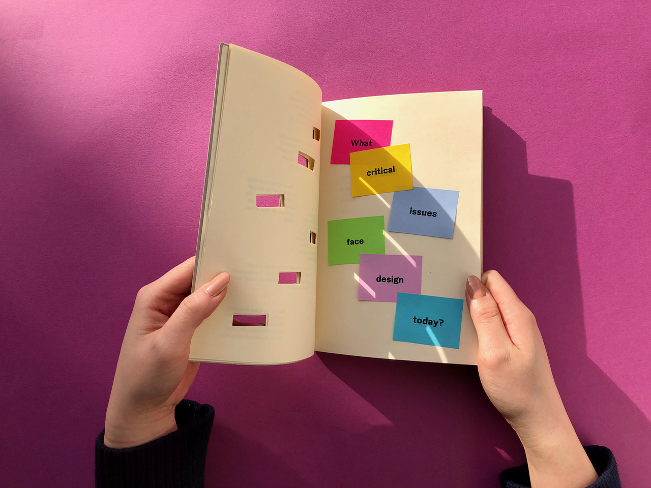
My team decided to specifically focus on a question that was hiding within the data set: “What critical issues face design?” Respondents could choose from multiple-choice answers, but also write-in their own answers. It was the 2700+ written responses that we found most interesting, and we wanted to create a way to explore the language that designers were using.
Because of this decision, this project became a deep dive into the world of qualitative data analysis and representation.
Rather than examining the trends in numerical data and finding ways to graphically represent this, we focused on creating a tool that facilitated user exploration of the respondents’ own words.
Site and Book– A unified system

Brand–
This is a data visualization, but a language-focused one. It collects a large corpus of personal user opinions, and based on text analysis, categorizes these quotes based on content. The final system provides a space to explore the interconnected themes found in individual opinions, and pushes users to explore their own perspective of design’s critical issues.
Typography is always important (especially to me), but with this project, it became everything. We decided from the beginning to use a type-forward approach. We focused on our colors as both a contribution to the playful feeling of both artifacts and as an integral tool for categorization.
Establishing a brand system that was robust, yet flexible for both print and digital mediums, was integral to our messaging.
Typography is always important (especially to me), but with this project, it became everything. We decided from the beginning to use a type-forward approach. We focused on our colors as both a contribution to the playful feeling of both artifacts and as an integral tool for categorization.
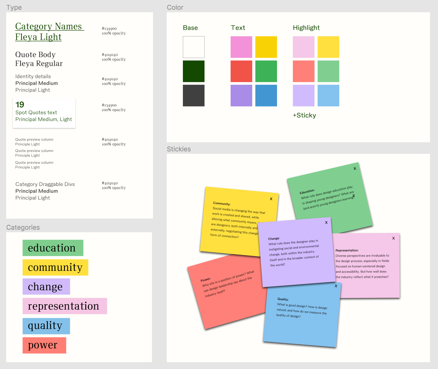
Without using illustration, we wanted to facilitate a “handmade” interaction both physically and digitally.
I integrated a humanist type system with user-activated animations and tilted, enlarged headline navs.
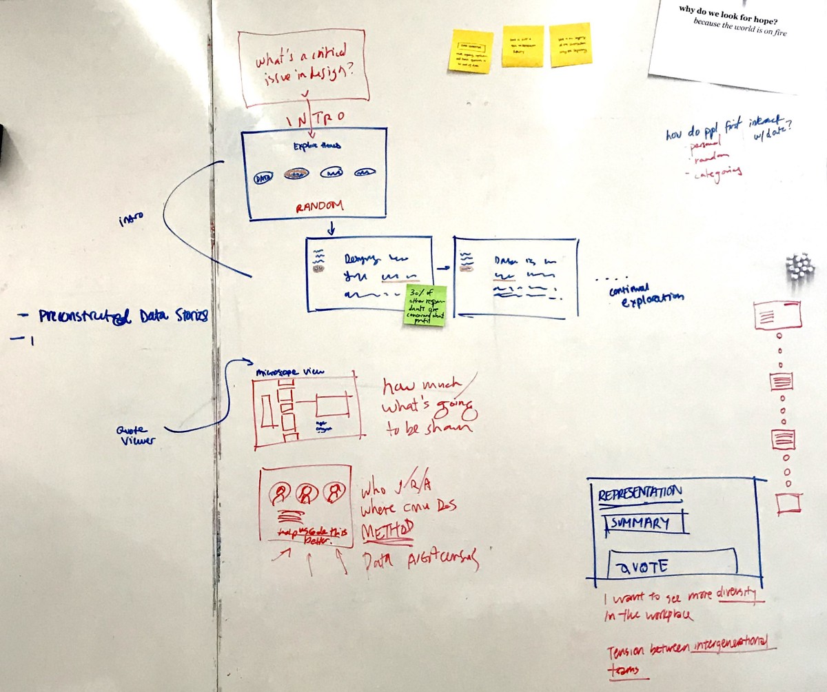
Key Interactions– Site
The site is intended to be visually dense: once users entered the data set, we wanted to give them something to dig into.
01. Spot word hover states
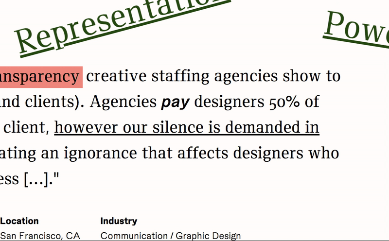
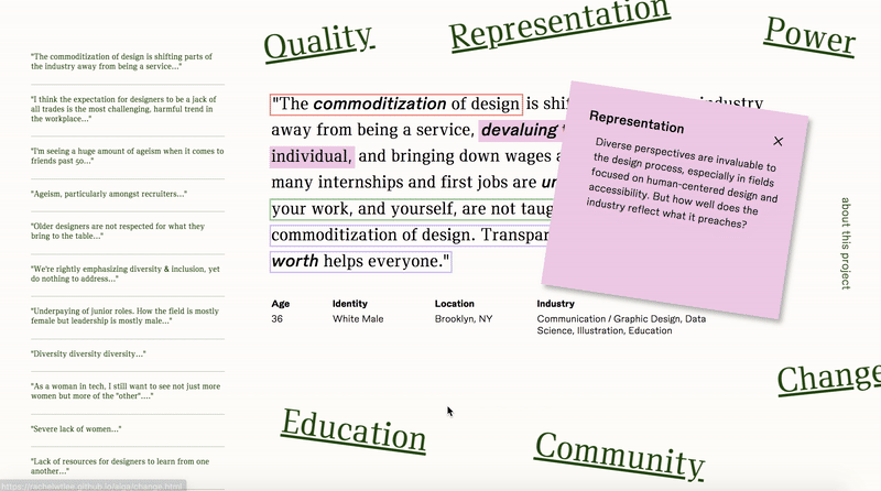
Although we sorted the quotes into categories based on libraries, we didn’t want to completely ignore some of the other meta-data we collected in our initial data search. When a user hovers over bolded words, no matter what category the quote is in, a hover window gives more info about how this word relates to the entire corpus.
02. Highlight Surf
The most direct way to explore an individual category, the highlight on a quote is a clickable function that permits users to surf to the next quote in the set. The highlight specifically identifies the part of the user’s words that warrants this quote’s categorization. The highlight key also permits users to jump categories, because oftentimes, people talk about more than one category when they talk about critical issues.
03. Scroll Quote Preview
In addition to the highlight function, the scroll quote preview provides the users with a bit more visibility into the entire data set. We didn’t want to throw a bunch of text at the user, so this abbreviated nav served a more concise solution. 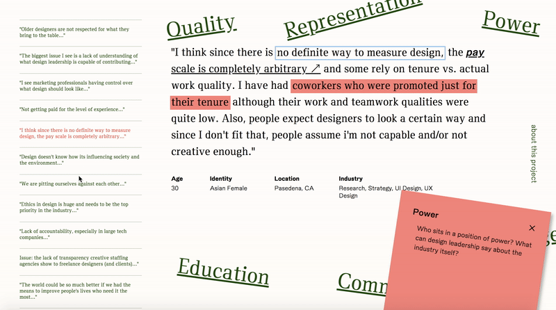
04. External Links
One big affordance of a web interface is the ability to literally access the web. Although digital interface can be distracting for reading, this interaction leverages the multimedia aspect and relates quote content to relevant AIGA Eye on Design articles.
User Flow Process–
Key Interactions– Book
The book is a different medium: there’s no multimedia component (There was talk of QR codes, but I was skeptical).
There is, however, the opportunity for a quiet moment between user and artifact. We leveraged this.
In order to communicate this interconnected, overlapping categorization in the respondent’s answers, we ran another search for common collocations and found common overlapping words. Printing on physical sticky notes, we created a physical color-coded system for identifying overlapping themes.

Our final book was printed at 120 pages. We hand-bound and covered each copy, and individually printed and cut the 80+ sticky notes that annotated the pages.
It was a labor of love.


Method–Data Parsing
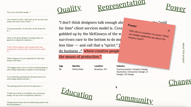
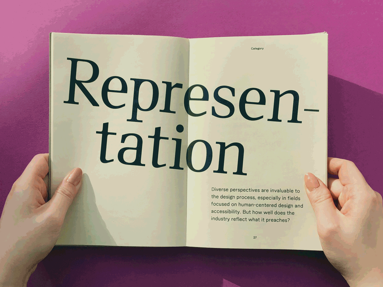
We used python and NLTK to parse the corpus, collecting the most frequent 150 words (excluding function words like “I,” “the,” “only,” etc.), bi-grams and tri-grams. Looking at the lists, we picked out words and phrases that described themes or ideas. From there, we grouped the words into six broader categories: power, representation, education, quality, change, and community.
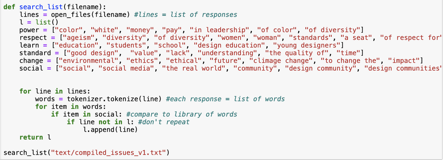
We then created and used these dictionaries to parse through the quotes again in order to sort which responses fell in which category.
Power
"color", "white", "money", "pay", "in leadership", "of color", "of diversity" Representation
"ageism", "diversity", "of diversity", "women", "woman", "standards", "a seat", "of respect for" Education
"education", "students", "school", "design education", "young designers"Quality
"good design", "value", "lack", "understanding", "the quality of", "time"Change
"environmental", "ethics", "ethical", "future", "climate change", "to change the", "impact" Community
"social media", "the real world", "community", "design communities", "the general public"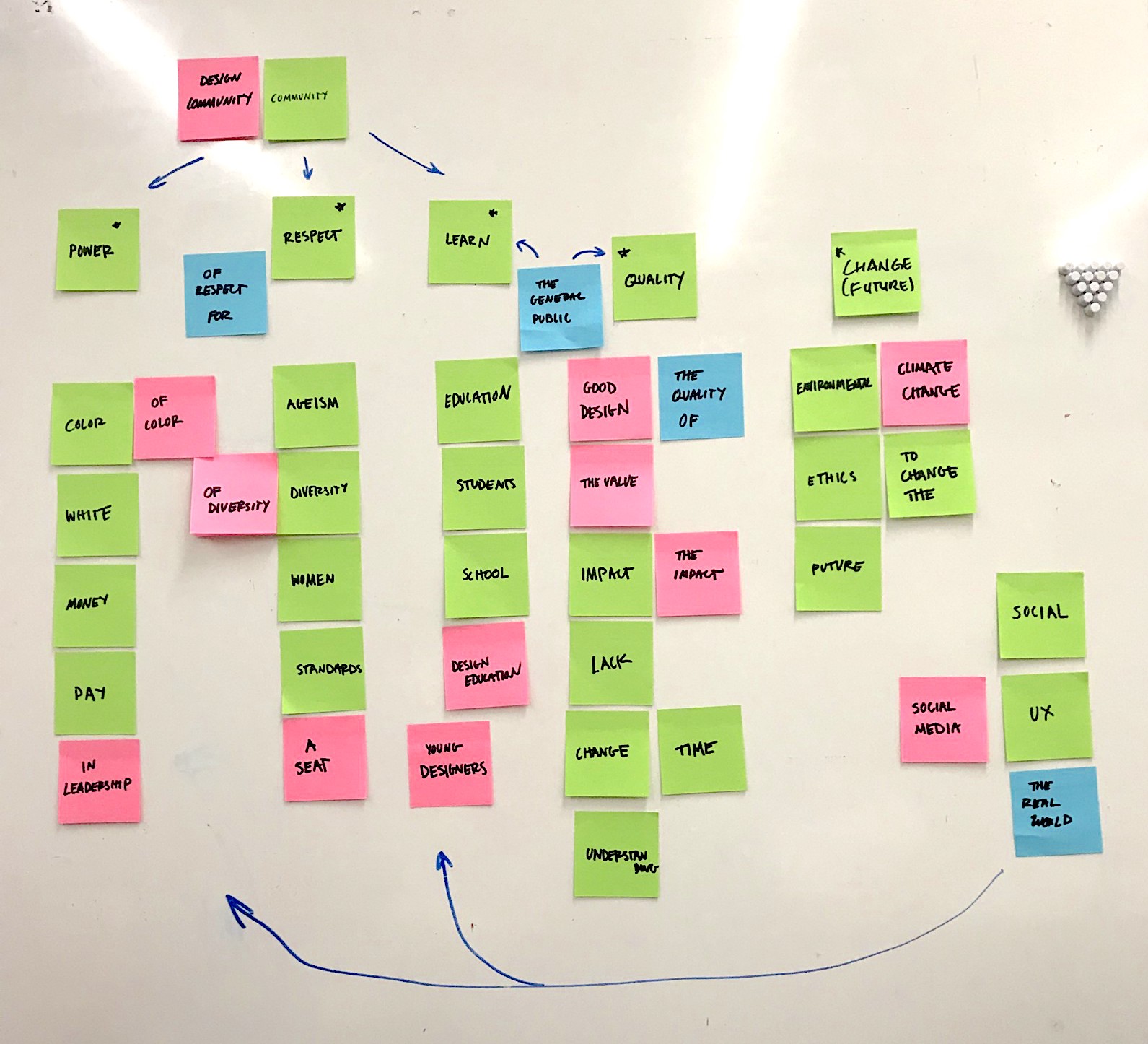

Final thoughts–
This project was exciting. It took us a while to fully grasp our concept at first: a lot of times with data visualization projects, designers want to jump to the bar charts and the pie graphs and then expand shapes from there, but I was very curious about how type could push this project further. Once we nailed down our approach to language and qualitative data analysis, my group mates and I were very passionate about this work, and that made the work more rewarding.
If we expand on this project further, I’d like to look more into web affordances that allow users to personalize their experience on the site. Right now, the site presents a story that users can get lost in–which was our intention–but I wonder how the experience would change if users could tag or annotate the quotes themselves, creating a collective that would serve as a “living” data set.
If we expand on this project further, I’d like to look more into web affordances that allow users to personalize their experience on the site. Right now, the site presents a story that users can get lost in–which was our intention–but I wonder how the experience would change if users could tag or annotate the quotes themselves, creating a collective that would serve as a “living” data set.
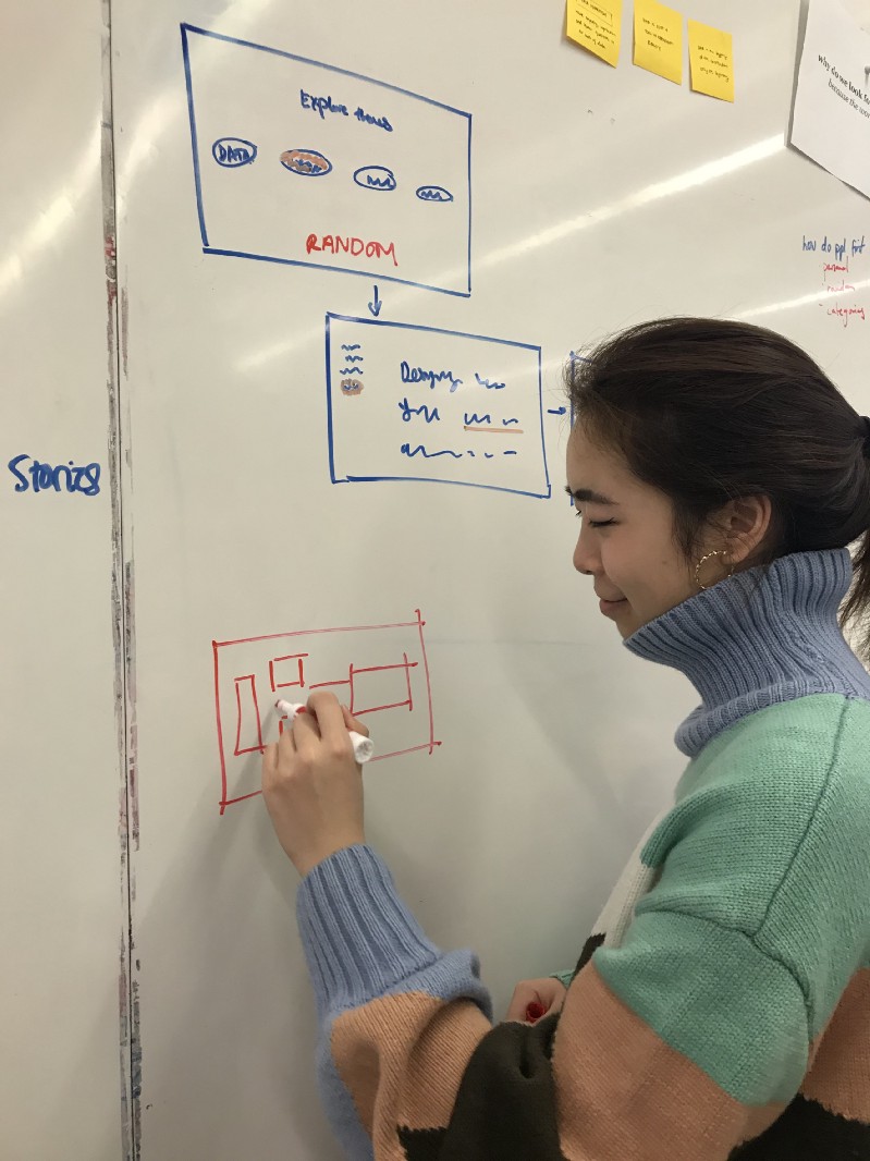
Wanna see some early stages? There were many! ︎


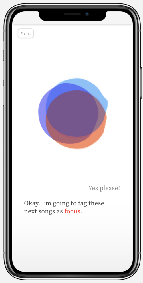
leva
4 weeksA mobile-first AI virtual assistant built to intimately understand their user, and then use this understanding to intelligently play music. leva is not a smart DJ, but instead is designed to be a personal confidant that the user can use as a resource for listening to music.
leva explores the effects of music on affecting the dimensions of identity, mood management, arousal and social interaction on an individual level.
leva explores the effects of music on affecting the dimensions of identity, mood management, arousal and social interaction on an individual level.
Tools:
Javascript (p5.js)
Figma
Illustrator
After Effects
Skills:
Interaction design
Conversational design
Prototyping for AI
Team motion/js file management
Team:
Jaclyn Saik
Elena Deng
Eunice Choe
Julie Choi
Project Space –
Human mood, preferences and music are inherently interlinked. In many current music streaming platforms, there are intelligent existing algorithms that can predict your music preferences based on your previous listening habits.
But rather than approaching music selection from a genre, artist, or labeled playlist perspective, what if AI and virtual assistant technology was used to generate music based on conversation with the user?
But rather than approaching music selection from a genre, artist, or labeled playlist perspective, what if AI and virtual assistant technology was used to generate music based on conversation with the user?
And specifically, how do the appearance and aesthetics of this interface contribute to the effectiveness of the product?
How Leva collects data–

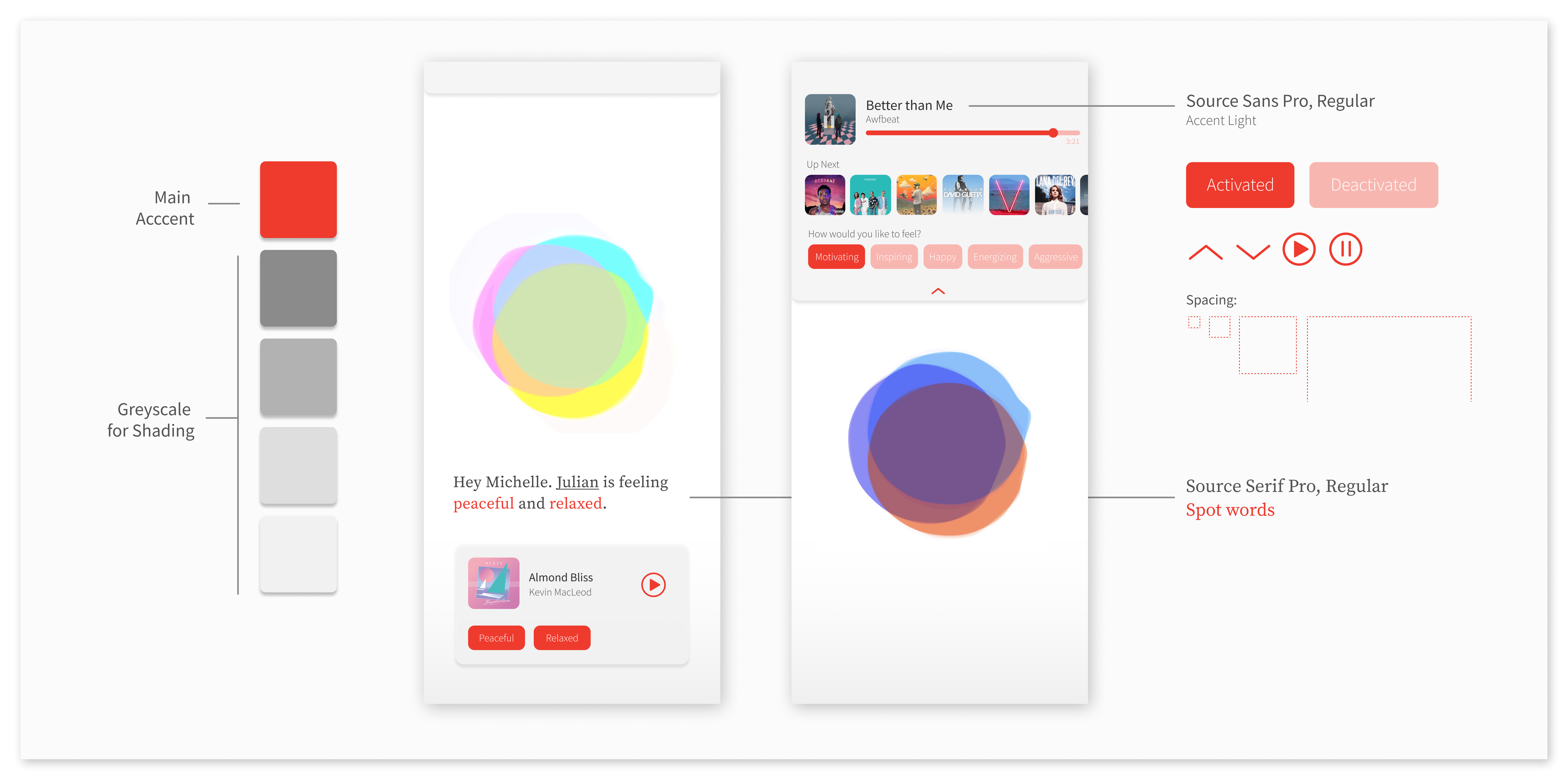
Final UI Element Kit –
Scenario Breakdown–
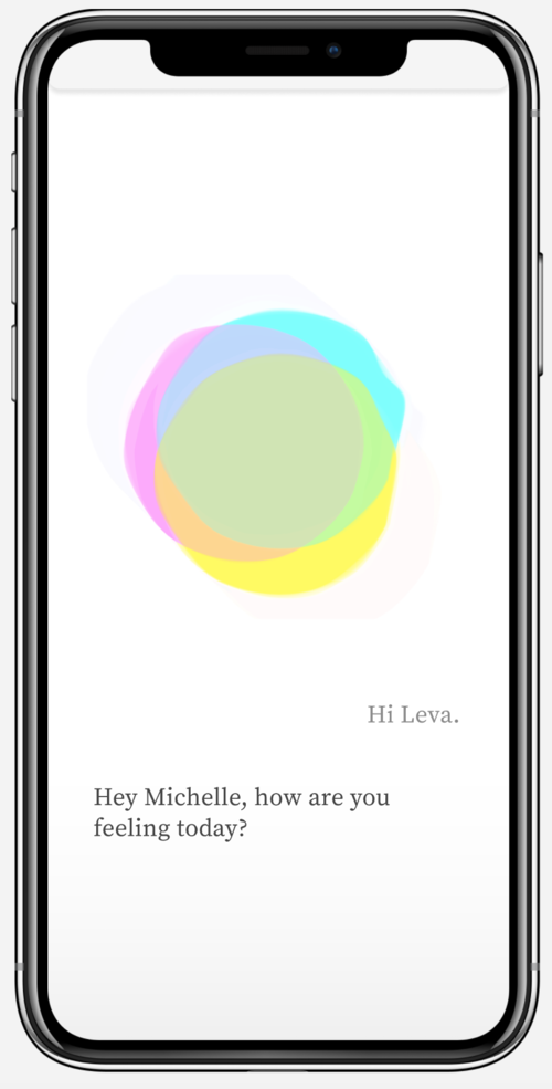
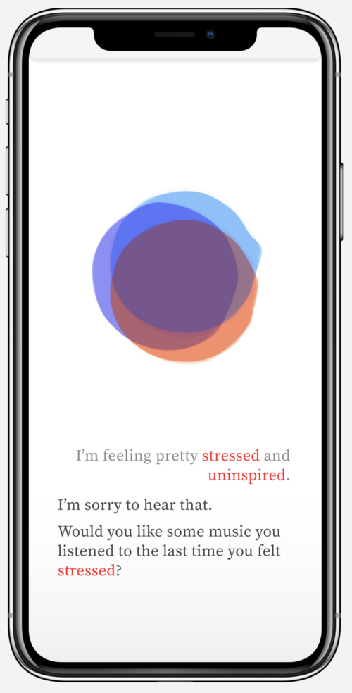
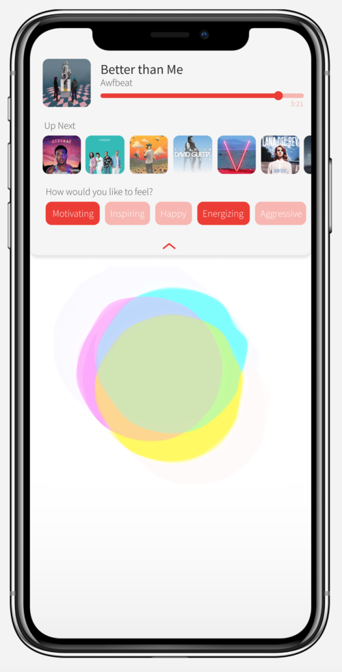
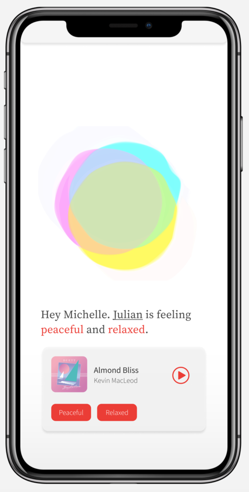
Here, our user Michelle, who only recently started using leva, wants to access music based solely on her mood:
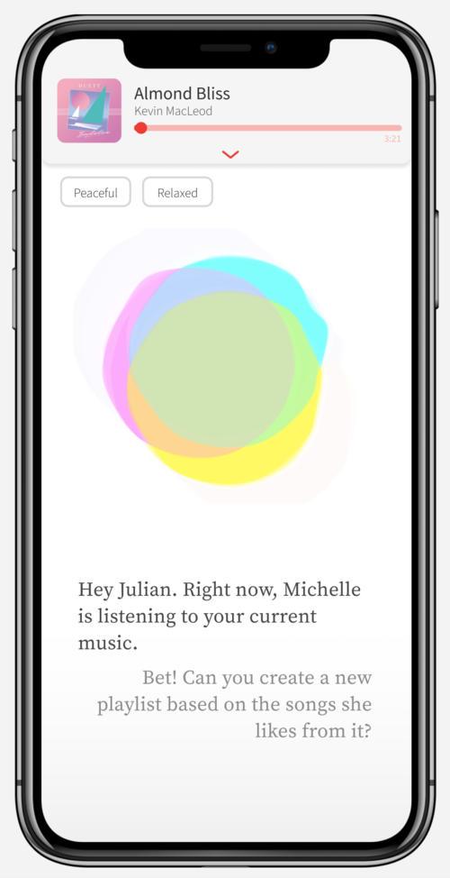
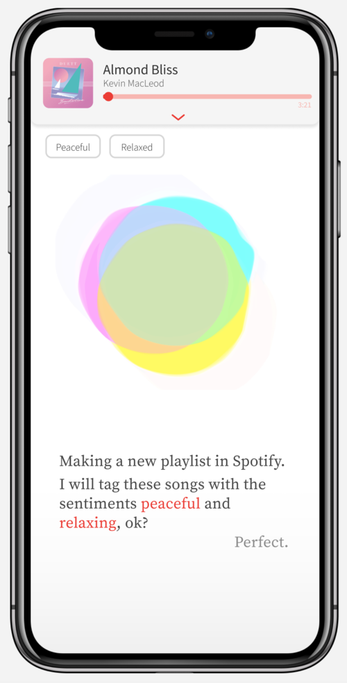
While in this case, Michelle is now interested in her connected friends’ moods, and uses leva to gain a better understanding through their listening data. Julian is also interested in what she’s listening to, and wants to combine tastes to make a collaborative playlist based on their shared emotions:

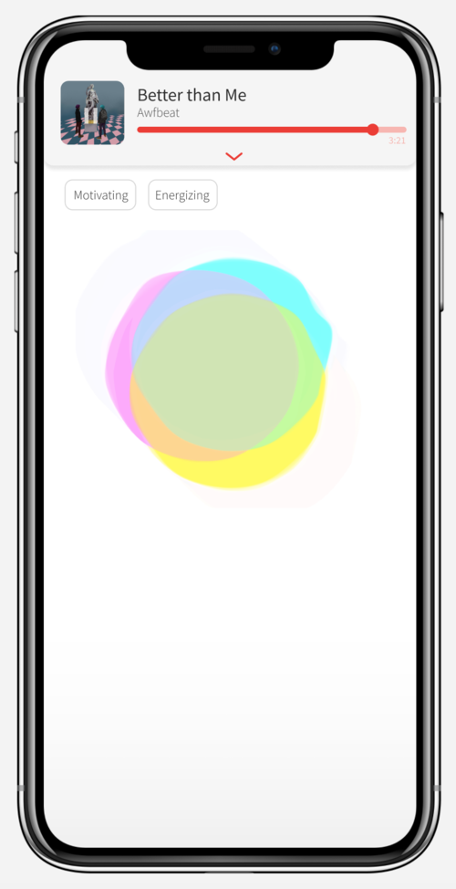
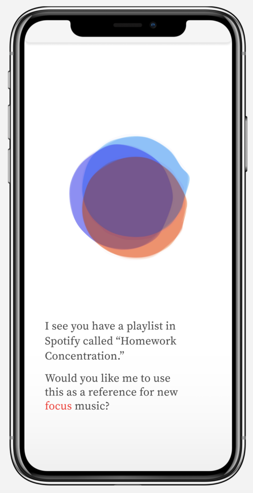
Michelle now has a specific listening goal, and leva contextualizes their recommendations based on time and user history:


01– Understanding the user
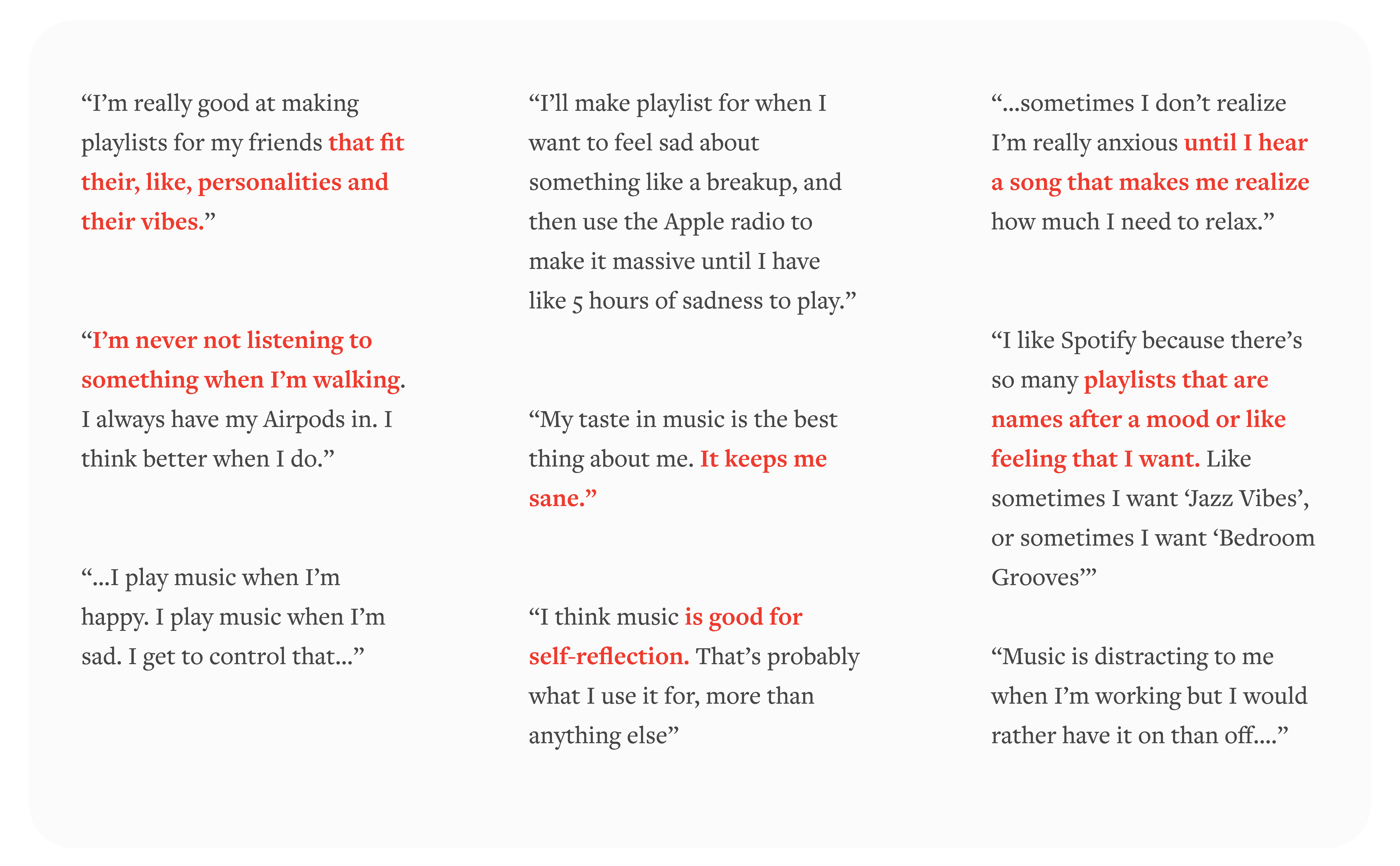
We kept our research methods straightforward: we talked to users about music and mental health.
Here’s some important insights and pain points from a series of 10 interviews, conducted on students and young professionals locally:
Personas–
By consolidating our preliminary user research and affinity mapping our observations, we created 2 personas modeled after our target user. Although the focus of this project was more on the visuals and direct voice interaction with leva, we wanted a more robust description of who leva might be speaking with.
Angie
20-year-old undergraduate student, studying business in Pennsylvania
Angie lives about a mile away from campus and usually walks to and from class every day, listening to music the entire time.
Angie likes getting song recommendations from her friends, but struggles to organize all of the content she gathers into the right playlist. She’s not sure what the “right” playlist means, since her mood changes a lot. Also, she likes to have as little touch-interaction with her phone as possible while listening, since the winters are cold and she prefers a hands-free experience while walking.
Kyle
18-year-old high school senior, living in California and preparing for college.
Kyle listens to music in his room constantly, and cares a lot about his reputation as a curator of new artists. He organizes a large amount of music into playlists for himself and his friends.
Kyle is currently seeing a therapist for depression and anxiety, and he knows that music often has a positive effect on his mood. He is looking for more support in how to use music to manage his symptoms.
02– Research: how music affects mood
Vocal assistants are nearly ubiquitous in our daily lives, but most of the interactions we have with them are limited to task management data recollection. leva was designed to be more than that: a tool that better understands users on an emotional level, and reflects that understanding back to the user (personally, I was imagining an expansion on ELIZA).
Leva’s ultimate purpose:
But why music? The psychological effects of music have been studied for decades, notably in a large scale survey by Lonsdale and North, 2011, through a uses-and-gratifications approach, they identified 30 musical uses that could be reduced to eight distinct dimensions: identity, positive and negative mood management, reminiscing, diversion, arousal, surveillance, and social interaction.
Leva’s ultimate purpose:
- Encourage self-awareness through mood-awareness
- Use informed understanding of user emotion, habits and history to create an environment dictated by mood
- Focus on how you feel, not just what you want to hear
But why music? The psychological effects of music have been studied for decades, notably in a large scale survey by Lonsdale and North, 2011, through a uses-and-gratifications approach, they identified 30 musical uses that could be reduced to eight distinct dimensions: identity, positive and negative mood management, reminiscing, diversion, arousal, surveillance, and social interaction.
With Leva, we aimed to explore how music affects these dimensions on an individual level.
03– Motion states
After mocking up our interaction prototypes using After Effects, we moved to the javascript library p5.js to create prototypes that were responsive to sound. The final states are created not only for clarity of interaction with the user, but also to give leva character.
leva’s “personality” is defined by fluid, oscillating response to sound input, which in turn informs their functional states.
leva’s “personality” is defined by fluid, oscillating response to sound input, which in turn informs their functional states.
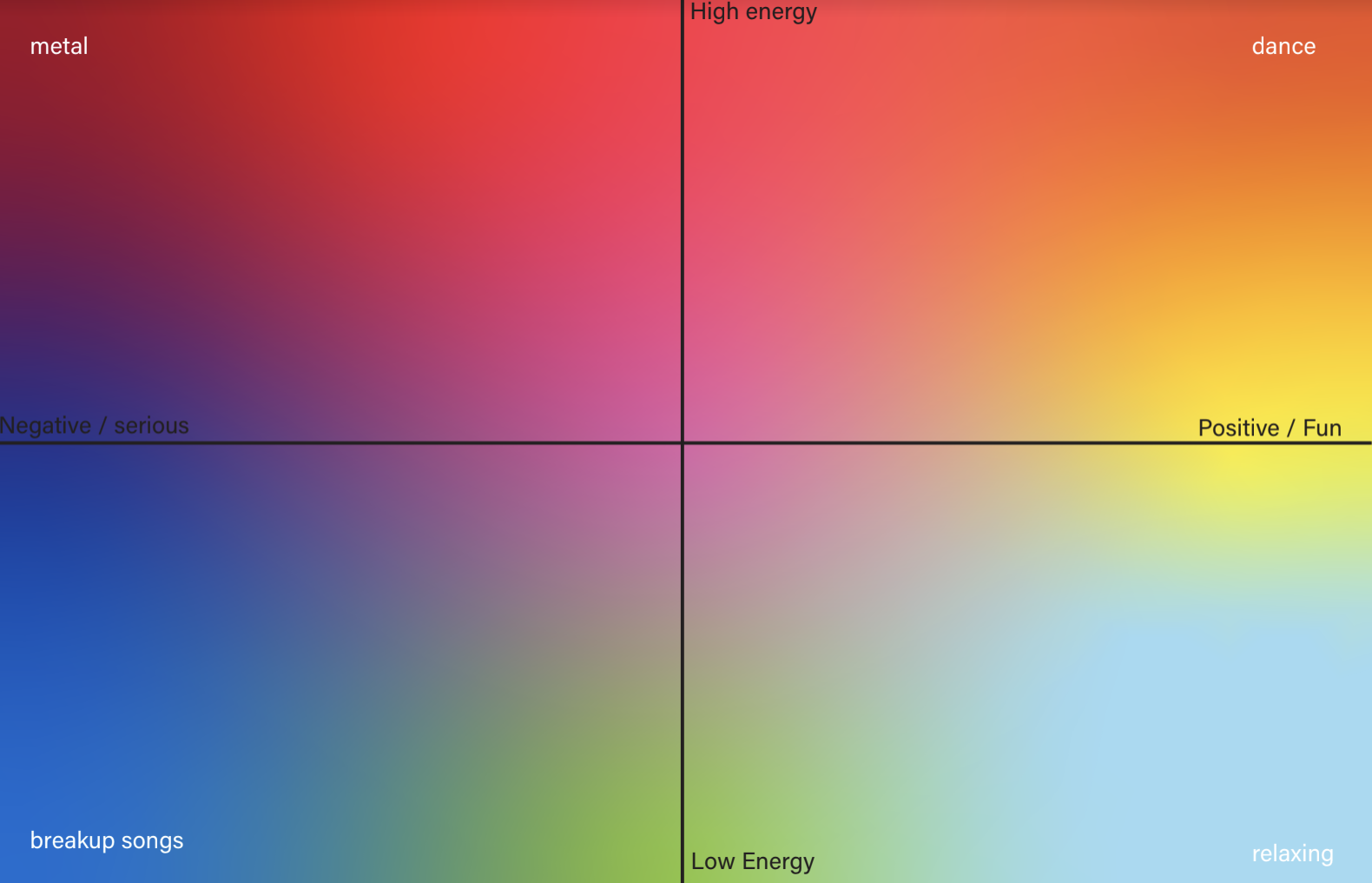
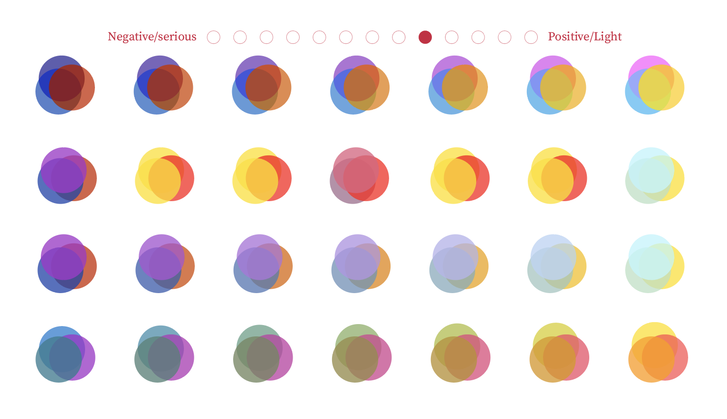
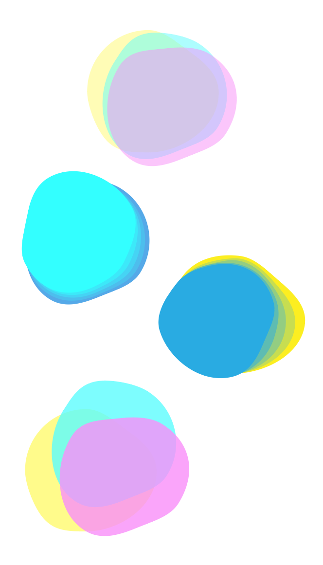
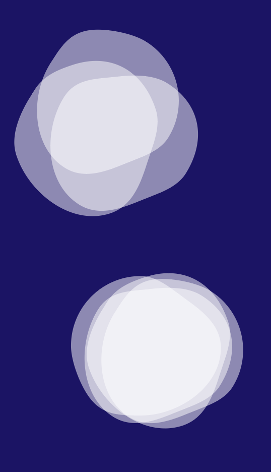
04– Empathy via color
One prominent feature we prioritized was leva’s ability to give feedback directly related to the mood of the conversation they have with the user. We finalized her color to adjust in temperature and saturation, to show empathy towards they user’s emotions.
Serious
Positive
We protyped this interaction using wizard-of-oz techniques to mimic the tone of a mock conversation with a participant. It was through this testing we understood that leva’s physical color should adjust color, rather than the environment they’re inside, as it shows a more direct connection tone.
Because we’re not using an actual voicebot, we prototyped the sentiment analysis feedback simply by adjusting the mouse’s x-position.
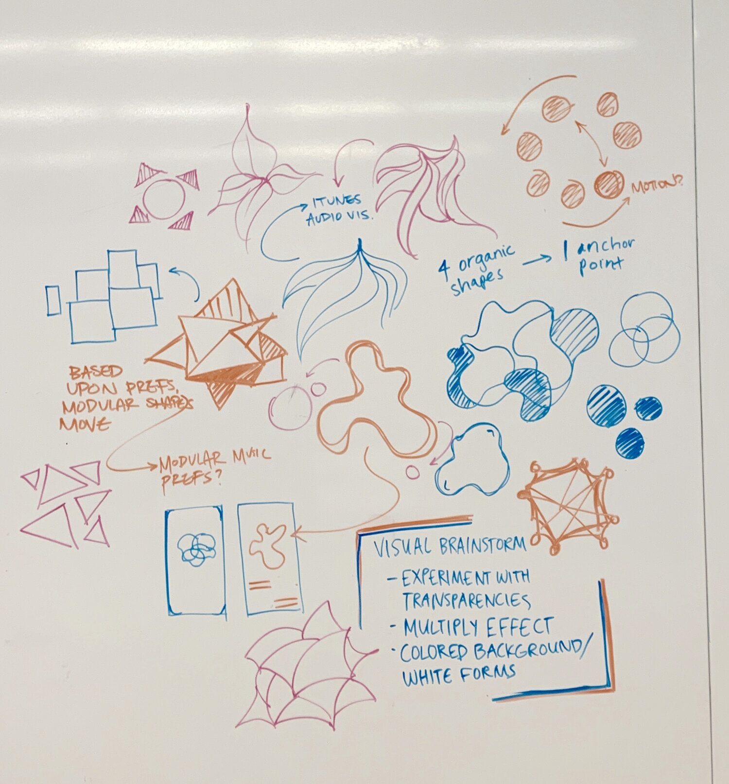
03– Form
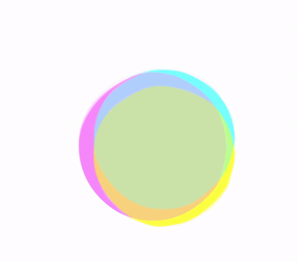
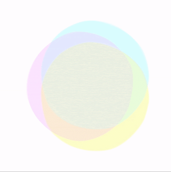
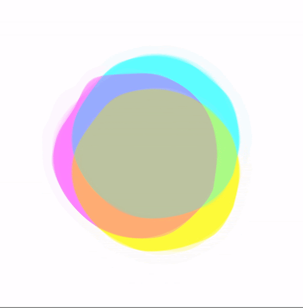
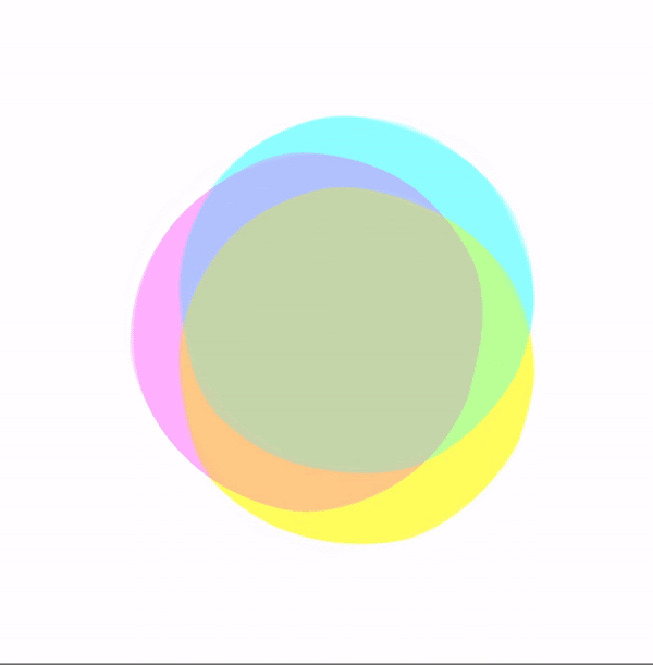
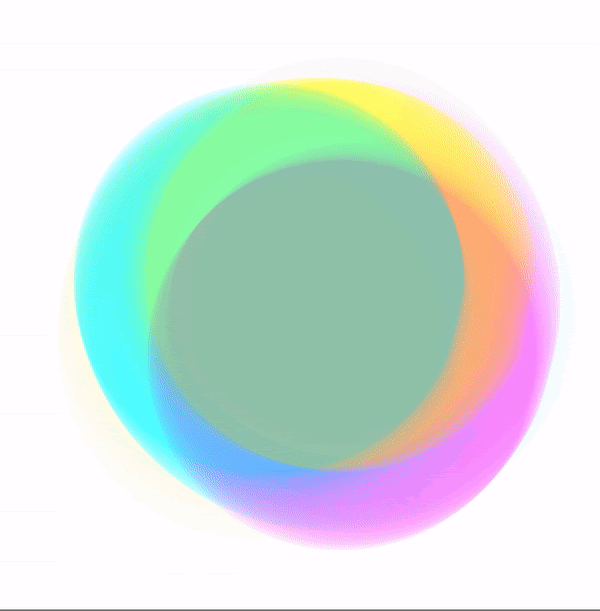
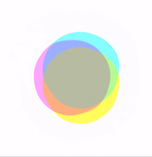
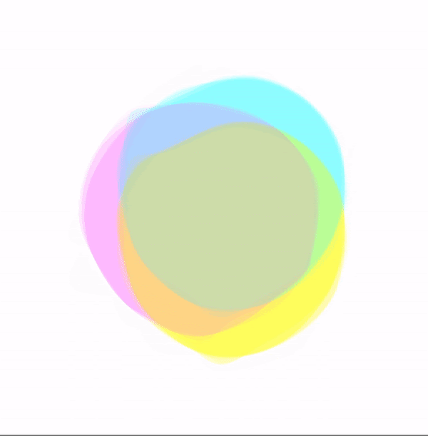
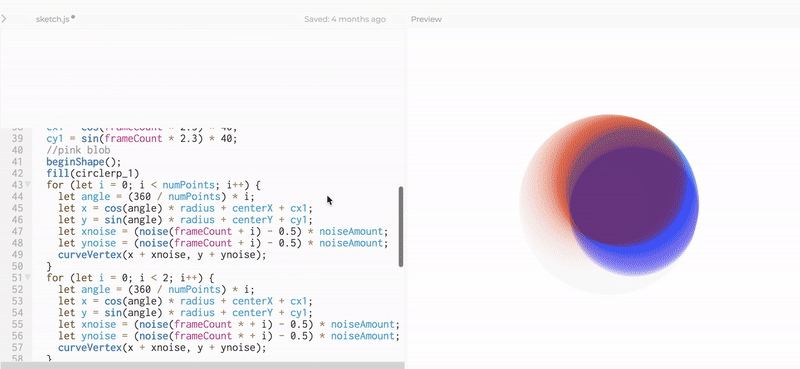
leva’s form is inspired from the rounded shapes of a whole note and the organic shapes of a blooming flower.
The overlapping form of each of the organic shapes layered on top of each other is a representation of the complexity of human emotions, individual preference, the process of creating music itself.
The overlapping form of each of the organic shapes layered on top of each other is a representation of the complexity of human emotions, individual preference, the process of creating music itself.

Final thoughts –
Music and emotion are inherently tied. So are music and conversation. With AI, there’s a possibilty to combine this, and in turn promote self-awareness and provide empathy.
With this project, I enjoyed synthesizing the skills I was pretty comfortable with, such as motion graphics prototyping typographic design systems, with skills I had never explore before. Learning to prototype a conversation, rather than simply some digital interaction or short wireframe sequence, was remarkably challenging.
We were restricted by the timeline and limited initial understanding of p5.js, but personally I’m proud of the skills we gained in such a short sprint. I can comfortably mock up prototypes in p5, and they will be live and actively responsive to the external environment. If we could expand on this project, I would want to fully flesh out a user flow throughout the entire app leva lives inside (especially the UI elements).
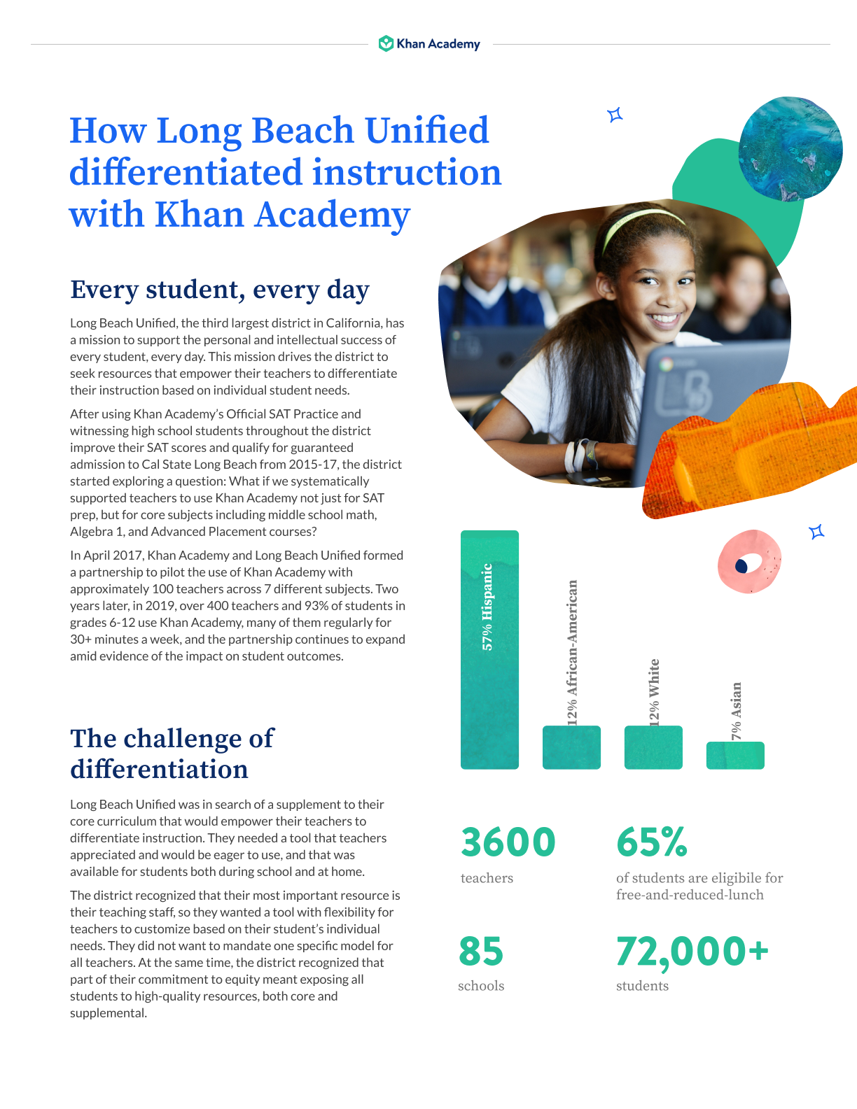
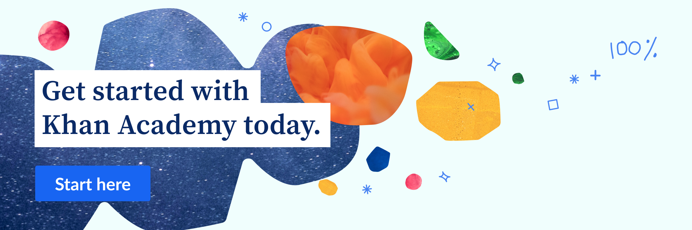
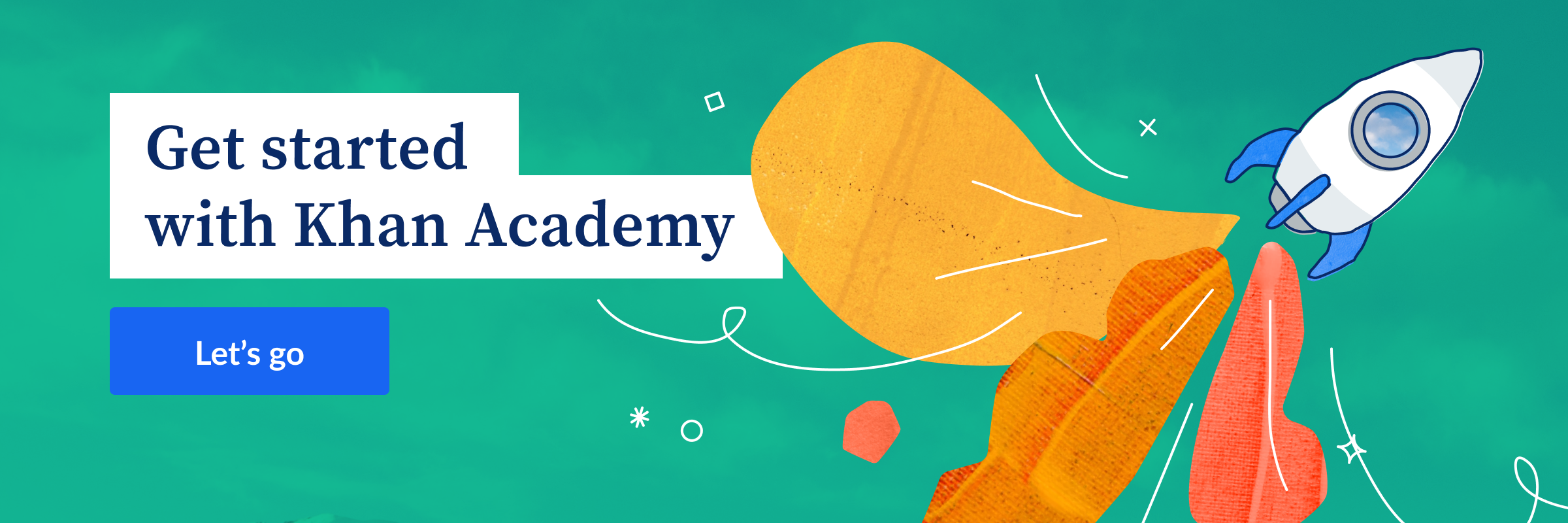
Khan Academy Visual & Interaction Design
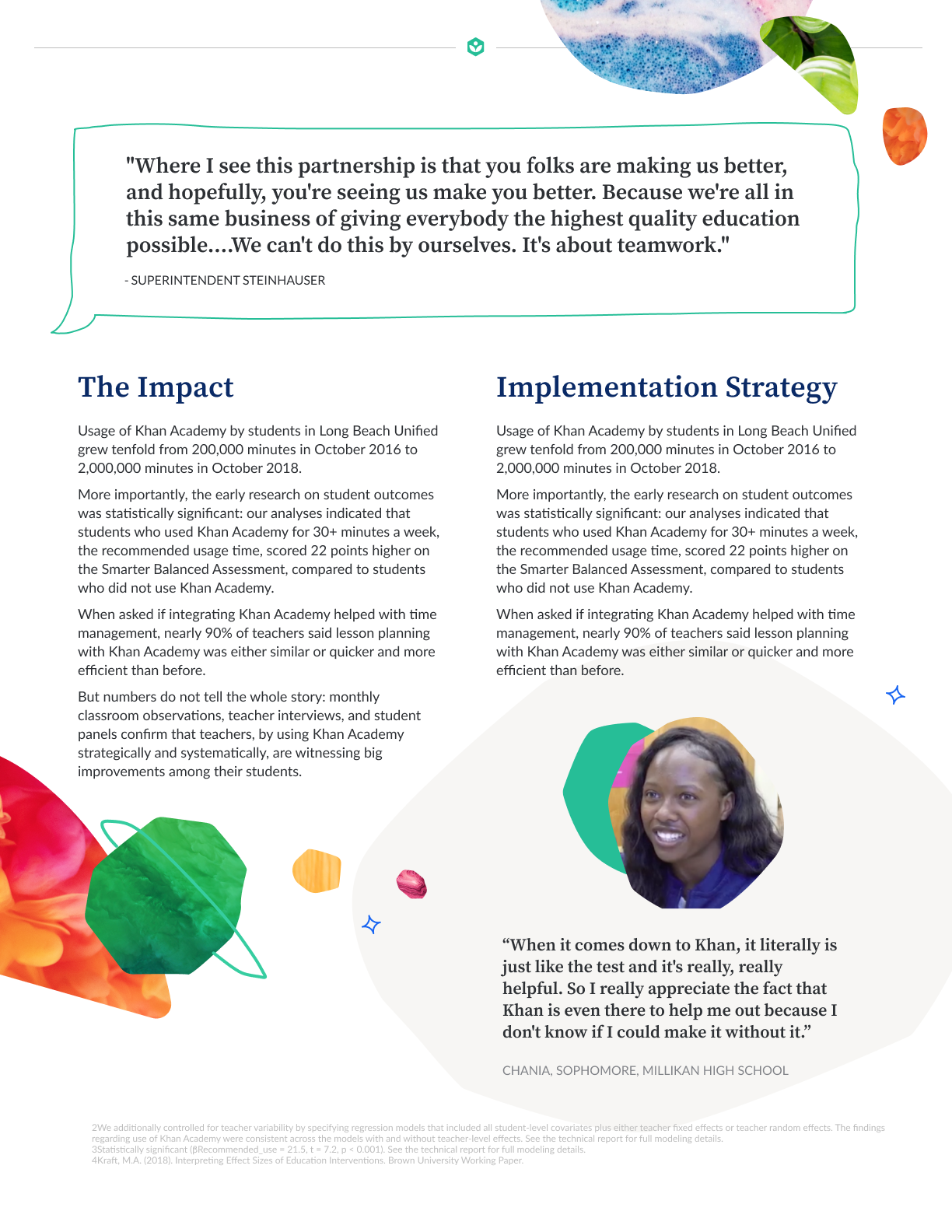
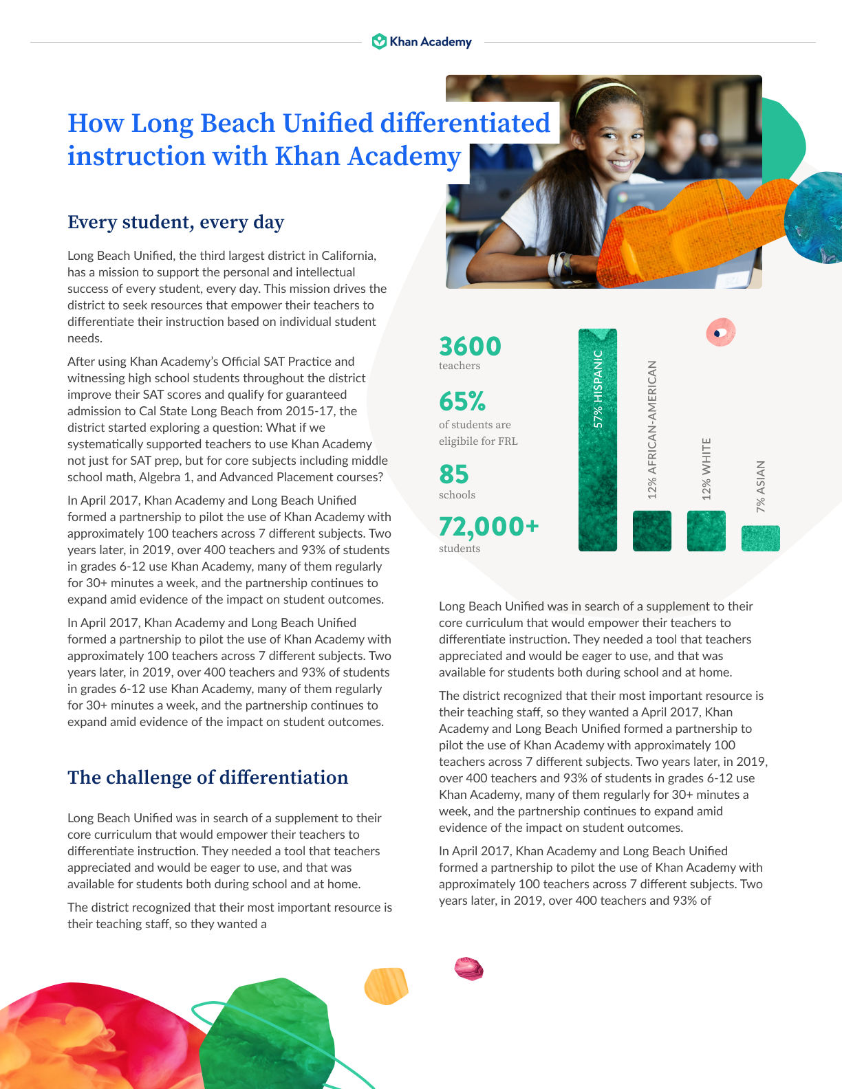
Summer 2019 - Ongoing contract (present)Now I can say it: I worked towards providing a free, world-class education for anyone, anywhere.
As a visual and interaction designer on the Khan Academy Design Team, I worked alongside UX writers, designers and engineers to redesign the company brand values and style. Most notably, my team implemented an updated visual identity that determined new UI elements and created an explorative experience that enhanced learner experience.
Through strategy workshops, asset audits, and numerous co-sketching sessions, we realigned the Khan Academy brand to represent growth, exploration and a passion for knowledge above perfection.
To learn more about my experience at Khan, reach out to me. I would be happy to talk about my experiences in non-profit brand strategy and learner experience design, and the wonderful people I got to work alongside.
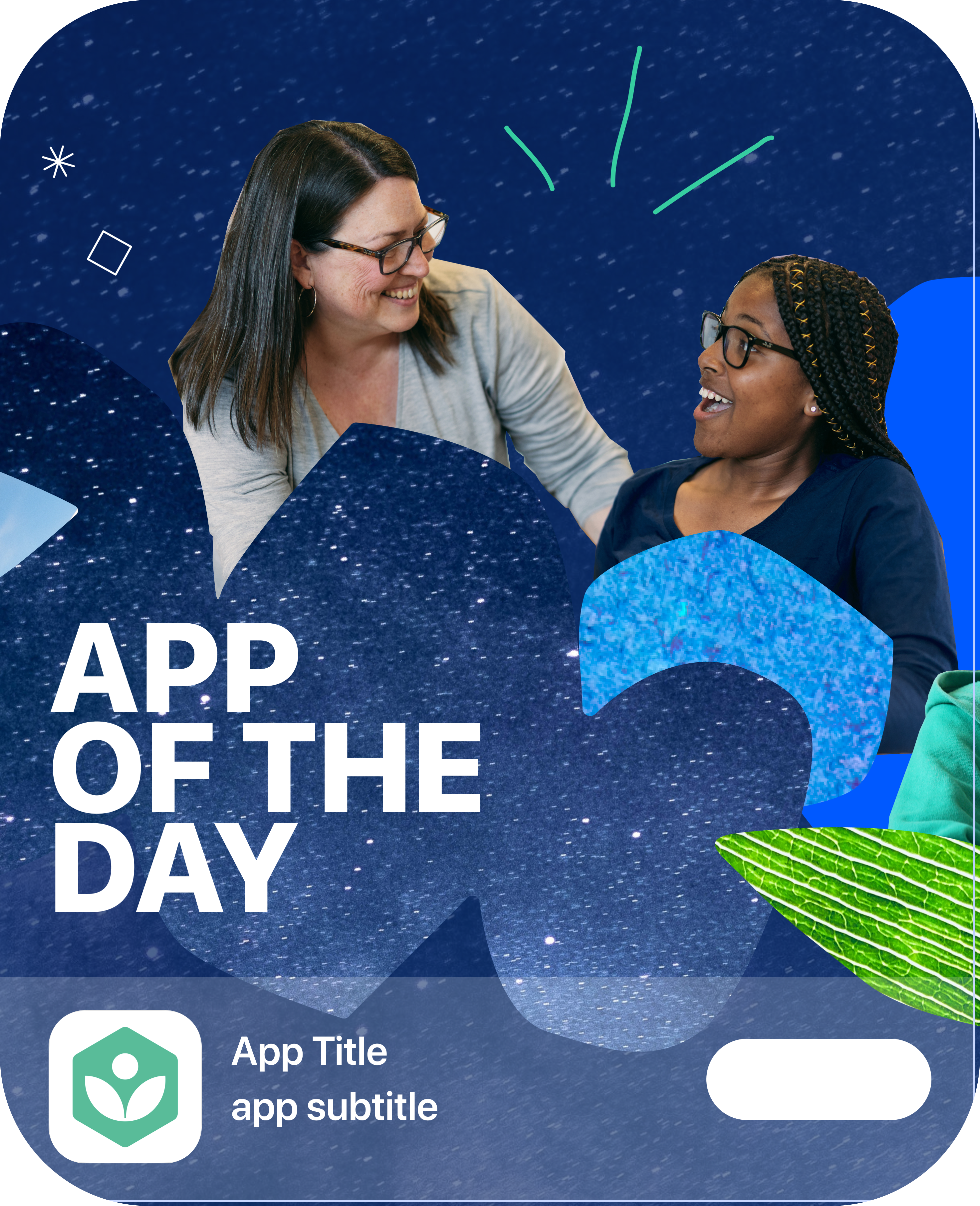
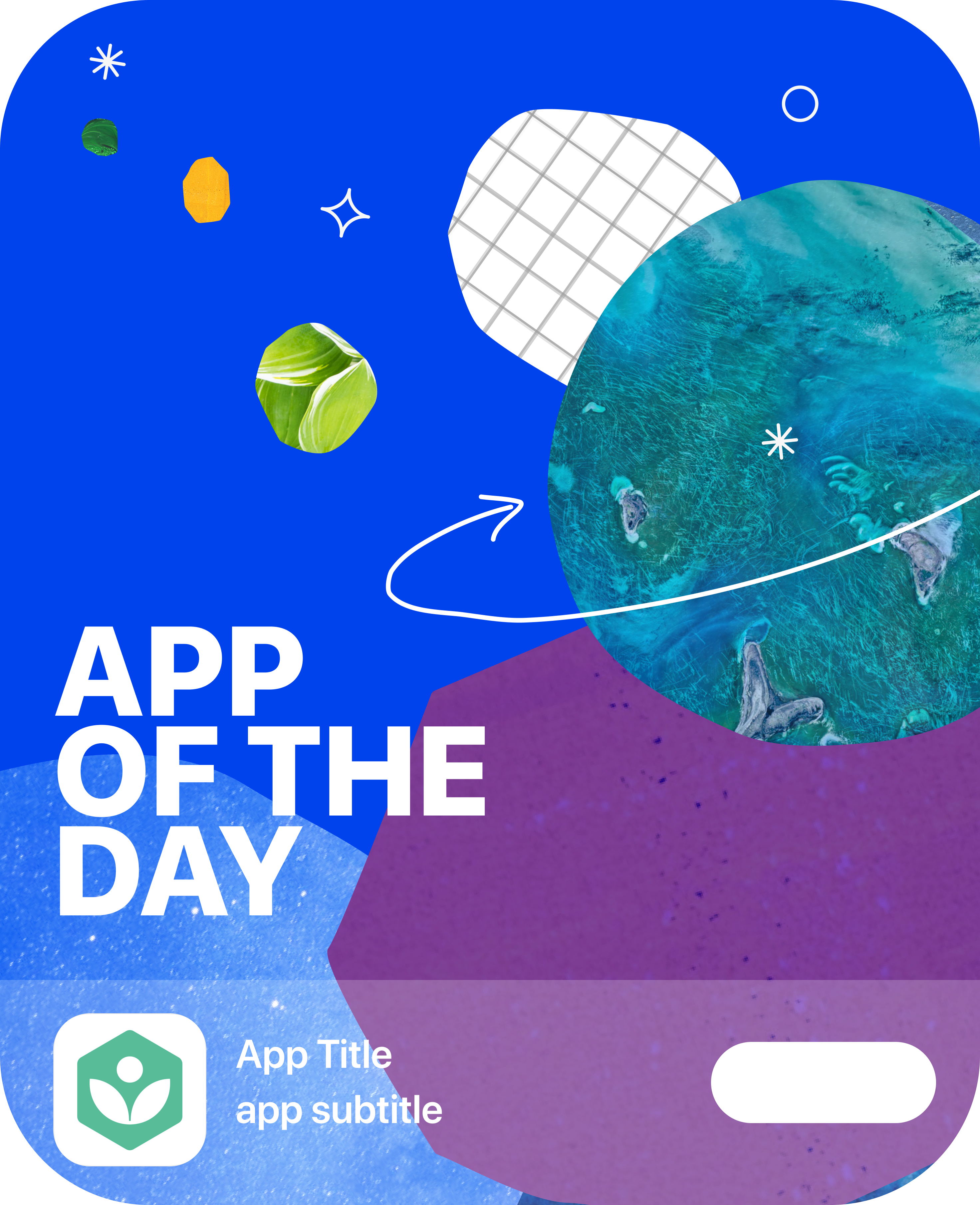
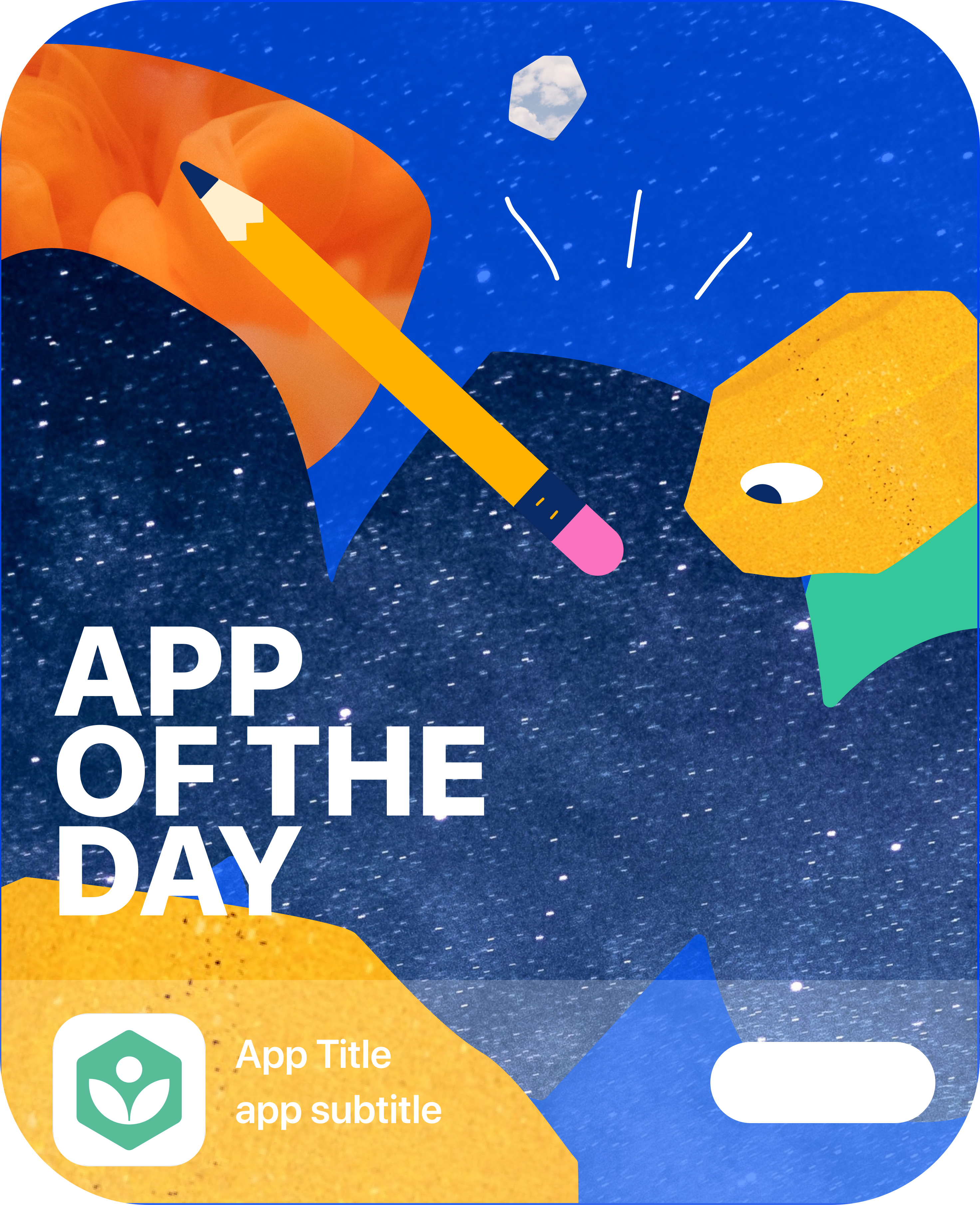
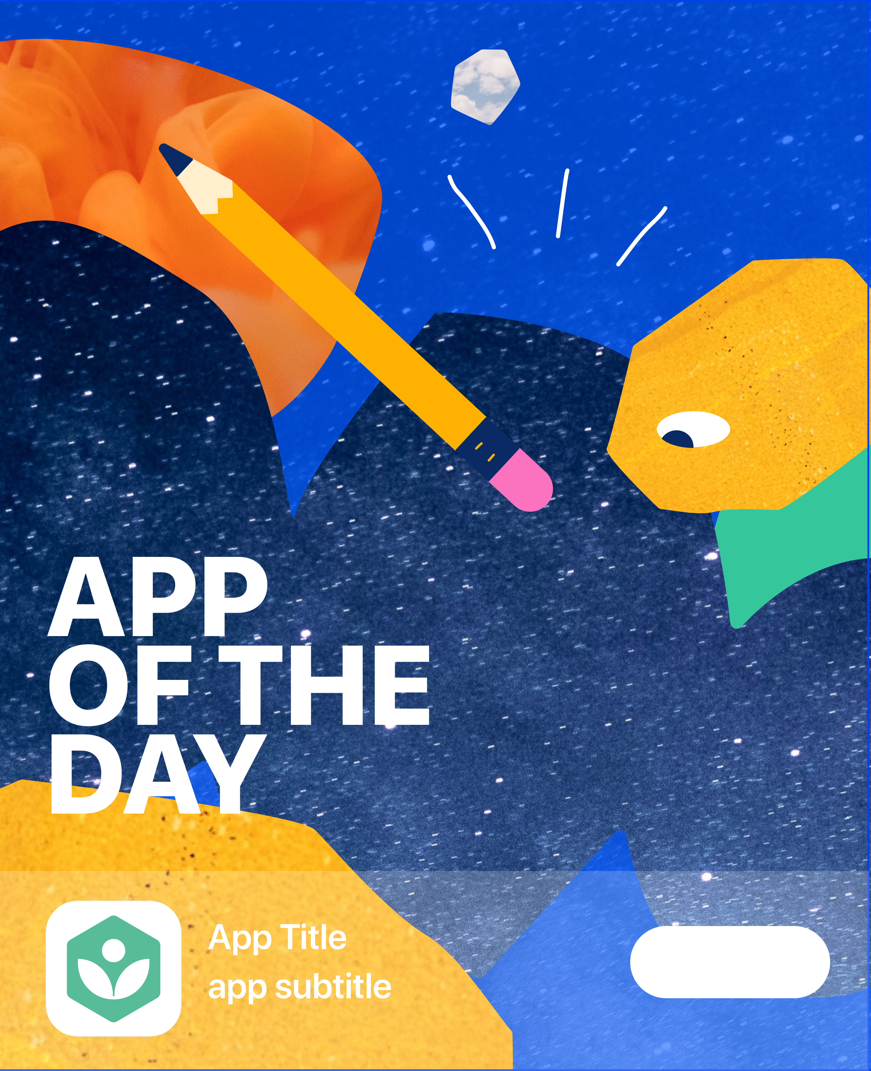
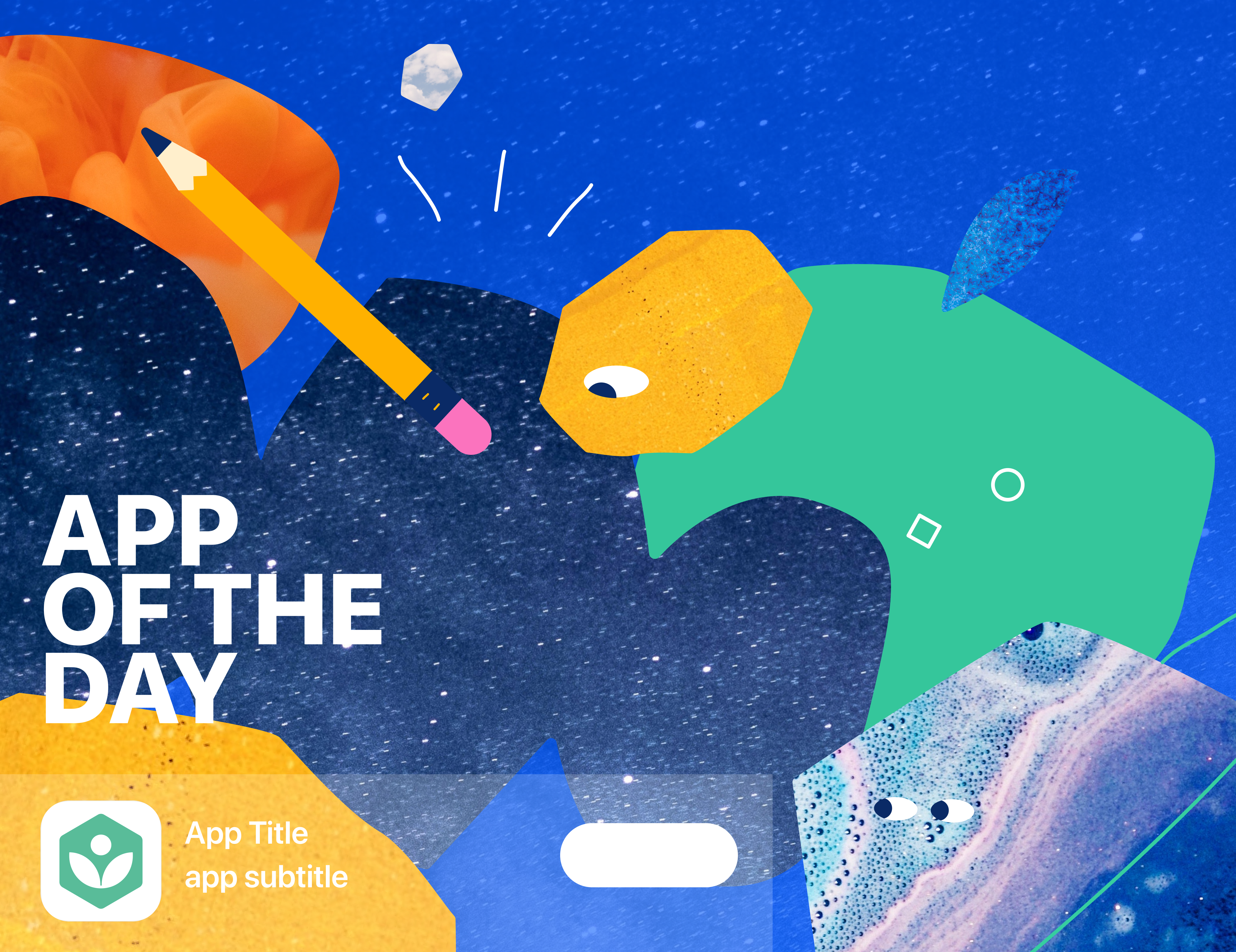
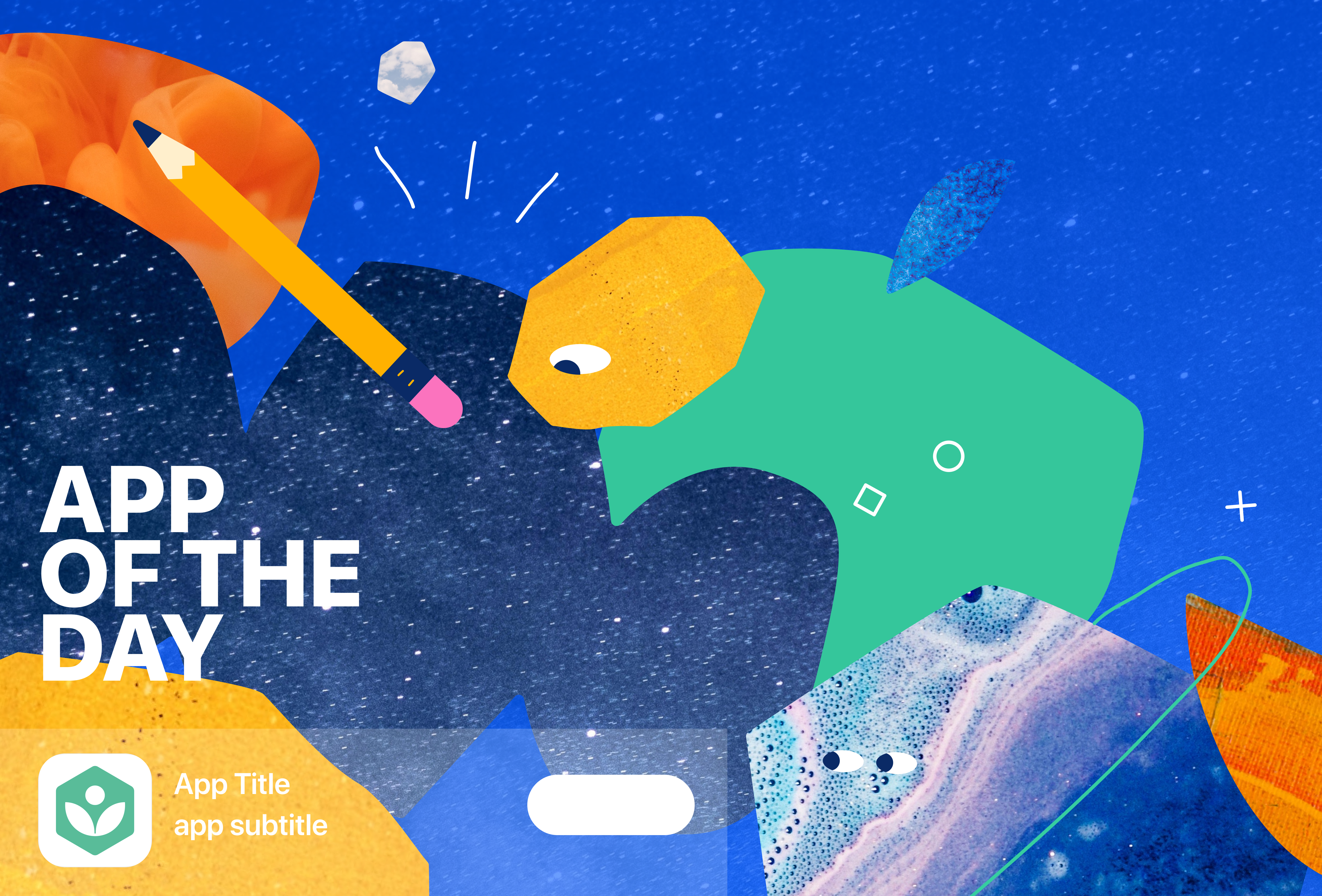
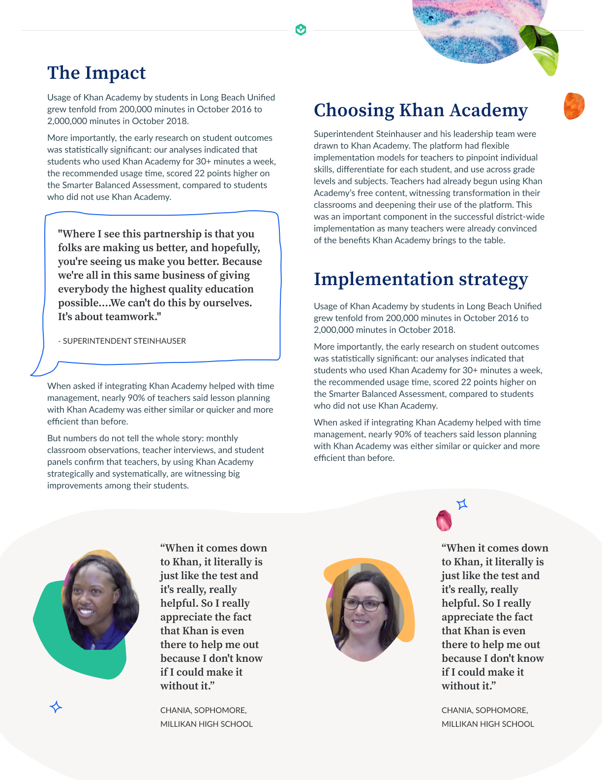
I’ve included a small piece of this redesign in these App of the Day illustrations I developed recently as a contractor for the organization.
App Store Illustrations
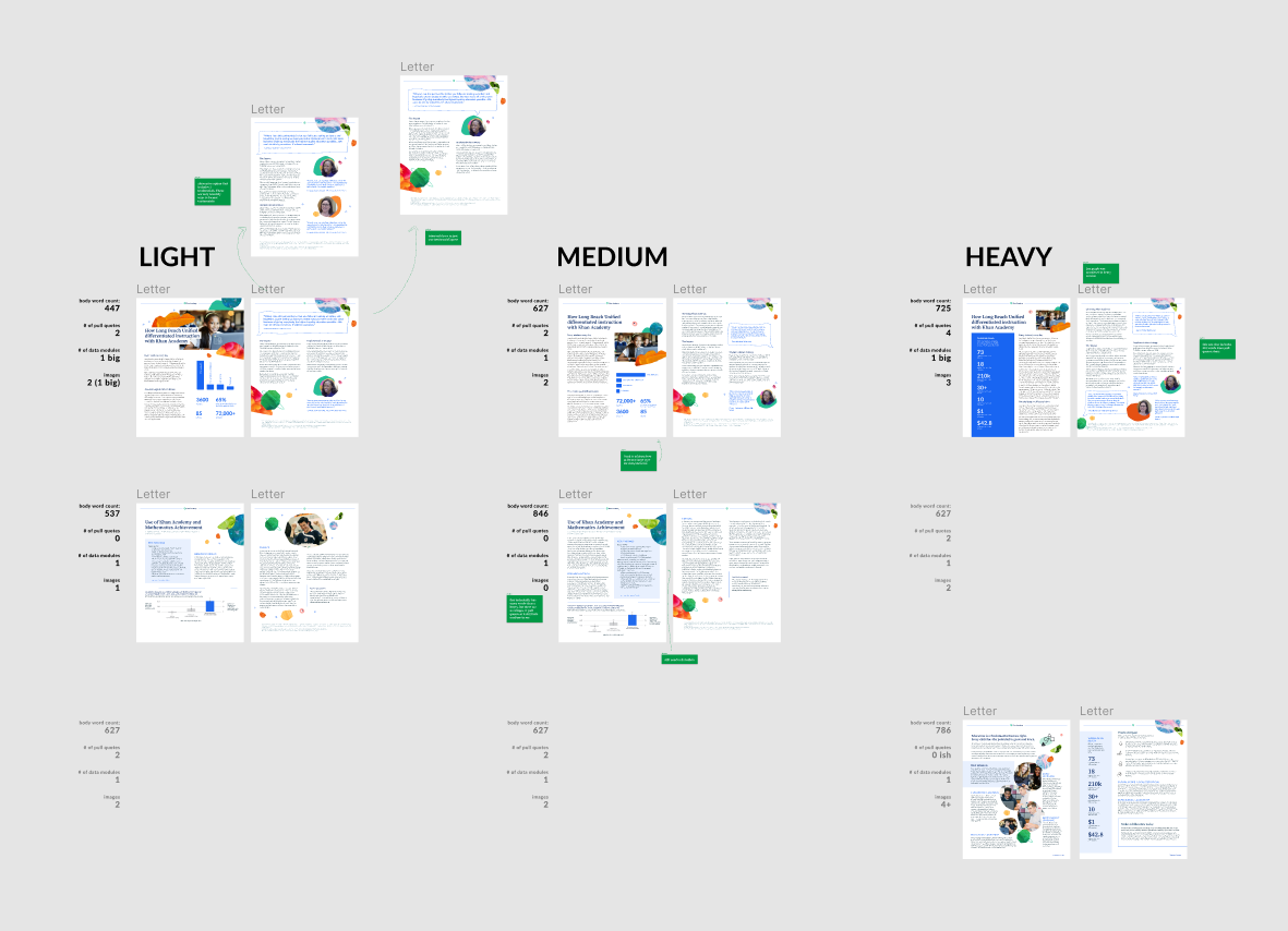
2-Pager Templates


Motion Explorations

Email Headers (200+ deliverables)


Internal Affinity Group Poster
