New custom fields
Asana Case Study
Lead Product Designer
How might we add a function to a complicated system without compromising clarity?
Custom fields are a bread-and-butter feature in Asana - simply put, they’re columns that let you tag tasks within a task management product. But as Asana’s feature set grew, no recent updates were made to custom field formatting, and the platform was rife with hacked-together workarounds, broken workflows and confused teams.
I led the design of the end-to-end process for a collection of new custom field types. I initiated early discovery and defined the problem space, generated buy-in, carried out the visual design, and paired with engineering to build and own each field.
We’ve since launched this collection of fields to 3 million users.
Role:
Lead and independent designer
Lead and independent designer
Skills:
End-to-end product design, UX research, Interaction design, Visual Design
End-to-end product design, UX research, Interaction design, Visual Design
Partners:
Cross-functional team including 1 product manager, 1 researcher, 5 engineers, consult with data science.
Cross-functional team including 1 product manager, 1 researcher, 5 engineers, consult with data science.
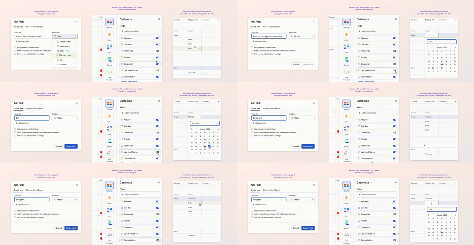
These are the three field types I focus on in this case study.
The problem space —
Asana is a task management platform. I like to describe it as a cross between email, Excel, and analog sticky notes, but with real-time collaboration and animated unicorn celebrations. A lot of our users are cross- functional teams that depend on this tool as a source of truth, so the design problems are often leveled, complicated and highly interconnected.
![]()
Custom fields, specifically, are intended for adding certain data to a task. When I joined the team, Asana only supported three types: a plaintext field, a number field, and a single-selection (dropdown). Users needed more.
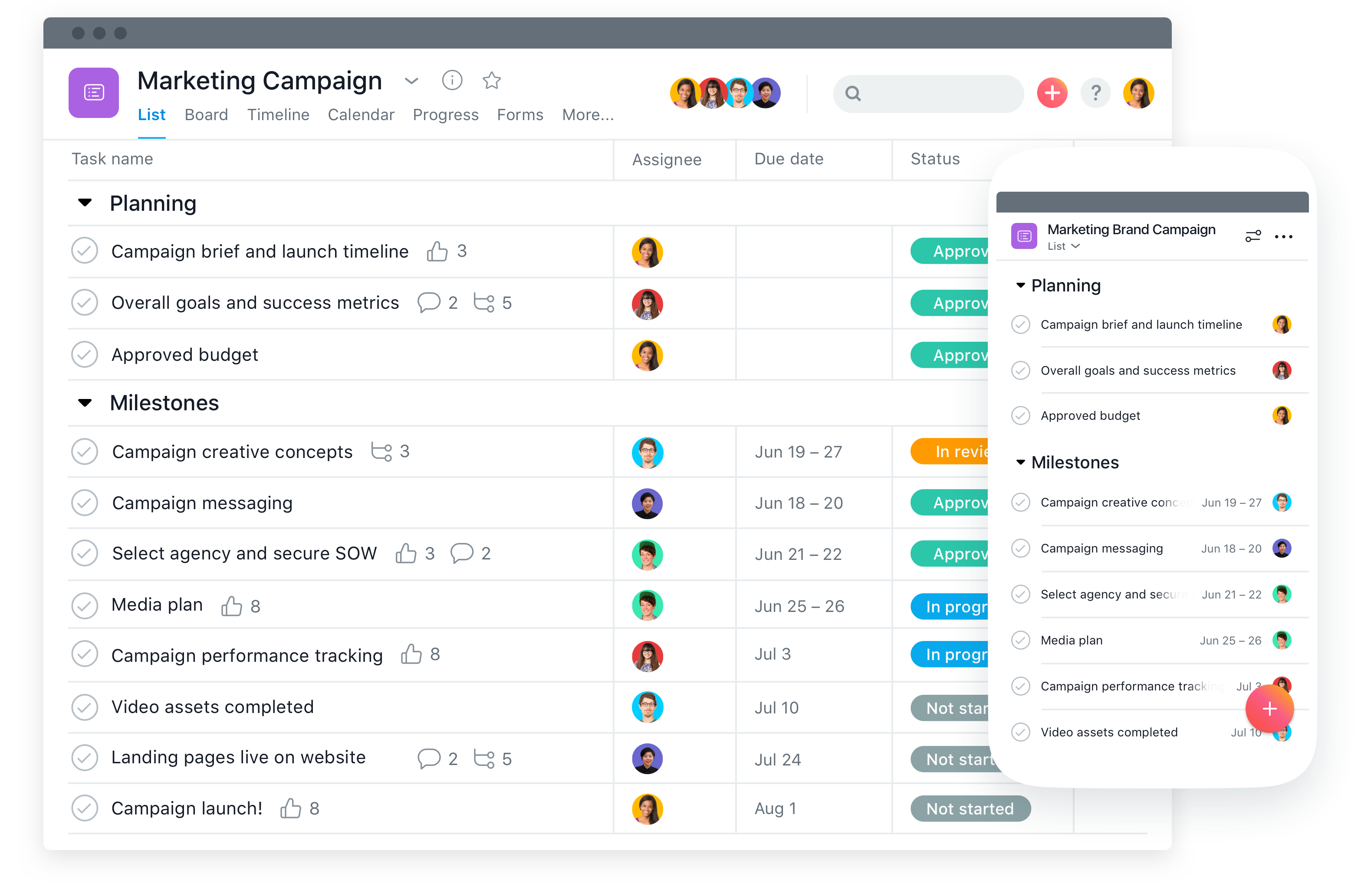
Custom fields, specifically, are intended for adding certain data to a task. When I joined the team, Asana only supported three types: a plaintext field, a number field, and a single-selection (dropdown). Users needed more.
User problem:
- Custom fields are a touchpoint for teams to align, but workarounds compromise this clarity and make the product feel brittle. Asana didn’t fully map to a user’s mental model of a workflow.
System problem:
System problem:
- Asana is a tool to establish “who’s doing what by when.” How do we introduce new fields without cannabalizing these core principles?
Vision —
Research —
What do teams want from a custom field? What do they need?
Through interviews and moderated usability testing, we discovered that most teams are actually happy with how Asana handles work people should act on: setting due dates, adding assignees and automating how they complete tasks. But custom fields aren’t for taking actions.
It was non-actionable pieces of data that were clouding the workflow and confusing teammates.
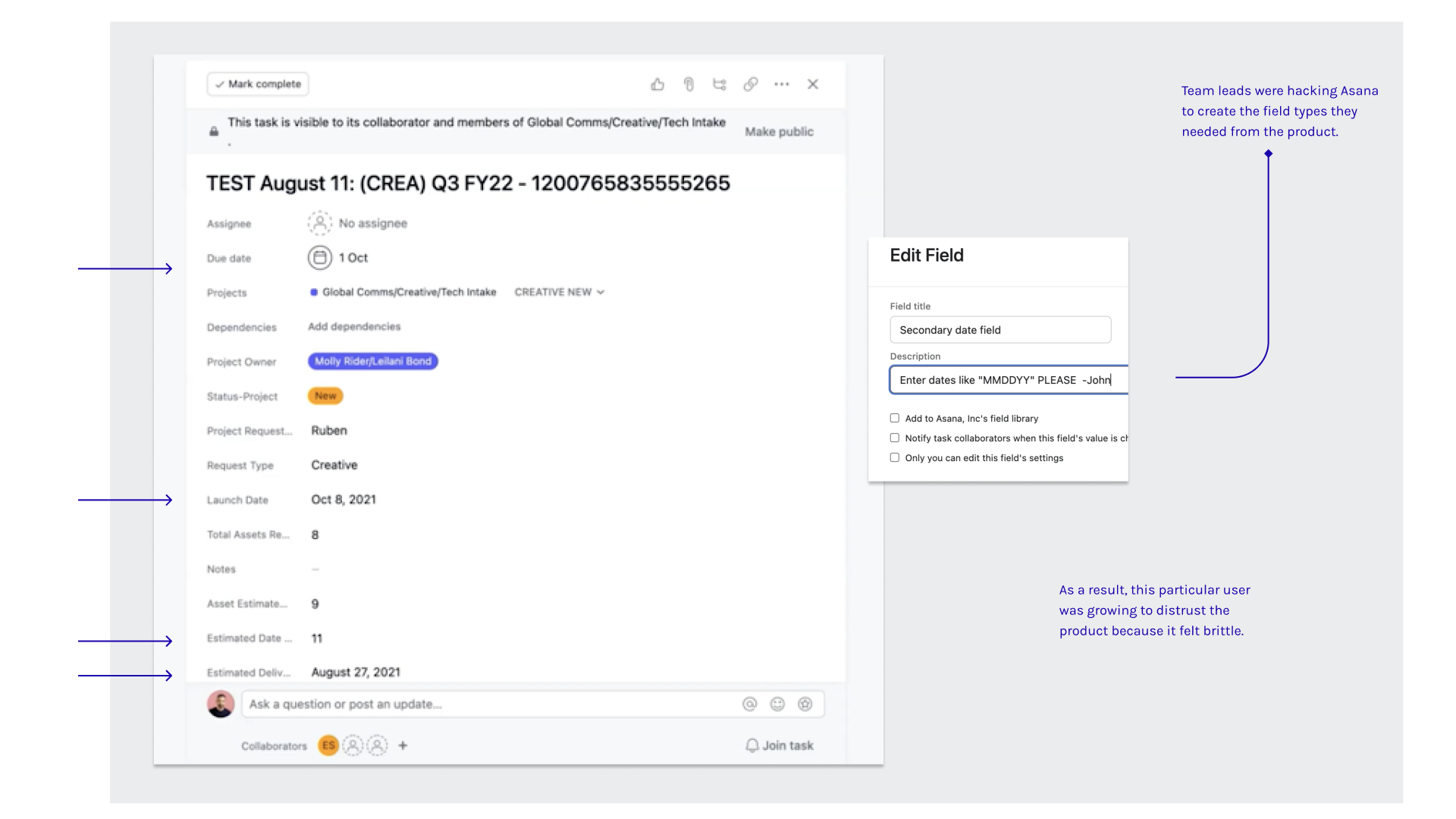
Real examples of “hacked” tasks in Asana
Product “hacking” was a key indicator of where custom fields were falling short:
“I used a number field to record projected release dates, but Asana added them all together automatically and it says 54 million at the bottom of my project. Did I break something?”
Product “hacking” was a key indicator of where custom fields were falling short:
- Labeling number fields with the discreet instructions for how to format them.
- Created a complicated system of rules that auto-configured due dates to the time of completion.
- Using other field types, like single-select, to designate people, then privately messaging them outside of Asana
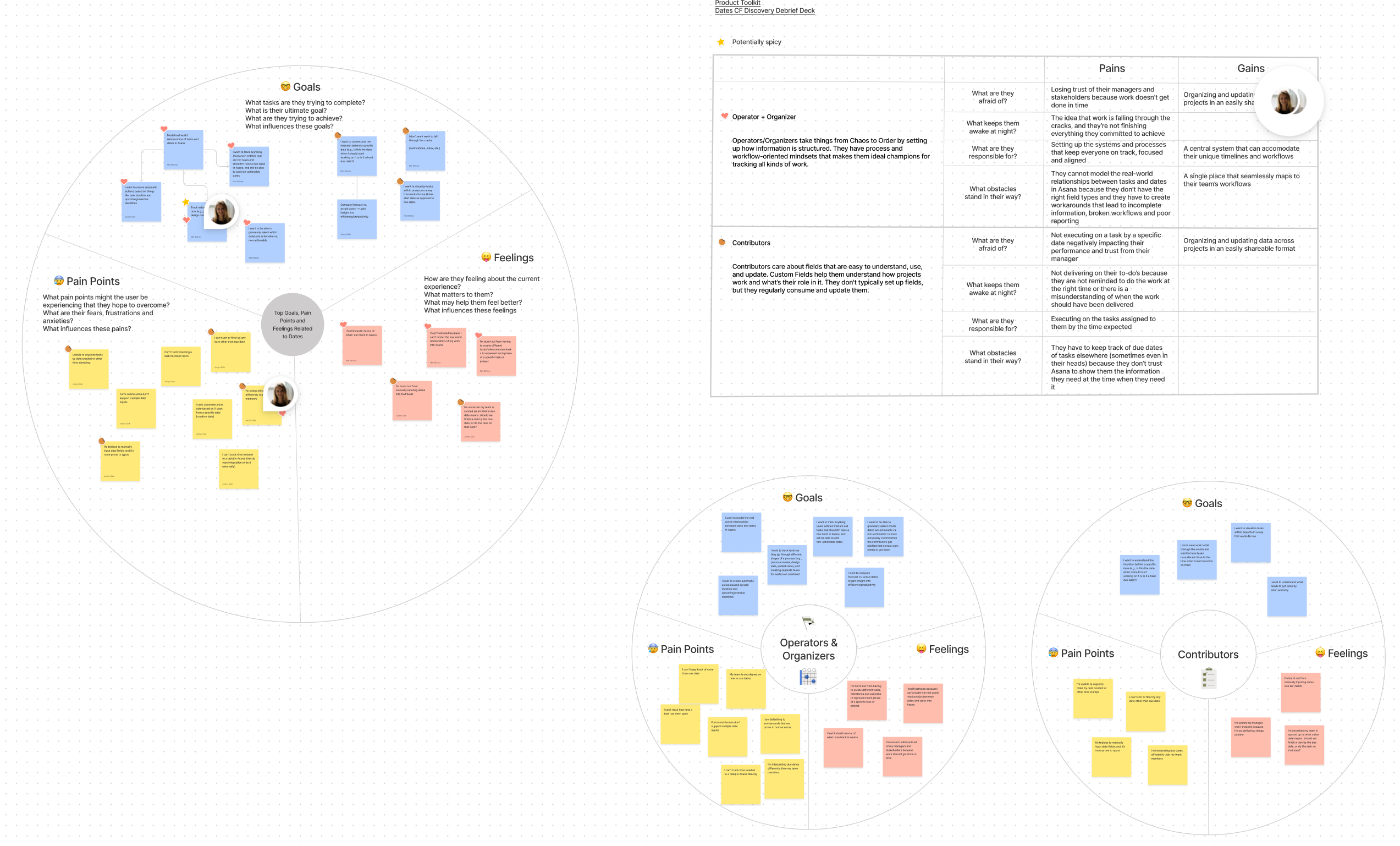
For Date and Person fields specifically, I led a mapping exercise based on insights from user testing
What we built —
Armed with usability research and a round of testing, we developed our solution with a focus on creating fields for reference. Leading the design, I placed a special focus on contributing the concept of non-action to the design system.
We prioritizied:
We prioritizied:
(01) Date
(02) People
(03) Metadata
Additionally, I pushed to allocate a few sprints for usability improvements in the (04) field creation modal and the (05) task pane view.
Implementation —
Because these field types represented a new way to capture information in Asana, I had the unique opportunity to take componentization into my own hands. A lot of our existing design system patterns were built around action and reward, but now people needed a way to add a date or connect a person to their work without explicitly applying responsibility.

These are some of the components of the final solution. There was a lot of surface area to cover.
I wanted to ensure the components we supported would be replicable, resilient and integrated consistently, so I initiated a design sprint with our internal design systems team.
During the sprint, we established that designing for nuance, accessibility, and discovery are just as critical to designing for achievement or completion, even in task management software.
There is an underbelly of critical, non-urgent information that fleshes out how humans collaborate with each other, and the components we landed on defined this new tone in Asana for future features.
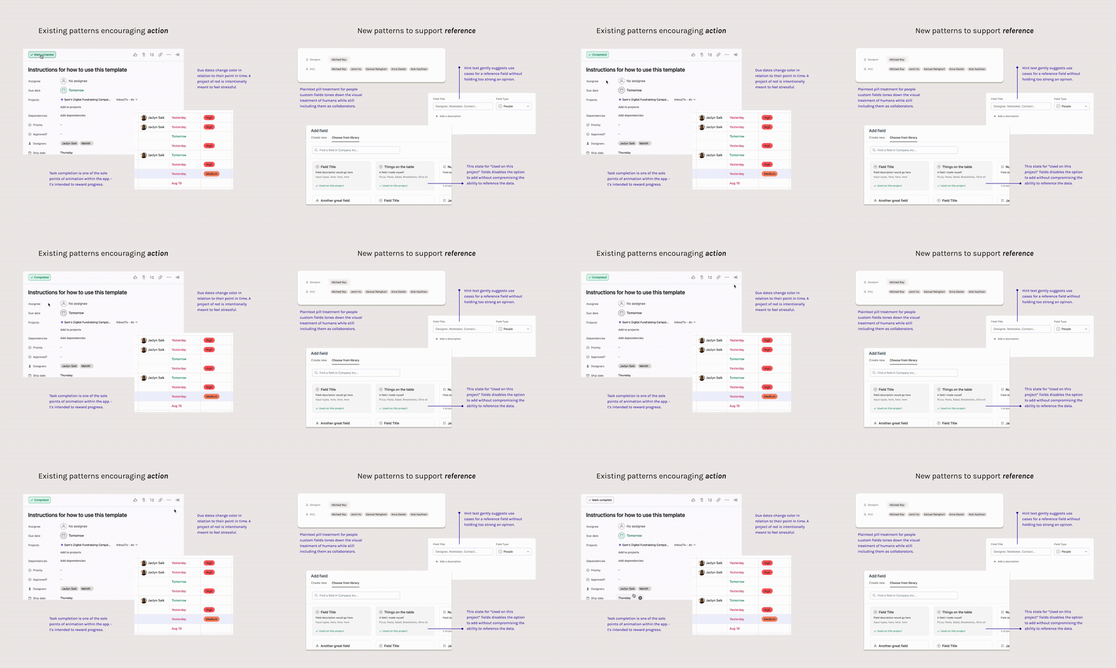
These are some examples of how we created a tone of reference and record in a highly “actionable” product environment.
01. Date custom fields
Referencing dates without urgency
“I want to record the dates that a shipment is expected to arrive, but the overall task to process the shipment isn’t until a week later.”
A “due date” seems like an easily-understood characteristic on the surface, but we found teams weren’t aligned on how to capture other dates, such as shipments, publish dates, receival, or even birthdays.
Working with design systems, I developed a treatment aimed at striking a balance between interactive and non-actionable.
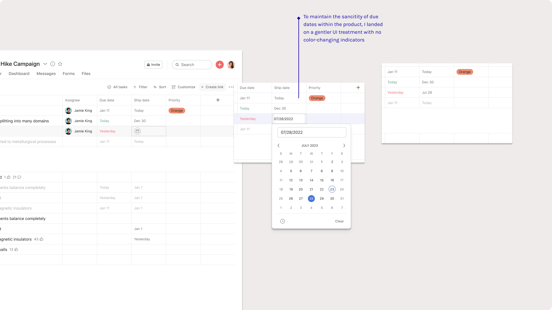 Date custom fields are intentionally static
02. People custom fields
Including humans without assigning them
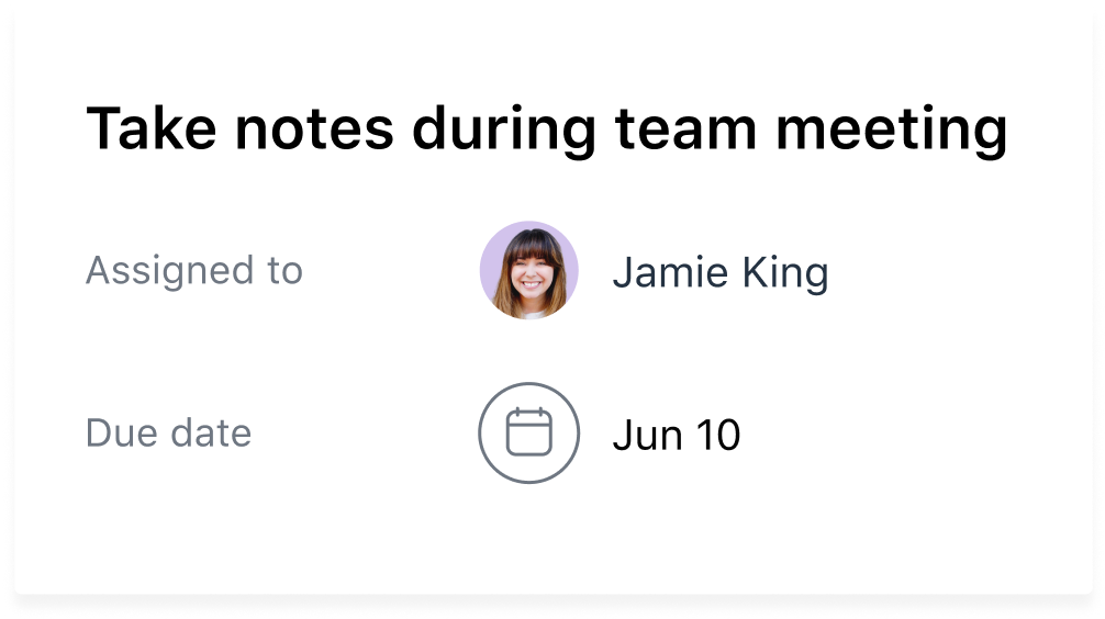
“This campaign request is Jamie’s responsibility, but I also want to identify which designer is helping out.”
We found that the core principle of “one task assigned to one person at one time” still held true in the wild. But in testing, we also learned that oversimplifying this connection of humans to work was leaving key contributors out of the loop. Users wanted to record their teammates’ relationship to the work alongside the main assignee.
People custom fields in particular posed an interesting design challenge: How might we represent humans in a new way in product?
We tested three options in moderated sessions:
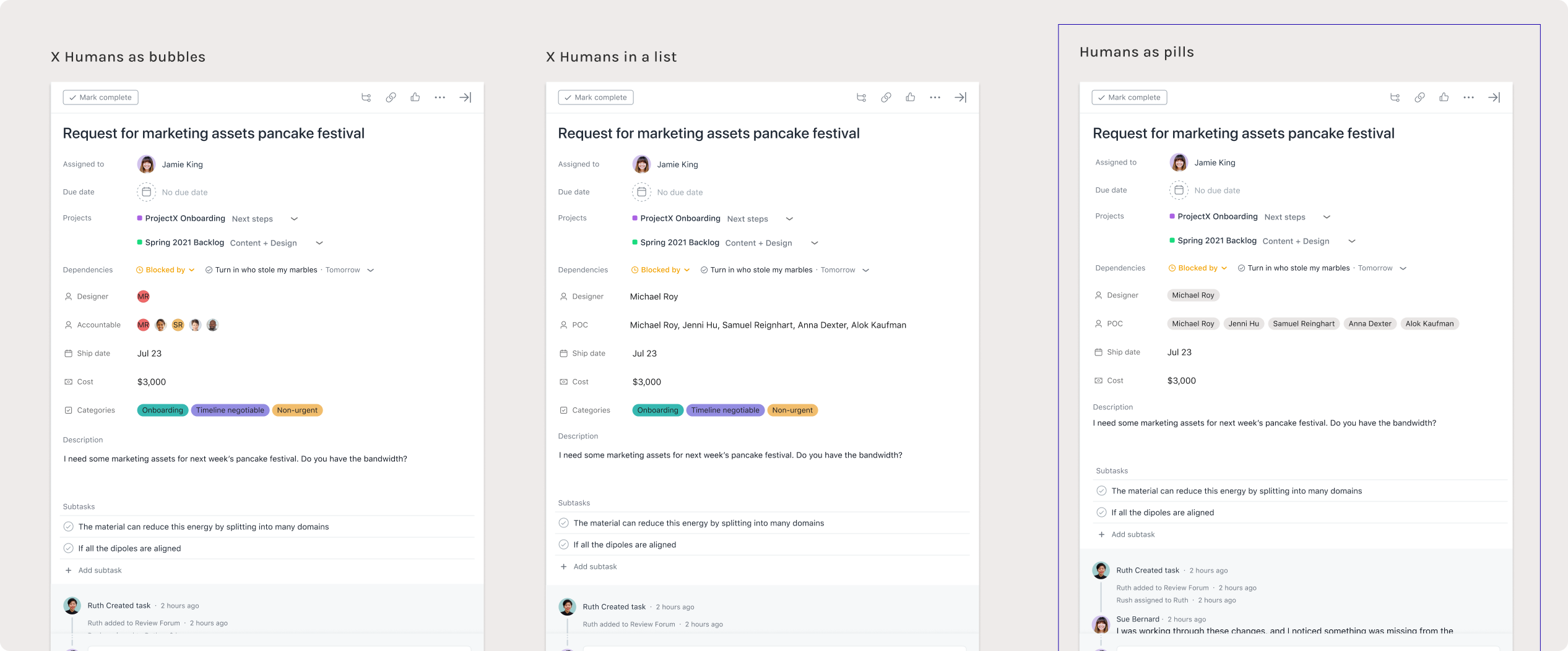
Three tested options for the UI treatment for people. We also tested other surface areas where this feature would appear.
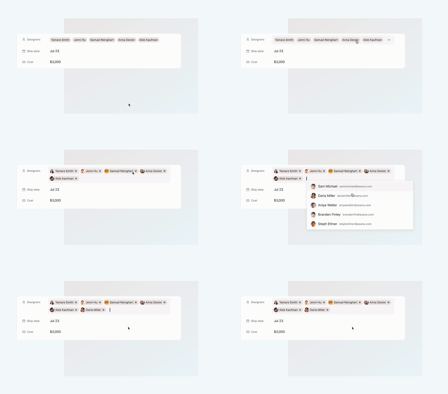
Plaintext pills were the most versatile component to build, and the least competative with the assignee field. I developed a new component by combining these pills with a selection “tokenizer” we originally use in our design system for bulk actions.
In this way, the solution progressively discloses more information about who has been added to the task without overwhelming the task pane interface.
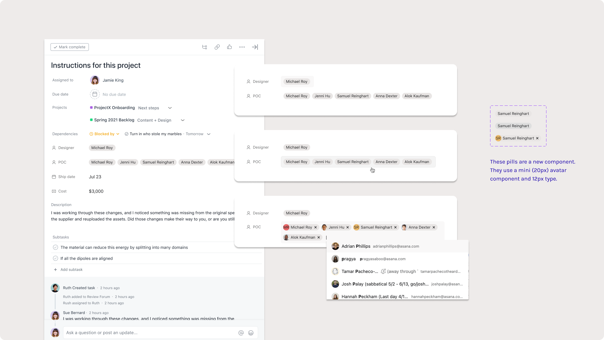
The tokenizer component reveals full names and image cards, but users have to click into the element to reveal that.
03. Metadata fields
Revealing inherent information about work objects
Metadata fields are all about surfacing data that Asana already knows and serving it to users in a way that’s uniquely useful to them. Research felt like watching users describe a fossil hunt they wished they were on.
“I want to sort by who created this task and then when it was last modified. Our team moves fast, and I’m wondering if this is a task that fell through the cracks.”
We uncovered characteristics like “time completed”, “last modified”, and “assigned by” as prominent asks. I worked closely with engineers to weigh design cost against eng cost, and that’s how we selected the first four pieces of metadata to build.
This was also an opportunity to power up a lot of the other popular features. Sorting and filtering projects by task characteristics is a fundamental function (hailing to Asana’s spreadsheet origins), so revealing this data illuminated a lot of existing processes.
 Metadata, our first read-only field type.
04. The custom field modal
Rethinking the system’s entry point
Additionally, our data science team noticed an interesting drop-off in the current creation flow. Although the “add custom field” button was easy to discover, many people were quitting the modal without following through on actually creating a field. Paired with our insights from usability research, it was clear the creation flow needed a redesign.
With no engineering budget left for any change to the information architecture or overarching UX, I used this as an opportunity to push the UI. I focused on prioritizing space, adding supportive product copy and making room in the modal for future custom fields.
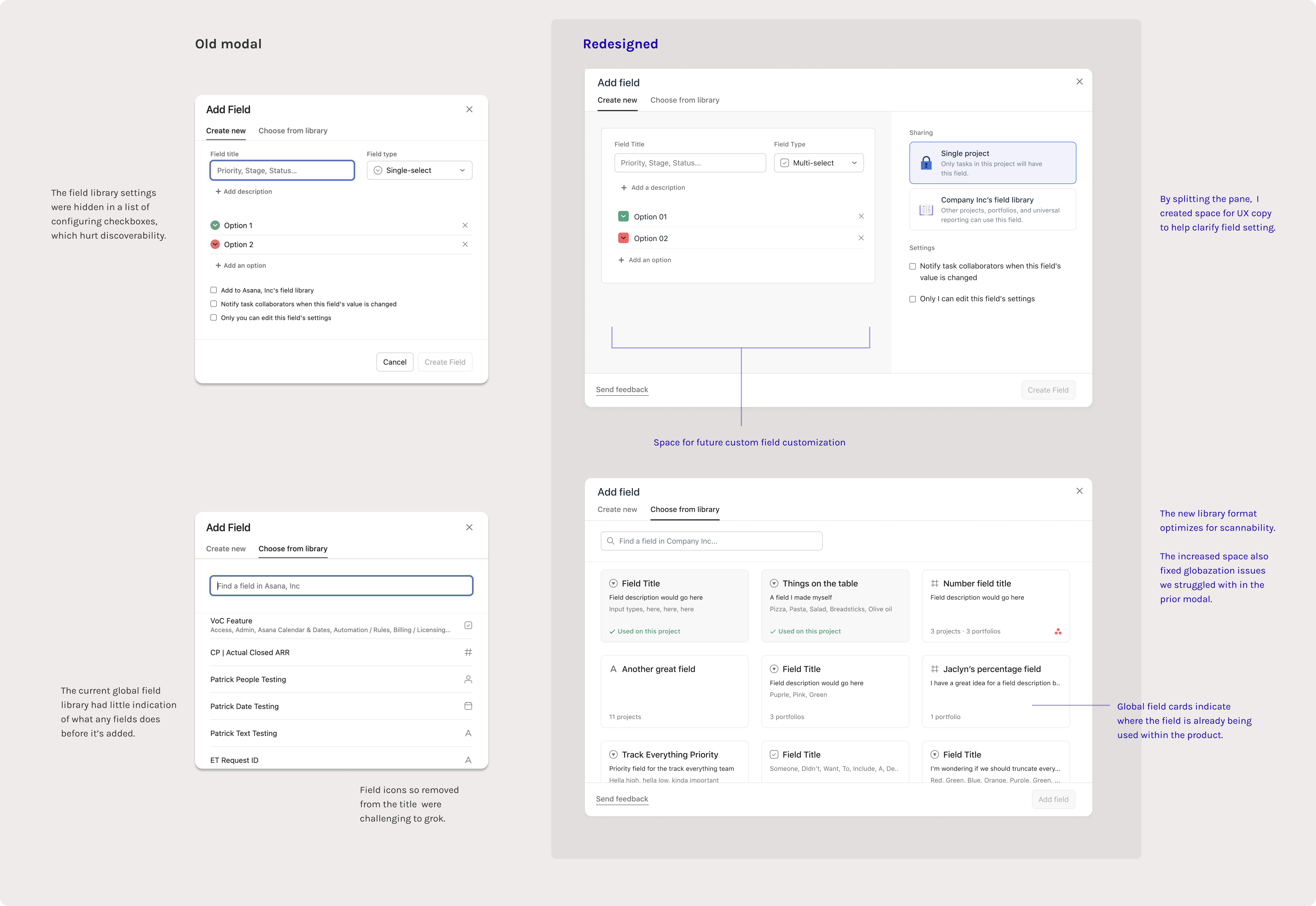
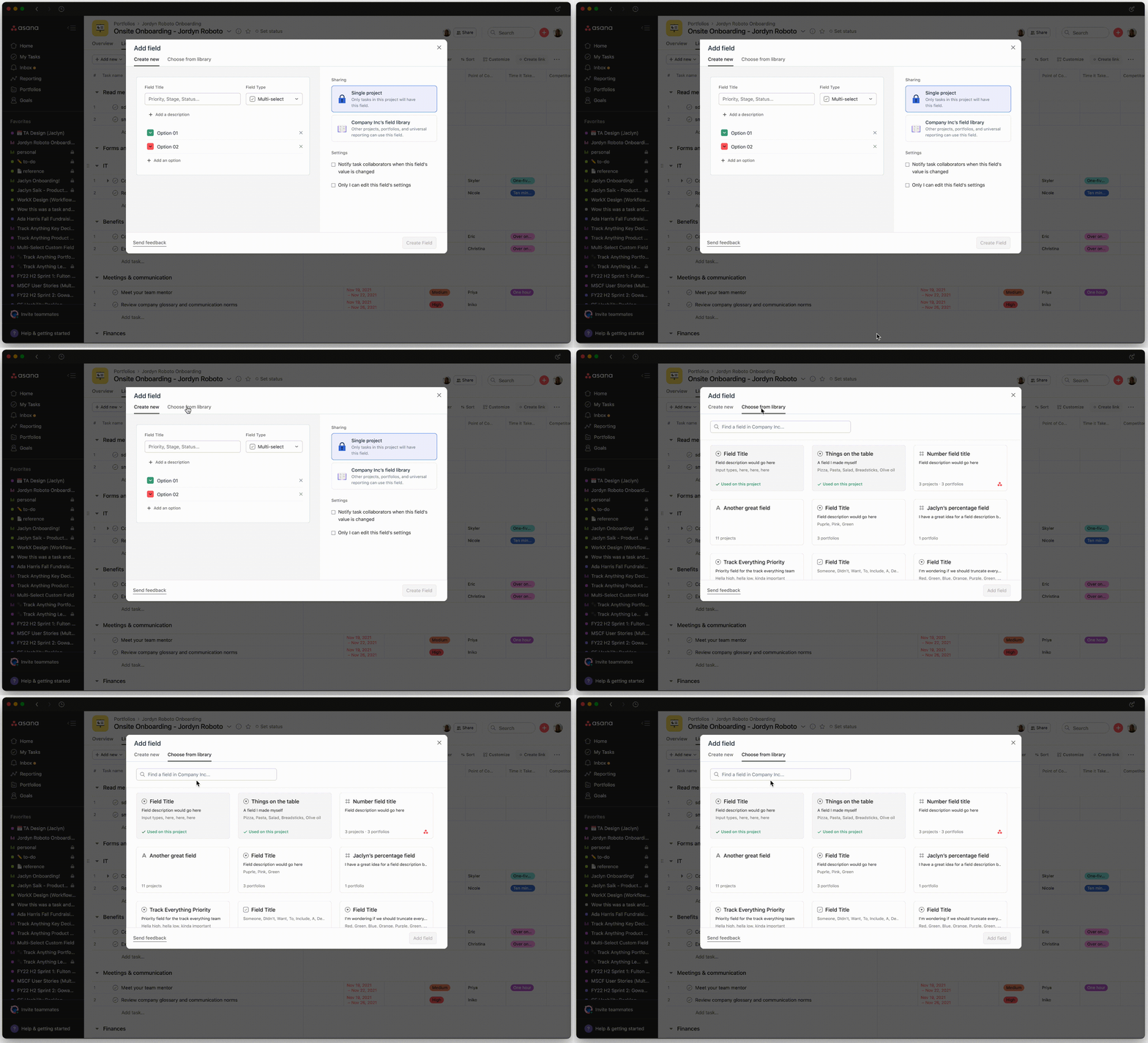 The modal redesign was also a fun UI challenge
05. The task pane
Distinguishing field types in a crowded space
The task pane is a detail view where people can really dig into “who’s doing what by when.” As mentioned, one of the biggest risks with building new field types was introducing something so similar to Assignee or Due date that it clouds this clarity.
We couldn’t just shove new fields types in without a second thought: the task pane needed a revision. This took a lot of visual exploration and a self-led design jam with relevant teams.
I mapped the final contenders on a scale of eng cost:

Curious about the wild places we could push the task pane? I’m happy to show more of what I’ve been thinking about.
... but I had to pare down my solution to gain buy-in from other teams (and not scare the engineers too much).
I was able to convince stakeholders on a light visual polish and a set a mini icons I designed specifically for our new collection of fields, used as a visual indicator in an otherwise uncategorized pane:
These mini icons may look tiny, but it felt like a remarkable achievement for my team to ship a change on such a high surface area
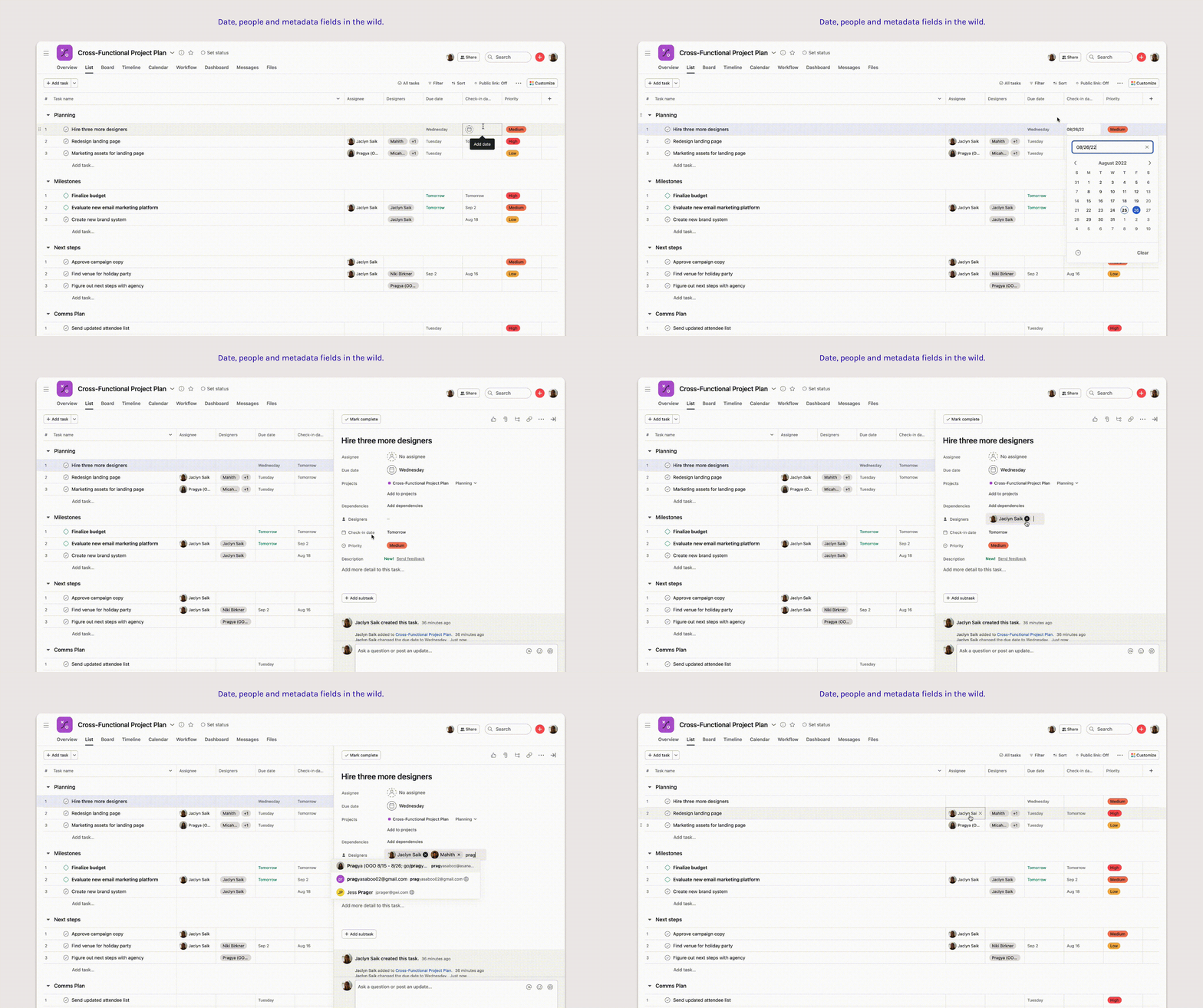 These fields fully launched in summer 2022
Results—
Post-launch, each of these field types maintained guardrail metrics — data points we specifically set up to make sure new fields weren’t cannabalizing due dates or assignees, which was validating.
We originally launched these fields quietly (no marketing) — and it was at that point we knew they’d be popular. Within a week of launching, a signifigant number of teams had discovered and added these fields into their workflows without any indicators.
We originally launched these fields quietly (no marketing) — and it was at that point we knew they’d be popular. Within a week of launching, a signifigant number of teams had discovered and added these fields into their workflows without any indicators.
It was empowering to know we built a tool that was intuitive enough to adopt without announcement.
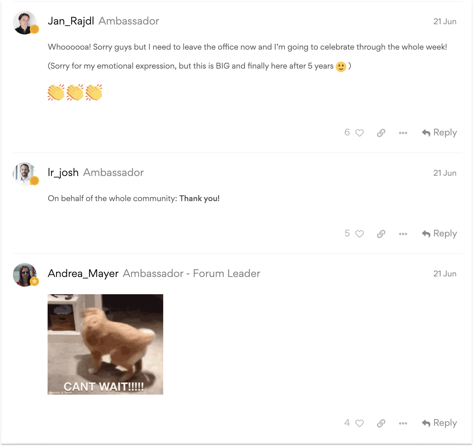
Some of the love we recieved for Date Custom fields.
I also learned that design systems work is all about people and advocacy. This series of projects was a delicate challenge of balancing how we communicate new patterns with honoring an existing system, and getting buy-in meant leading with this mission in every proposal I made.
In the near future, we do need to come to terms with crowding. As we build out the custom field suite in Asana, we’re adding complexity to a system designed for clarity. Although users are using these fields in ways that made their work simpler, there’s also just more options to choose from.
Working closely with design systems, my current work is centered on rethinking how our UI can declutter the touchpoints where users falter with decision fatigue.
Curious to learn more about my design process around these fields? Want a peak at which one’s coming next? Feel free to reach out ↗